LOUIS
RABAN
LEDGER
I’m a designer dedicated to the principle of clear and effective communication. I have a BA in Graphic Design from the University of the West of England (2023) and have been working as a Graphic Designer at Capture Property Marketing since June 2024. I’m always on the lookout for new and exciting freelance projects, as well as creative collaborations. Do feel free to email me with any enquiries.
Personal Project
Branding / Logo Design
NOKO
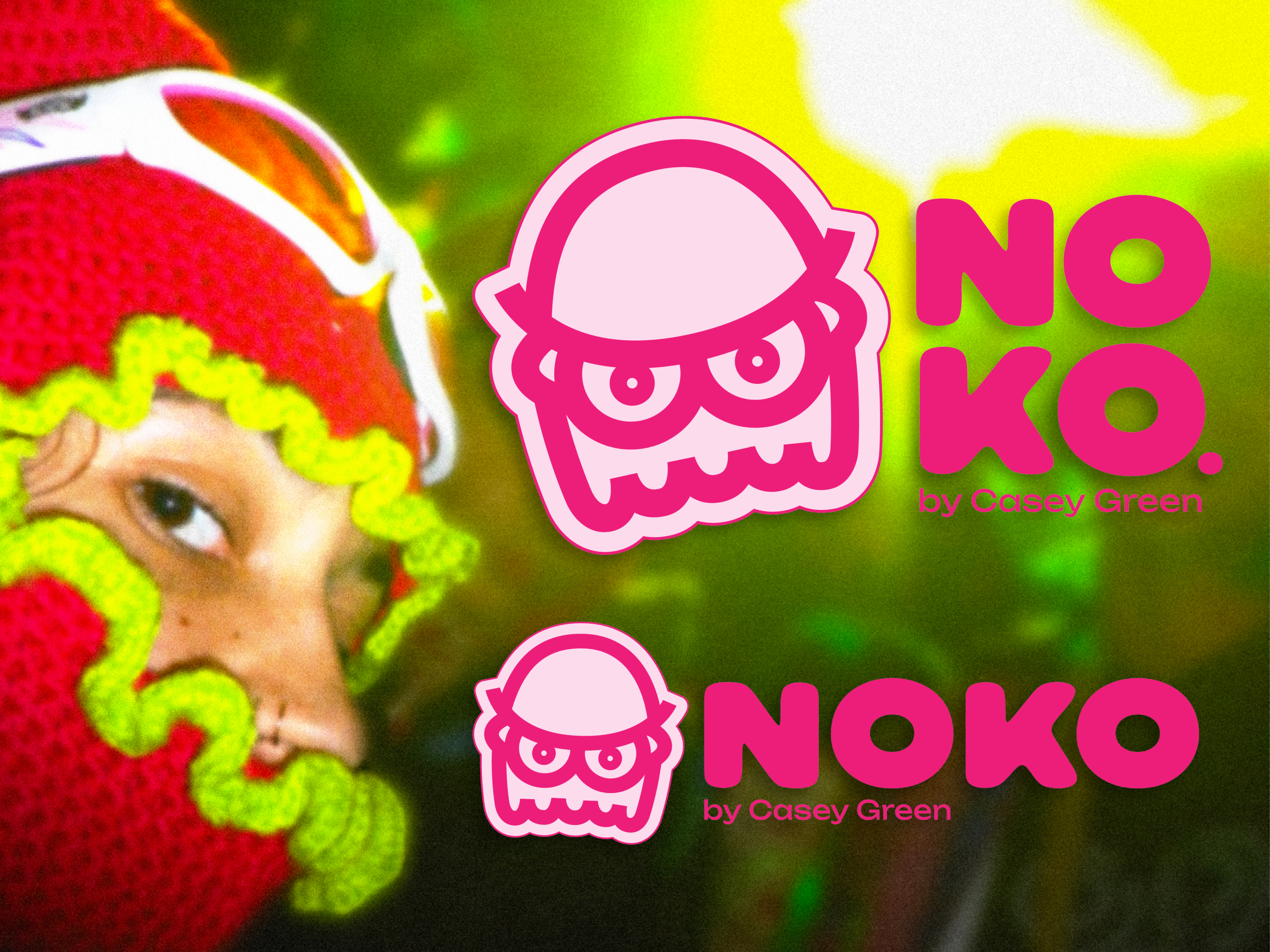
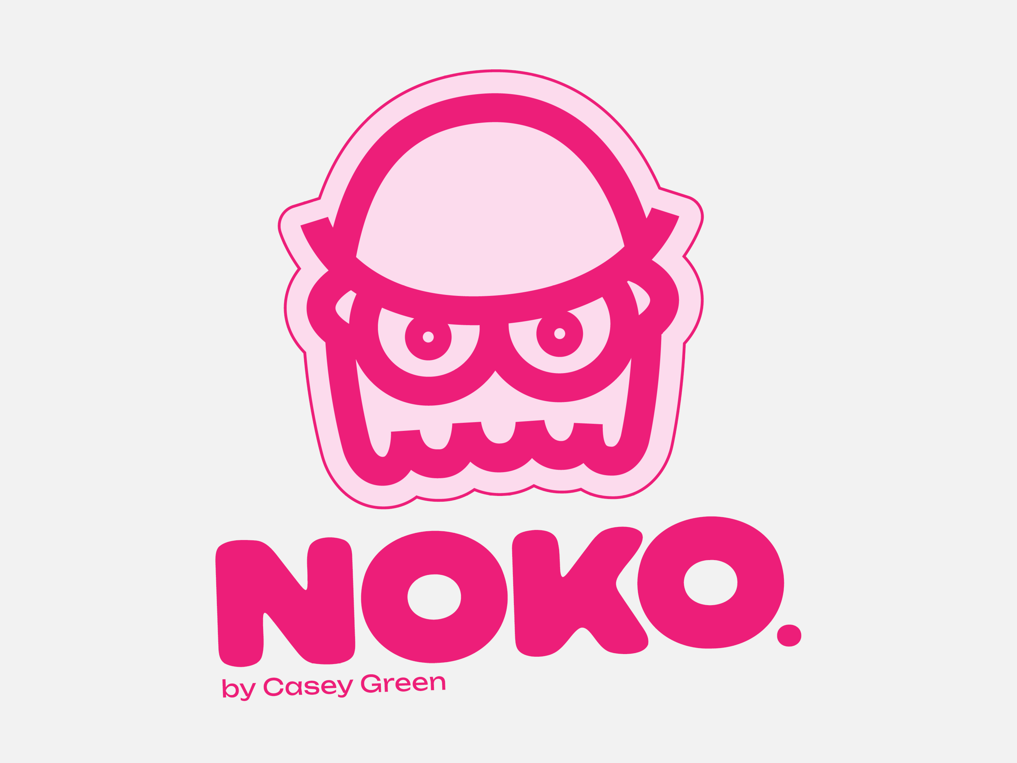
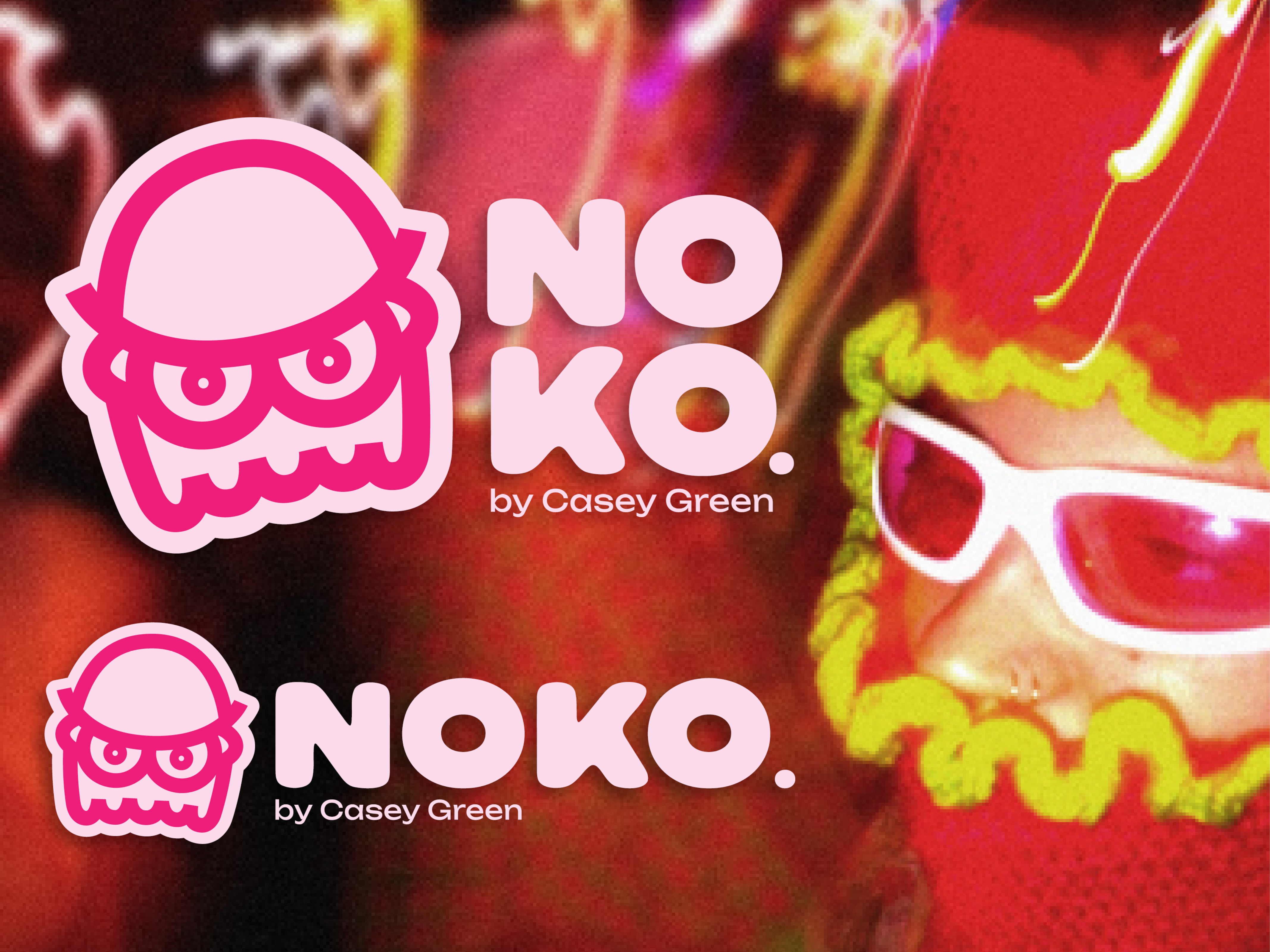
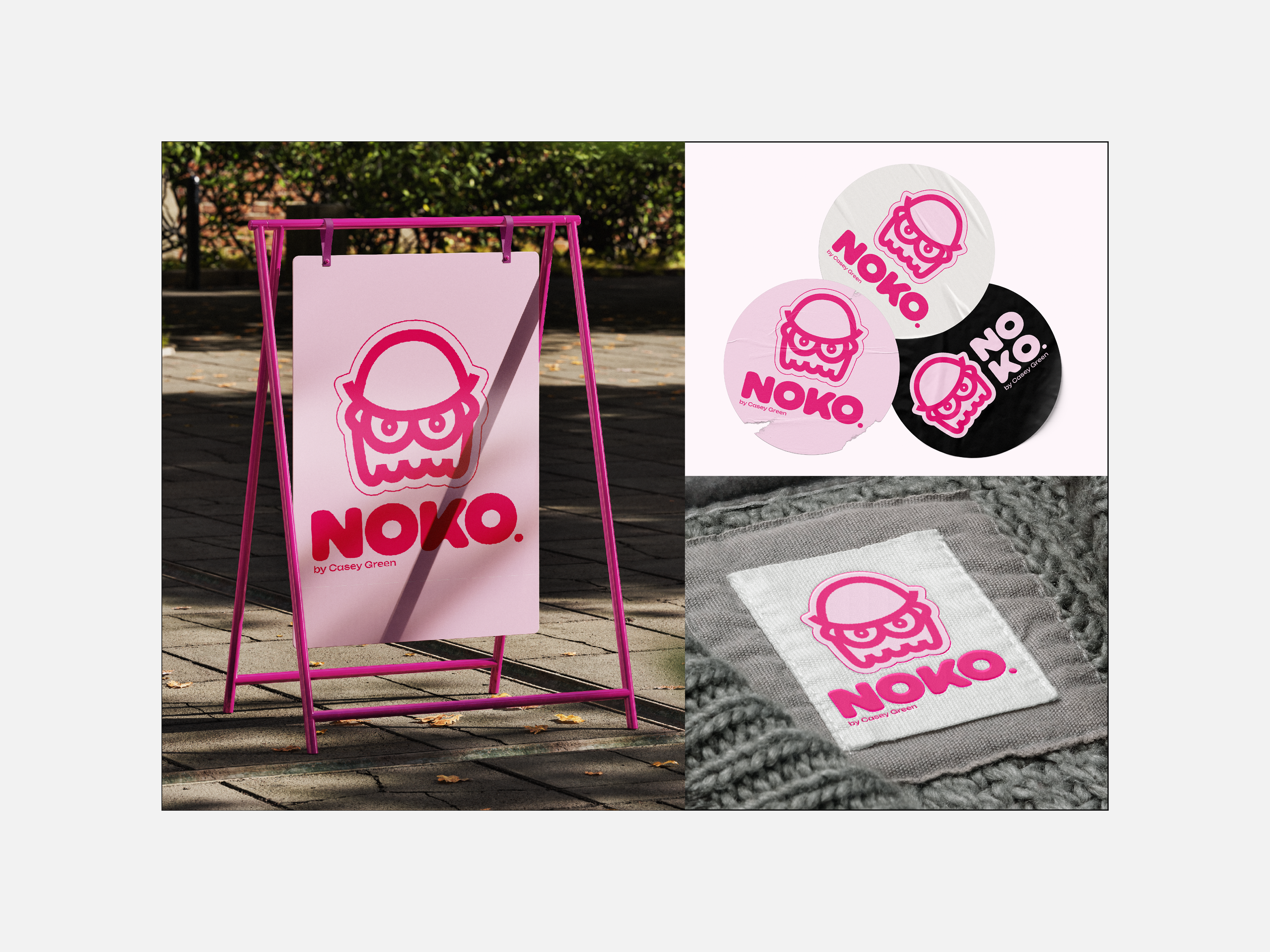
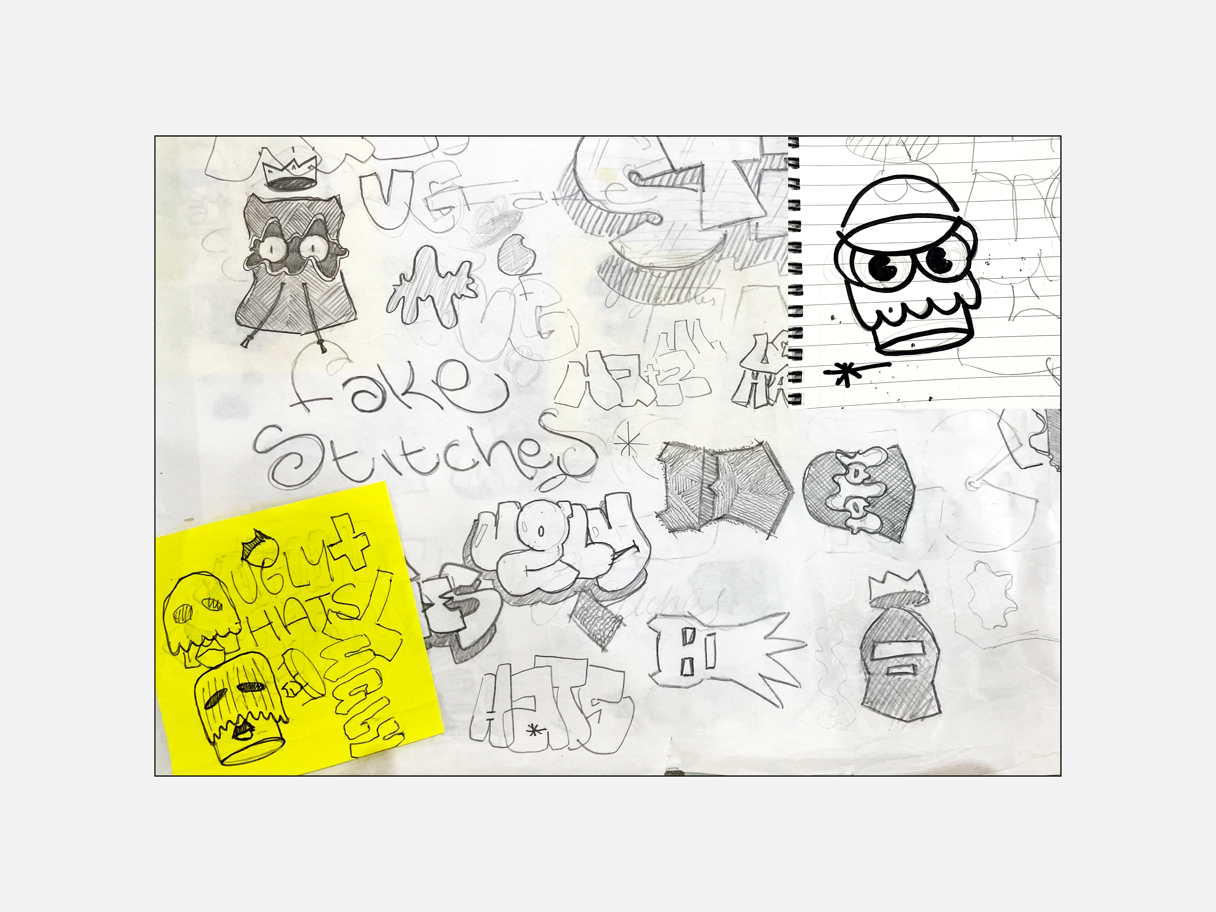
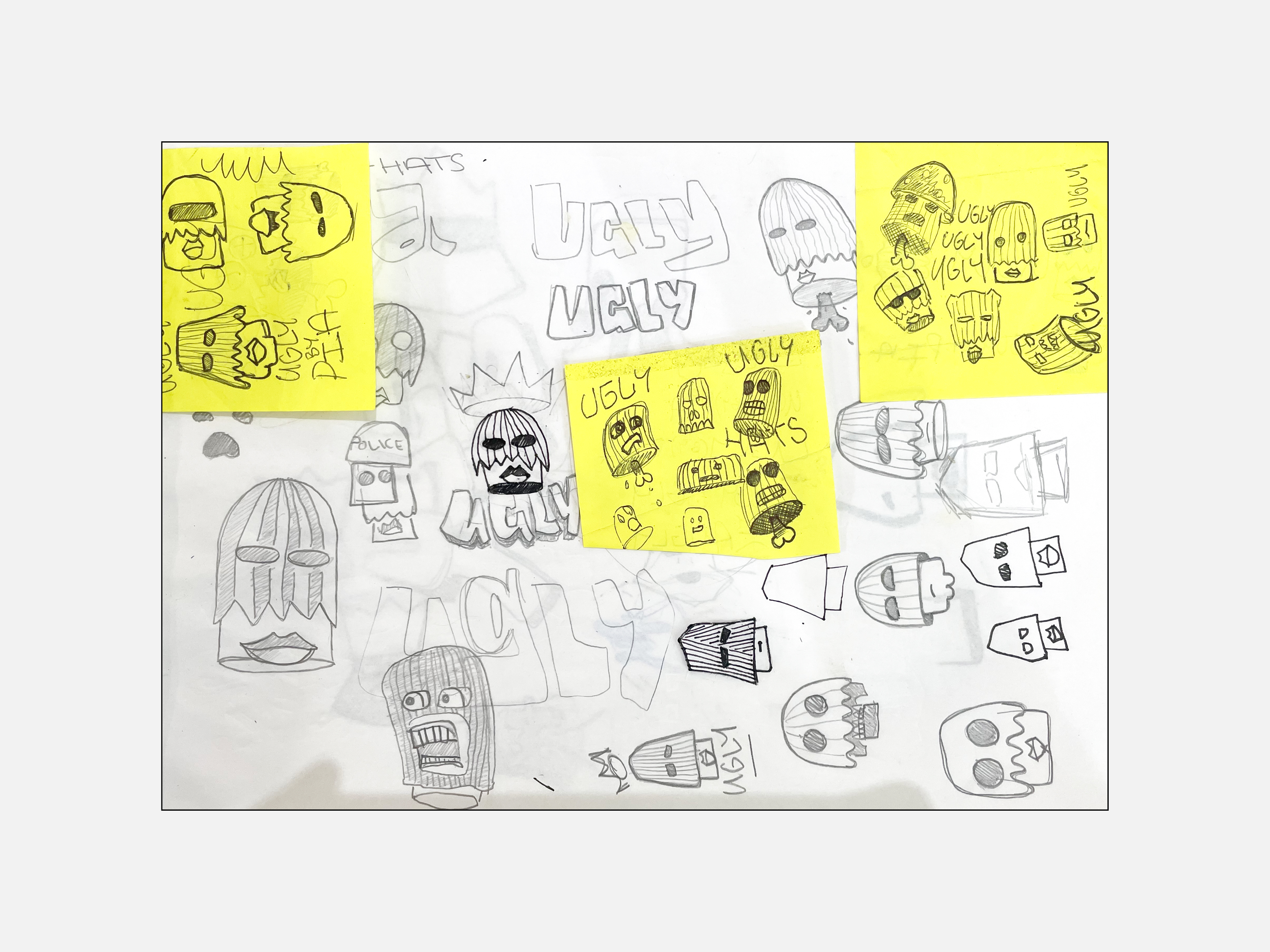
Conceptual branding project for a speculative independent crochet clothing brand aimed at young festival-goers and party people. The brand emodies a rebellious, anti-fashion spirit, while the products themselves celebrate bold colours, striking forms, and imperfection.
︎︎︎ Software used: Illustrator.
︎︎︎ Image Treatment: Images taken by me.
︎︎︎ Software used: Illustrator.
︎︎︎ Image Treatment: Images taken by me.
Freelance Project
Branding / Logo Design
Danse Fraîche - DJ I Don’t Mind
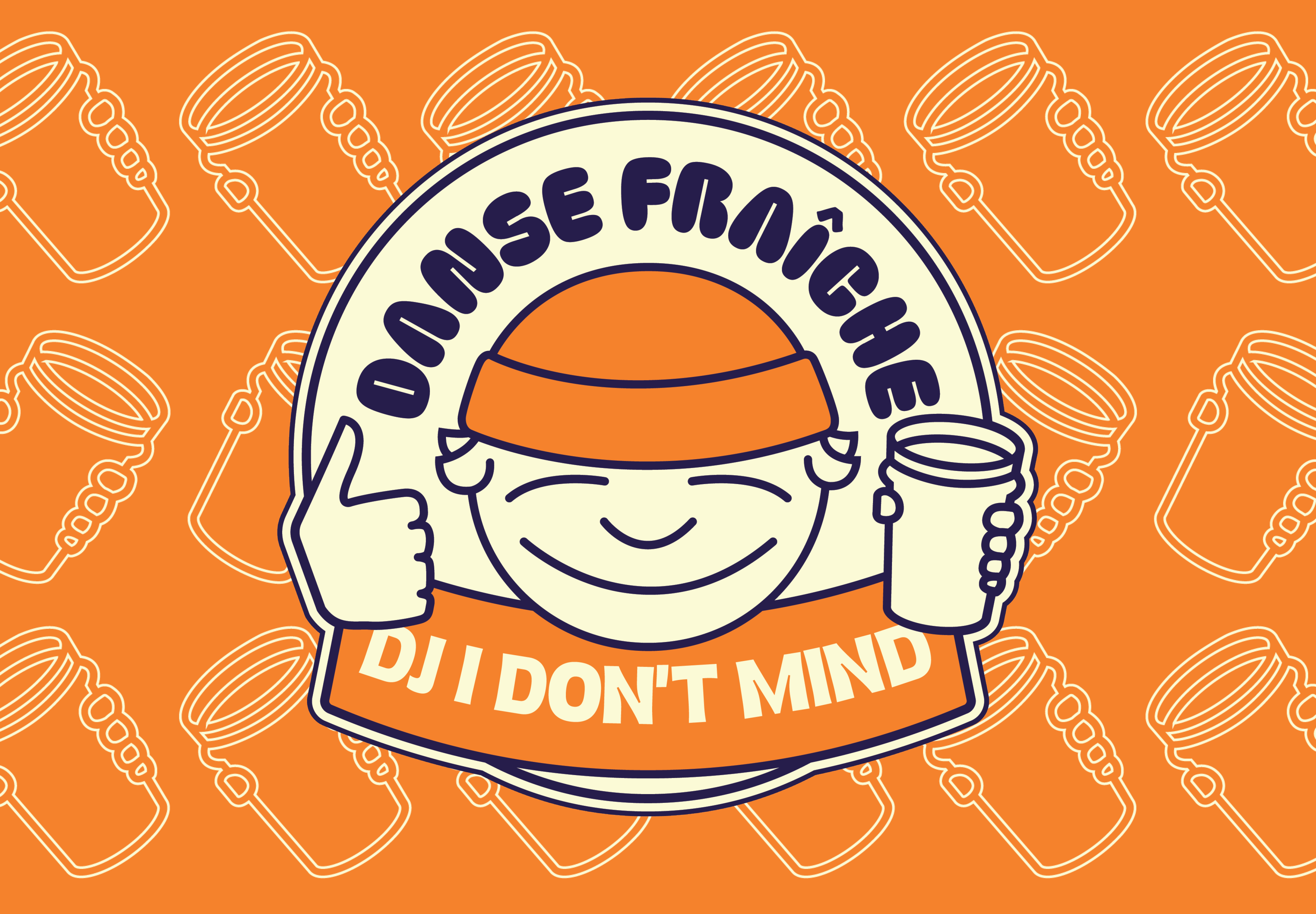

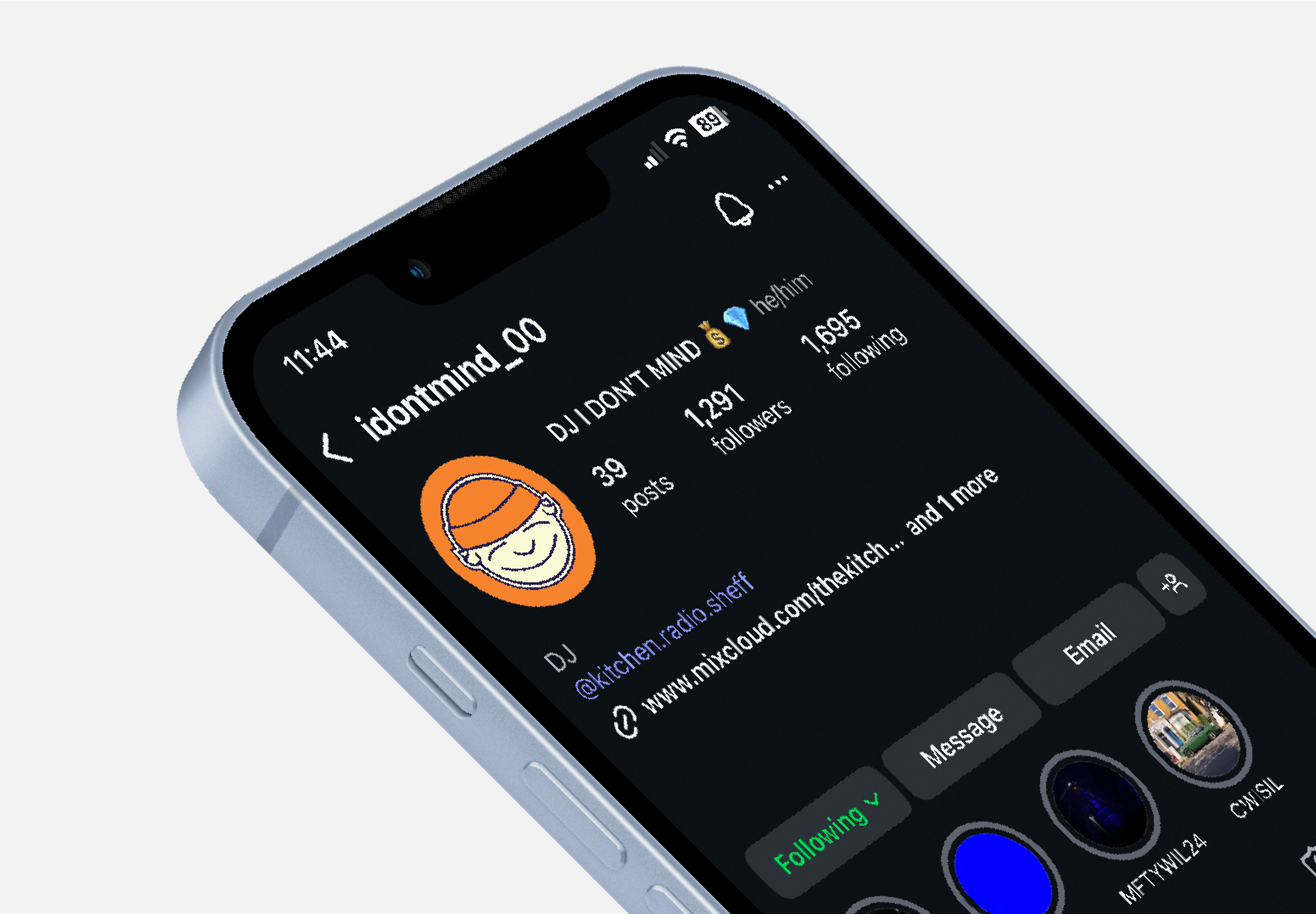
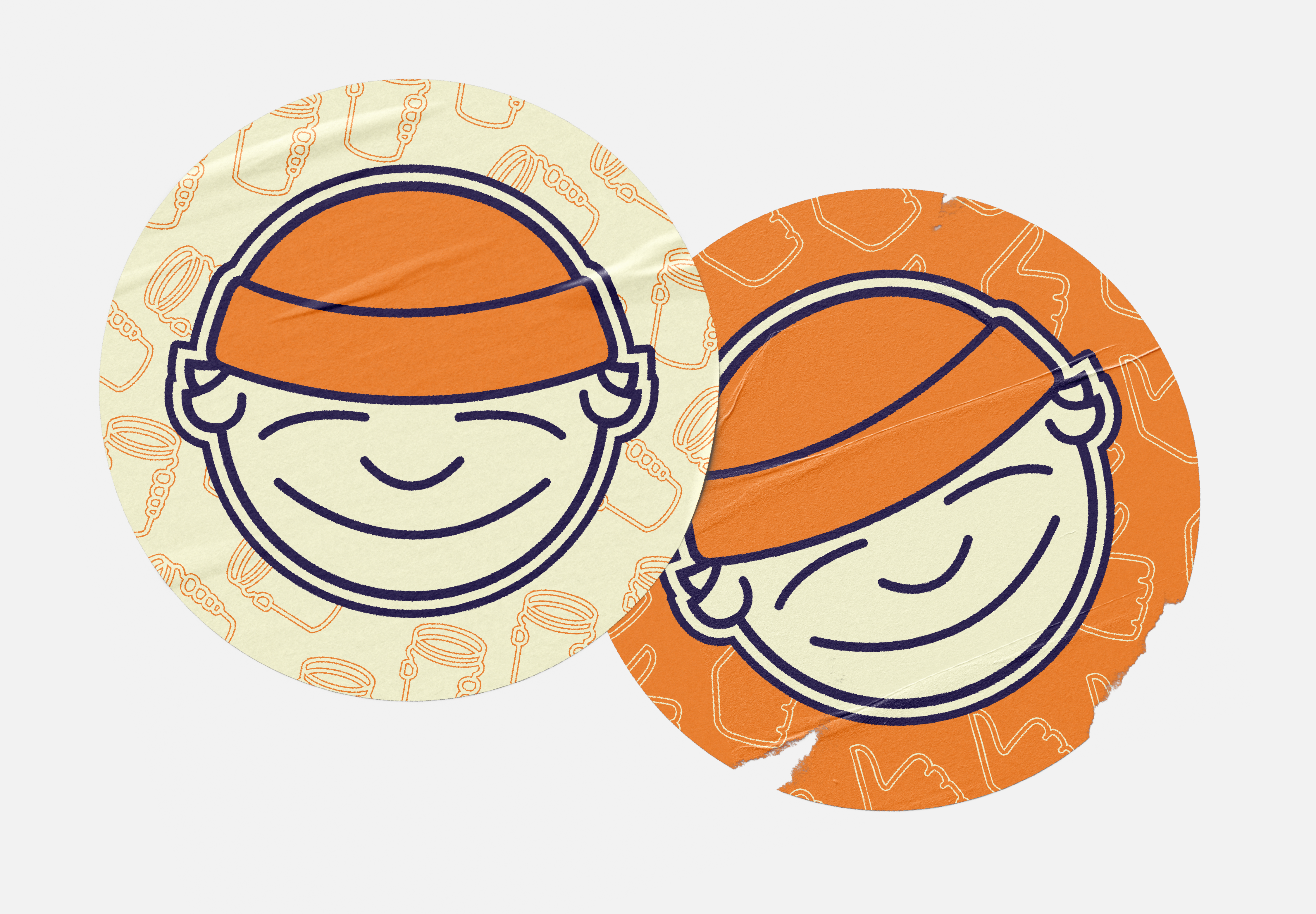
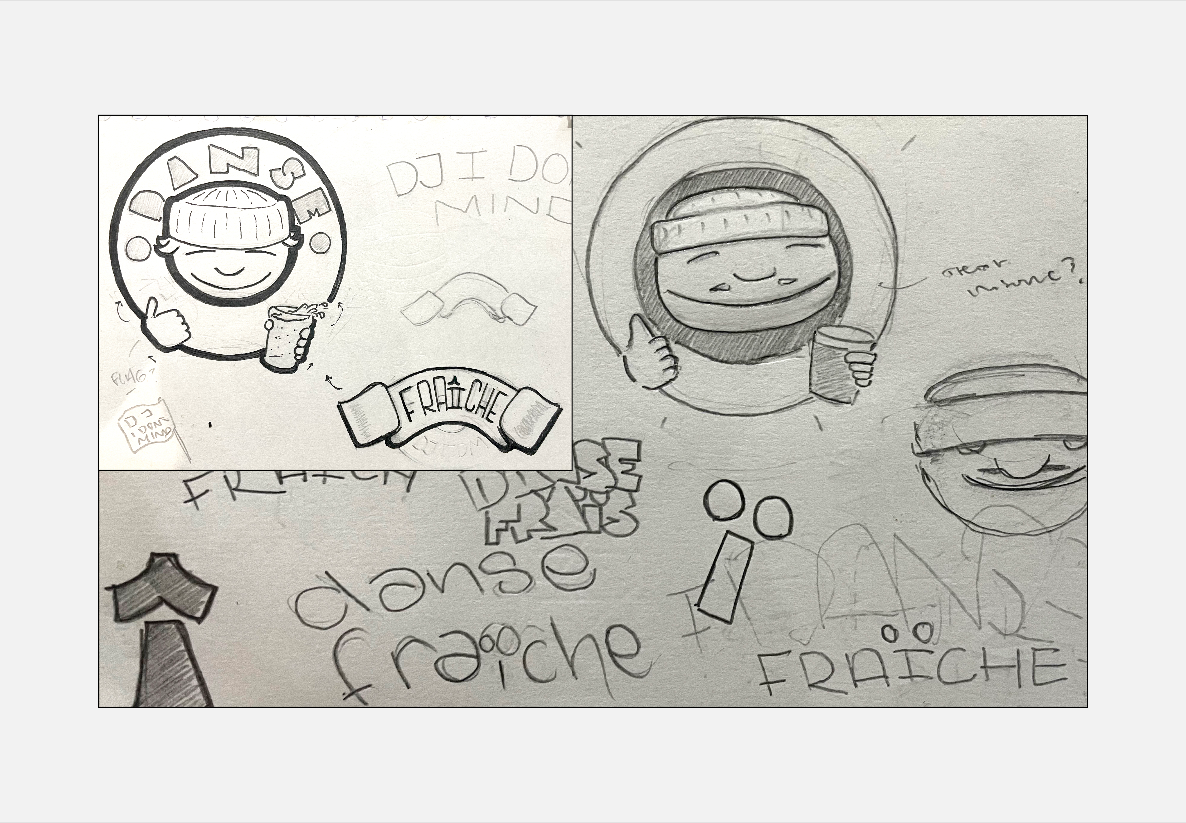
Logo package designed for a Sheffield-based radio show, hosted by a local DJ.
It was created for use across his social media platforms and to promote his radio show. It was designed to expand into a full brand identity sometime in the future.
At its core, the logo features a caricature of the client, inspired by his old Instagram profile picture of PaRappa the Rapper (the ’90s rhythm video game character).
︎︎︎ Software used: Illustrator.
At its core, the logo features a caricature of the client, inspired by his old Instagram profile picture of PaRappa the Rapper (the ’90s rhythm video game character).
︎︎︎ Software used: Illustrator.
Freelance Project
Branding / Logo Design
Therapeutic Coaching Consultancy
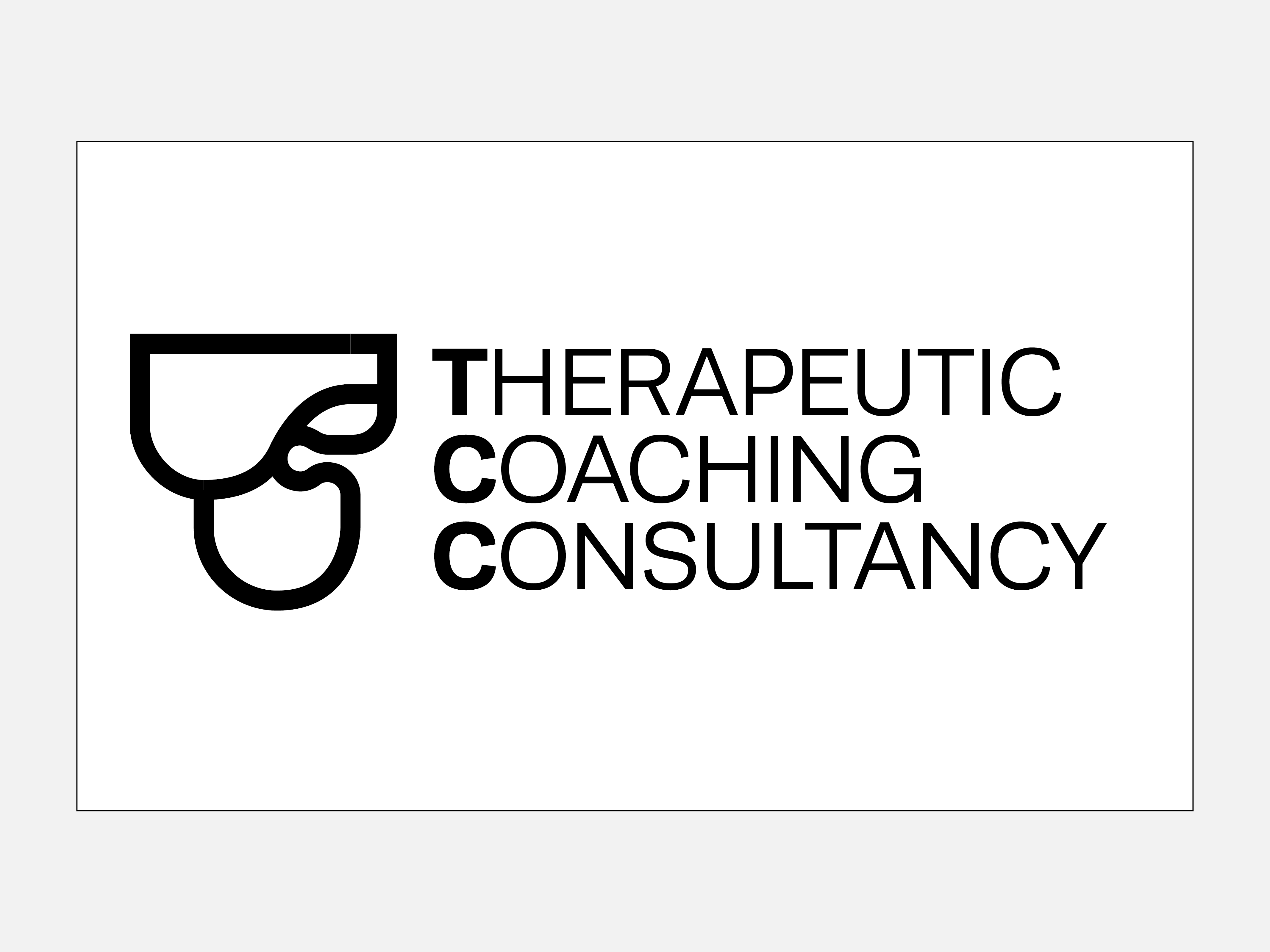
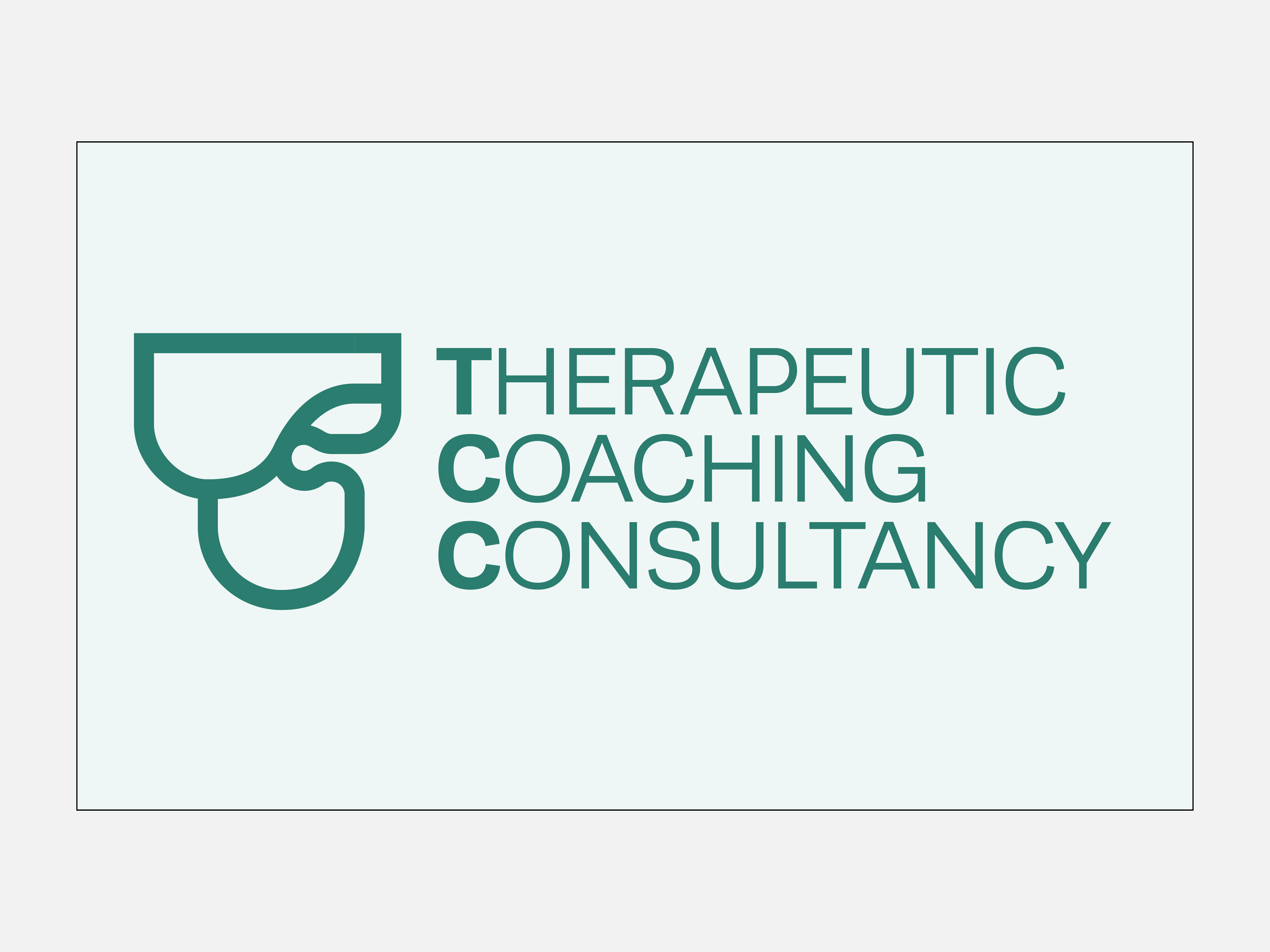
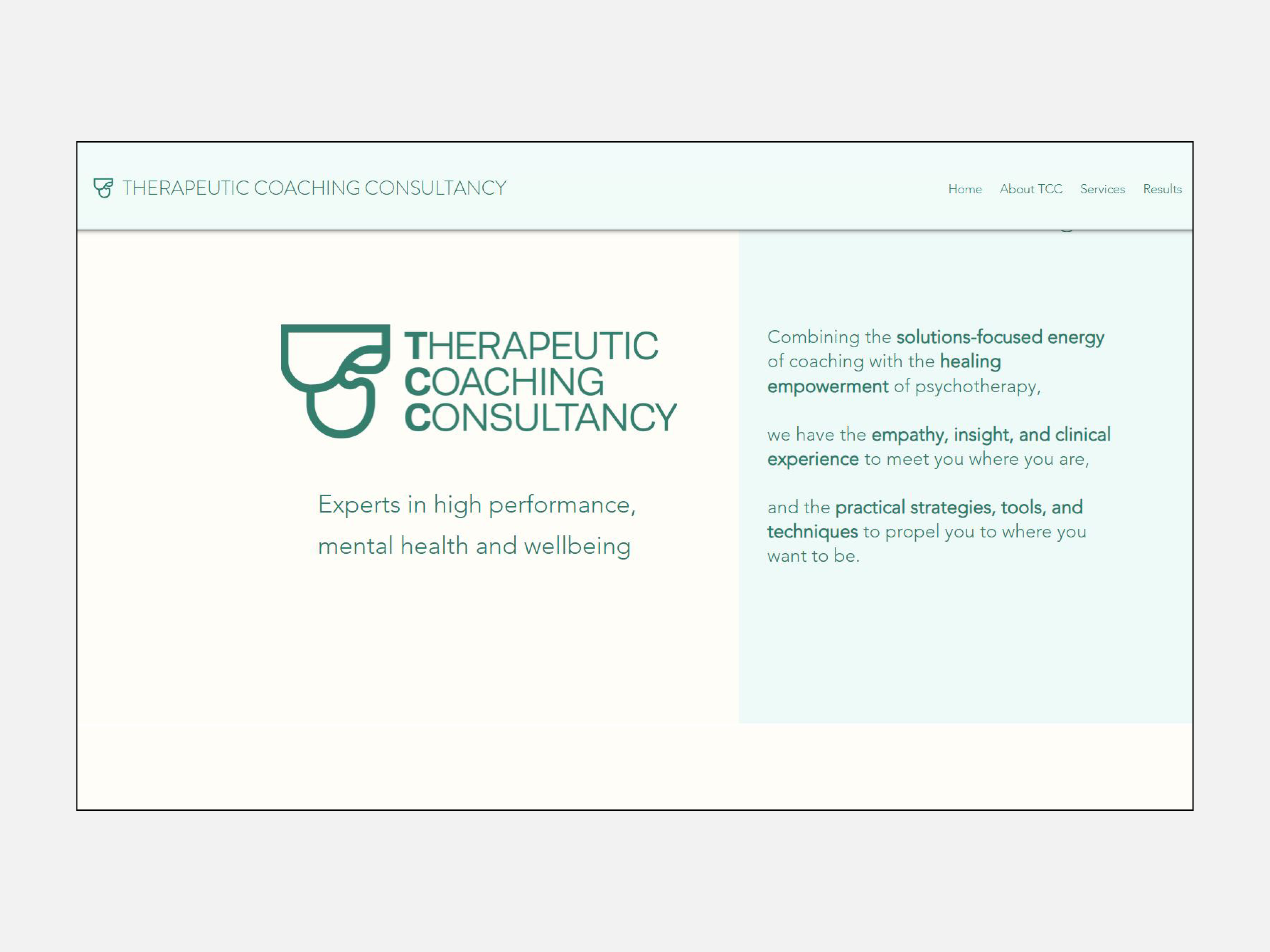
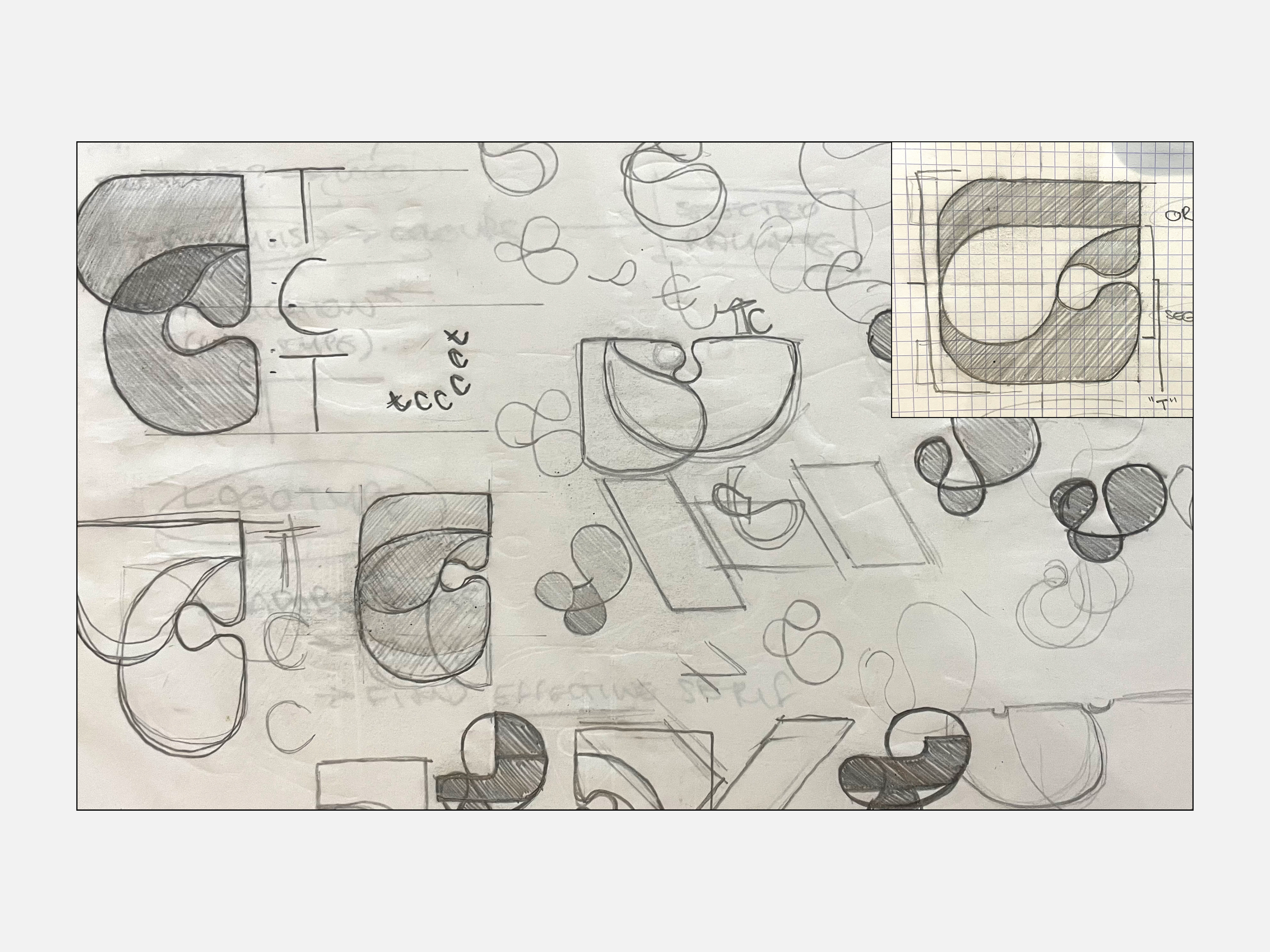
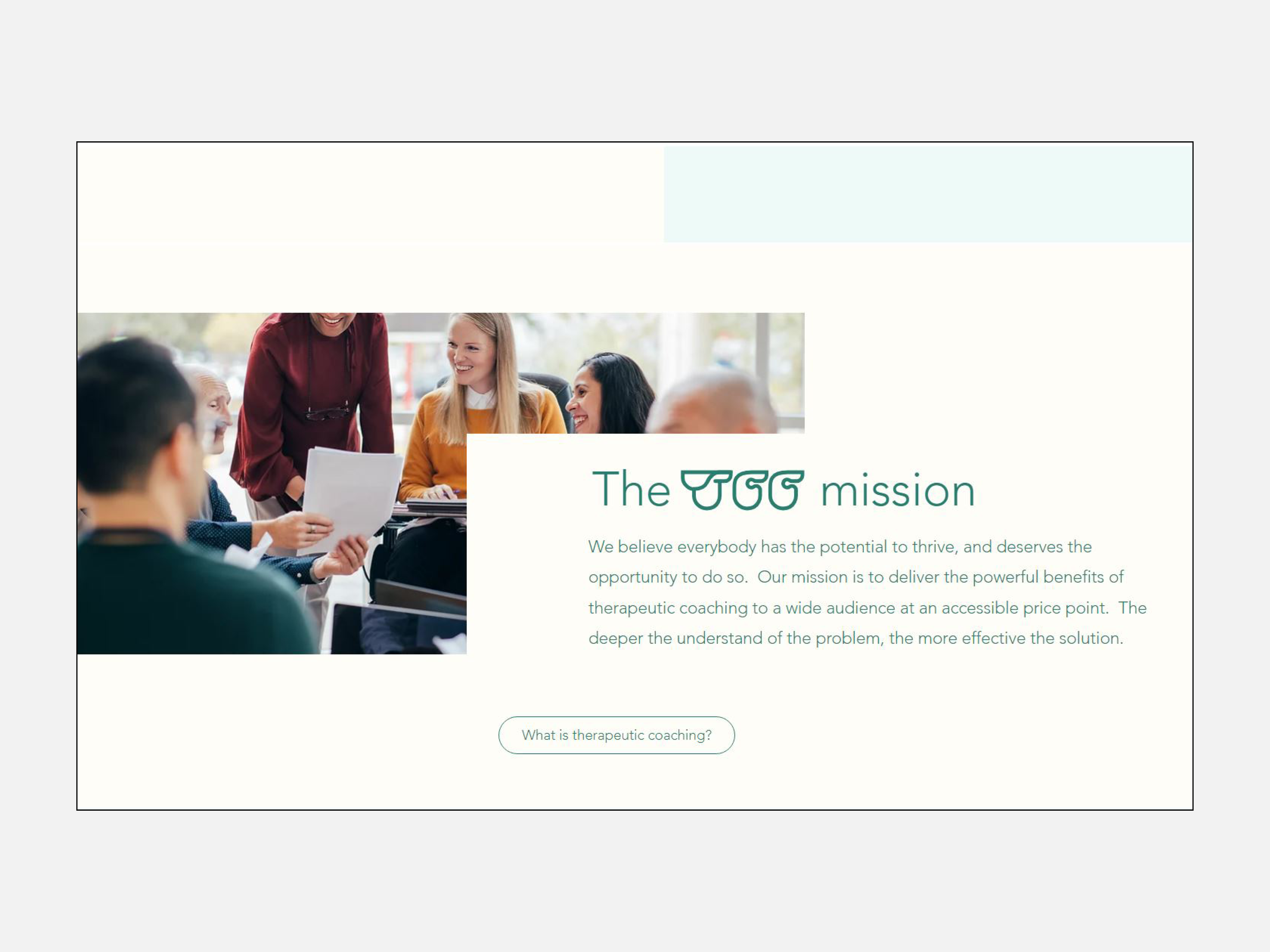
TCC are a startup company providing therapeutic
coaching within the corporate sector. My core responsibility was to design a logo, unique to their competitors, that communicates the core company values. This involved thorough research, sketching and regular meetings with the client to actualise their vision. This project required me to work to the strict guidelines of the client and with a quick turnaround due to the upcoming startup conference.
︎︎︎ Software used: Illustrator.
︎︎︎ Software used: Illustrator.
Univesity Project
Product Design / Campaign
Social Pressure Beer Mats
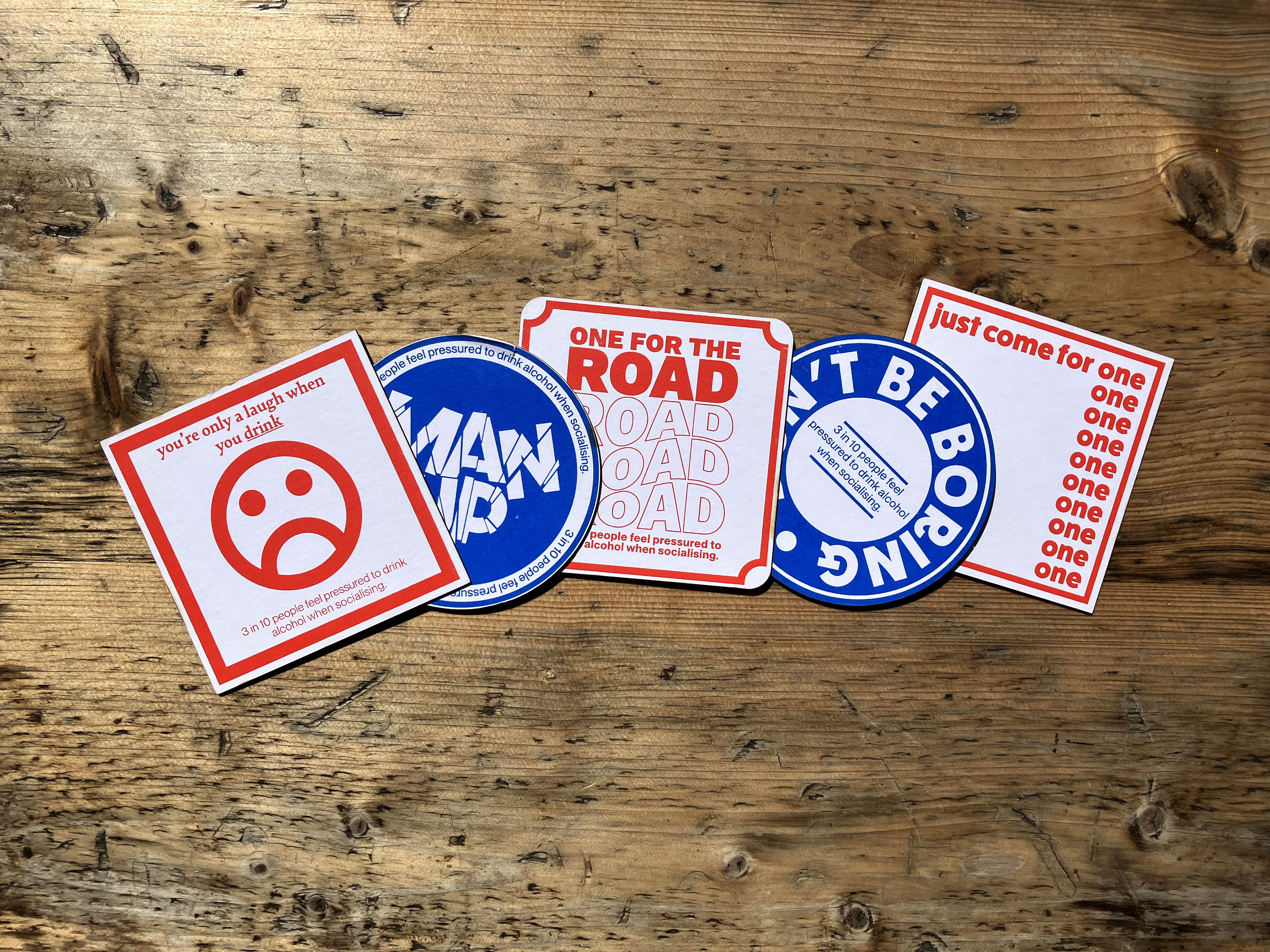
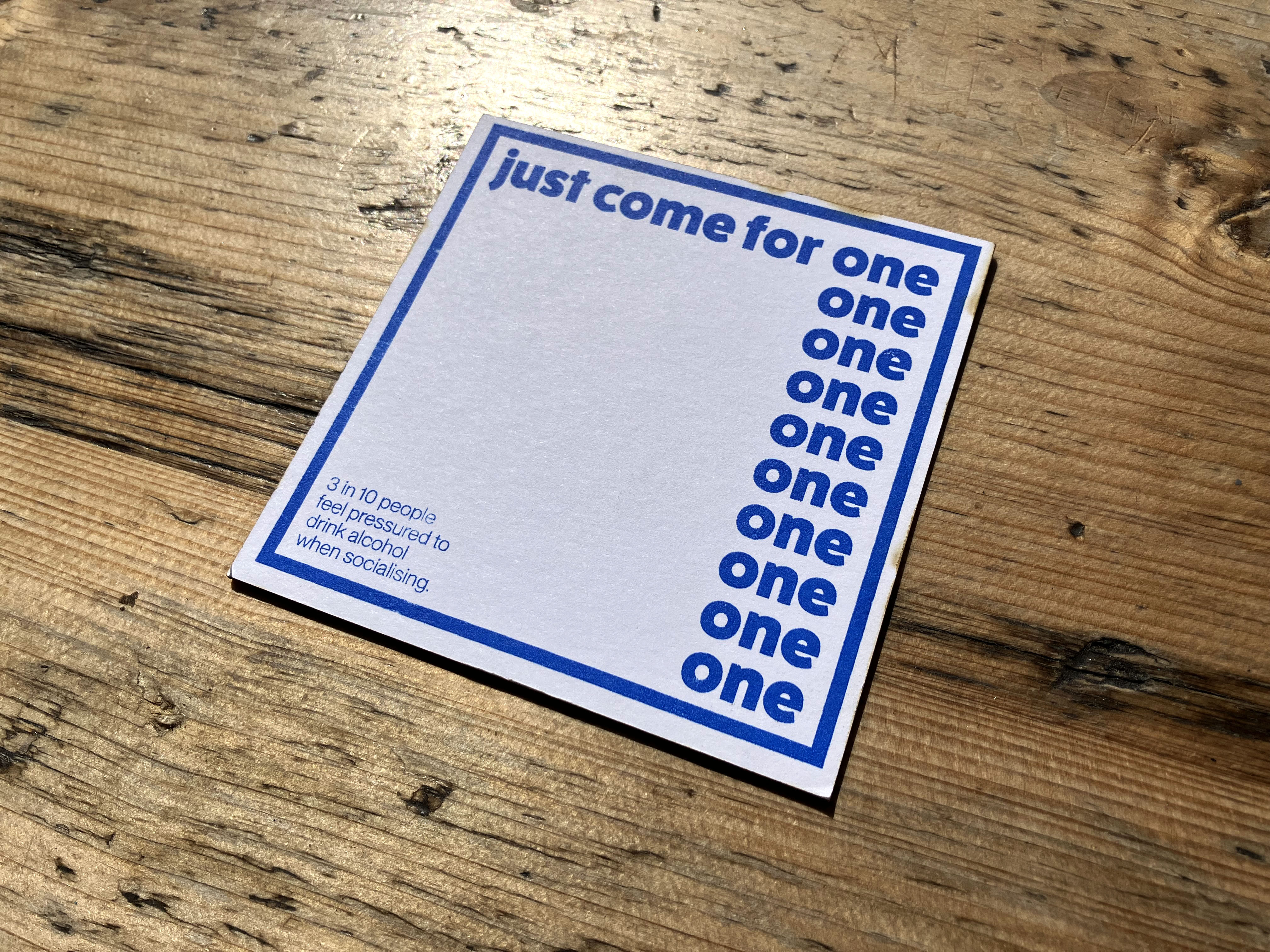
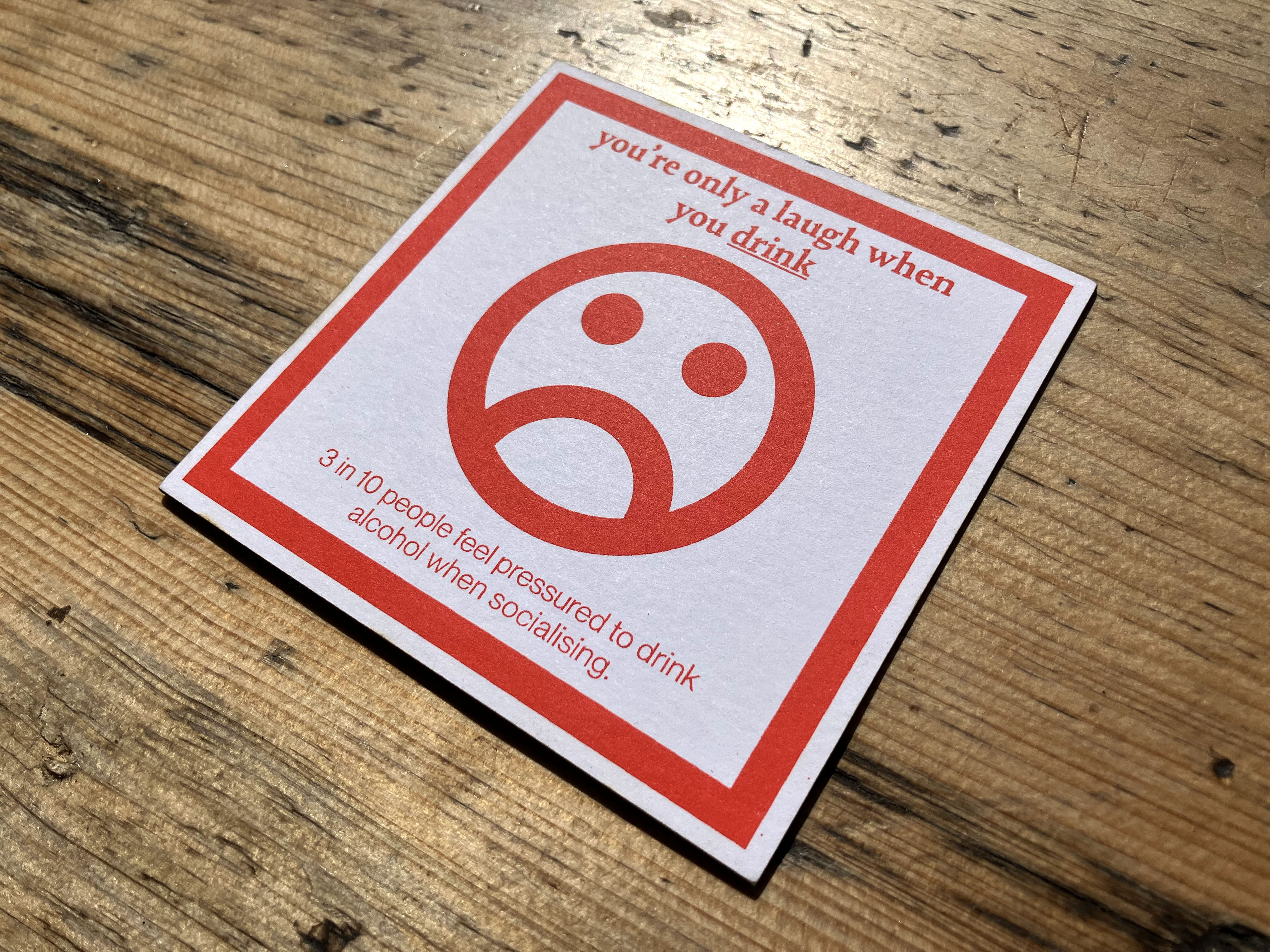
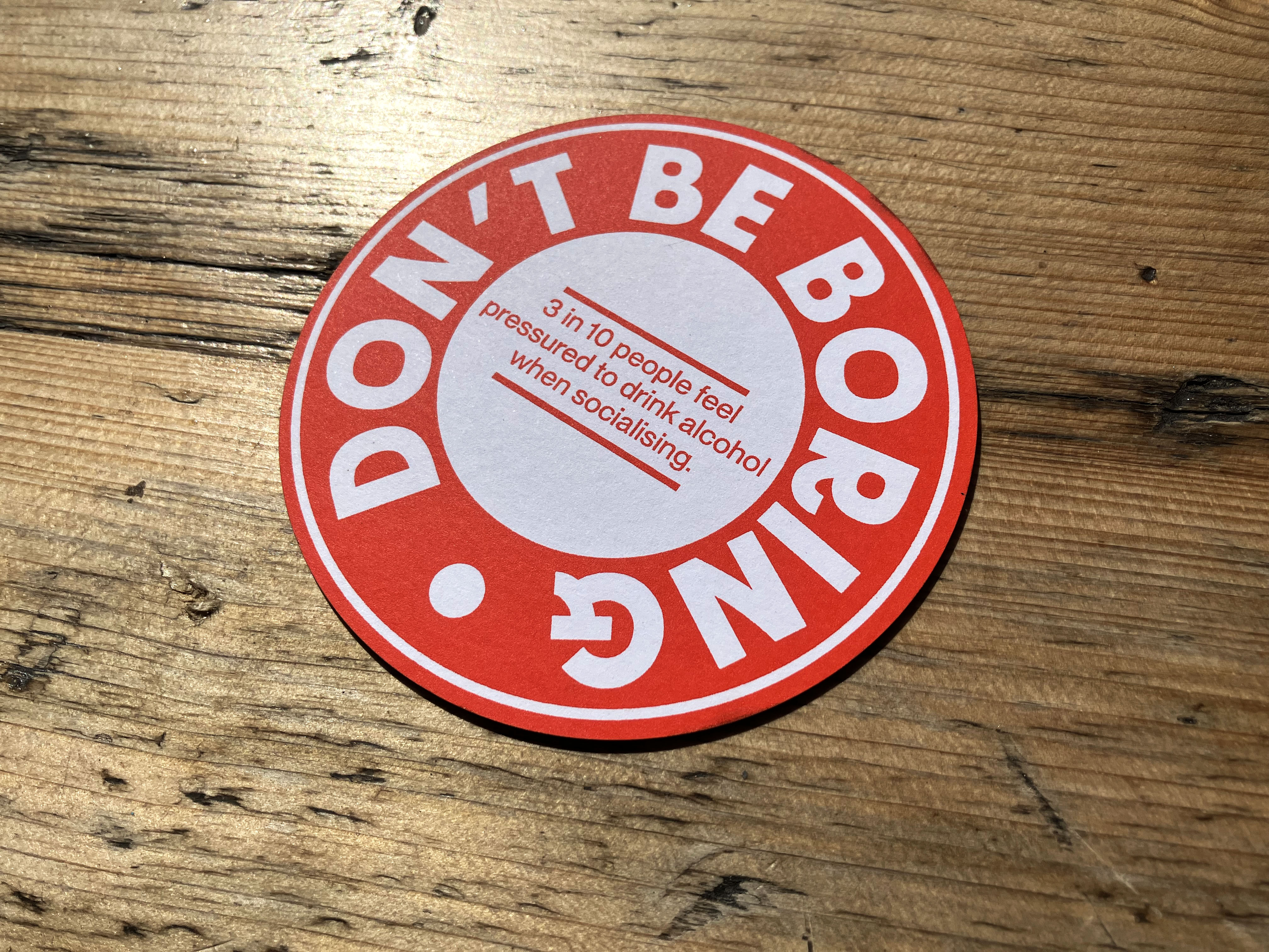
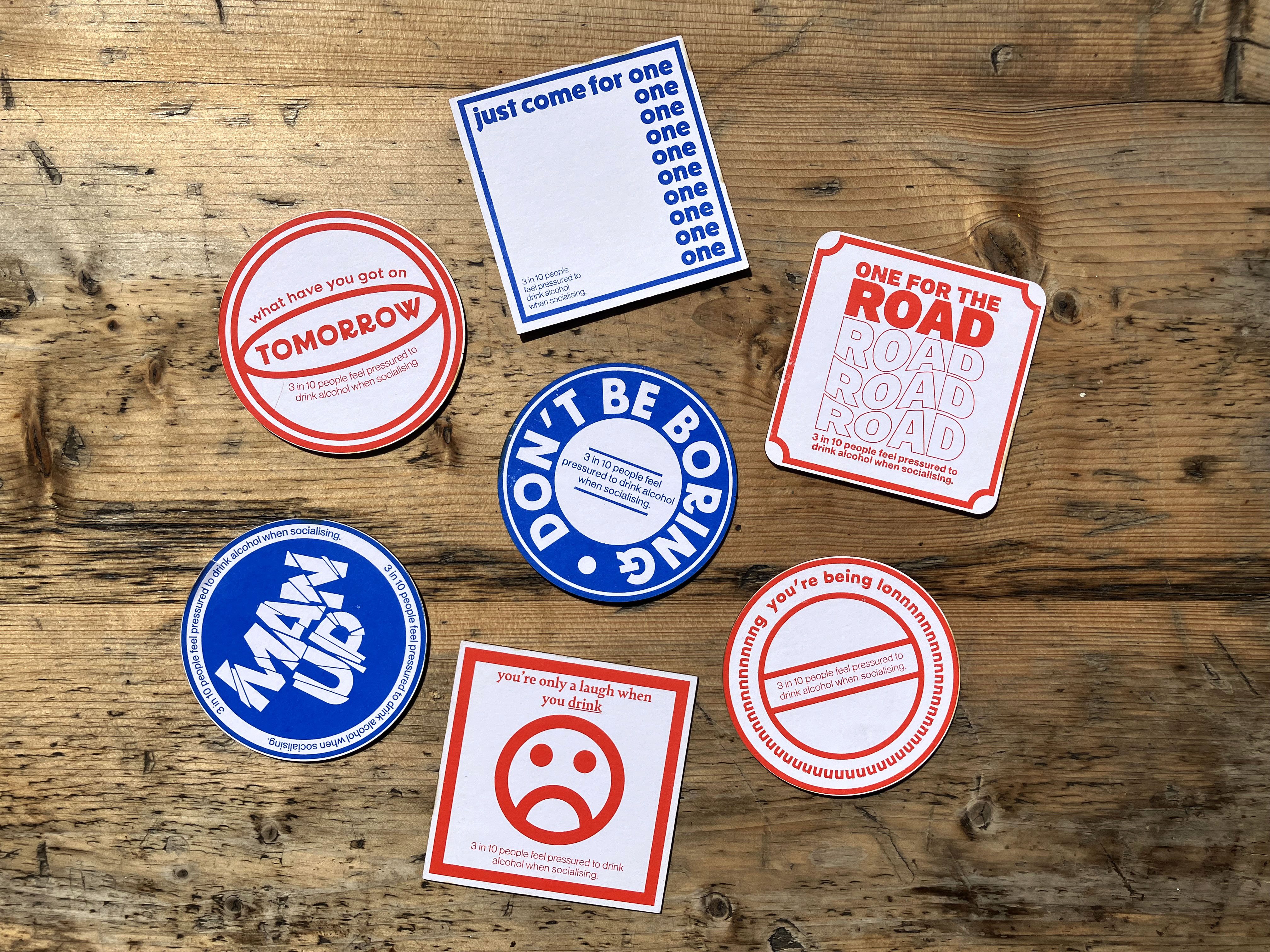
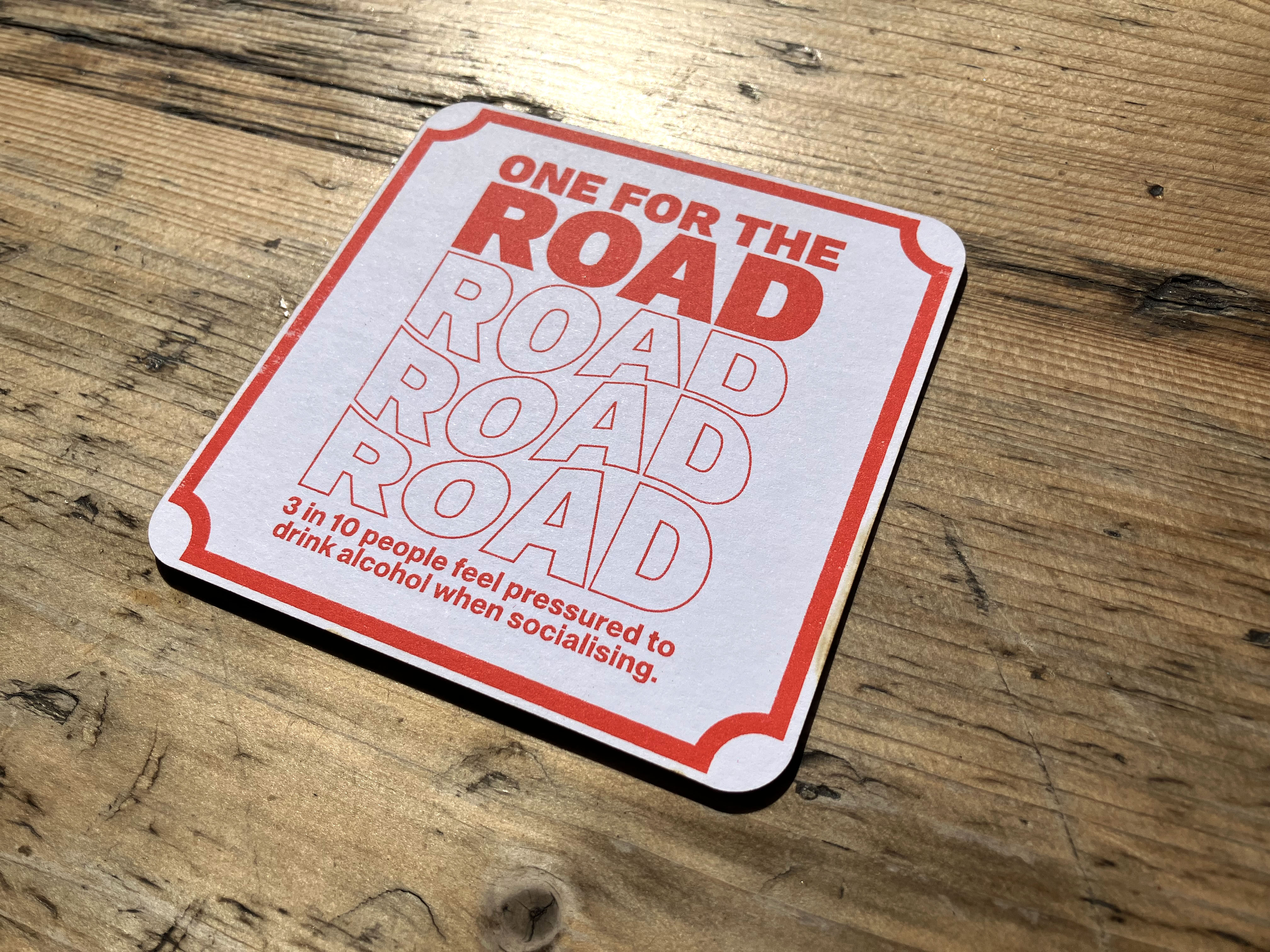
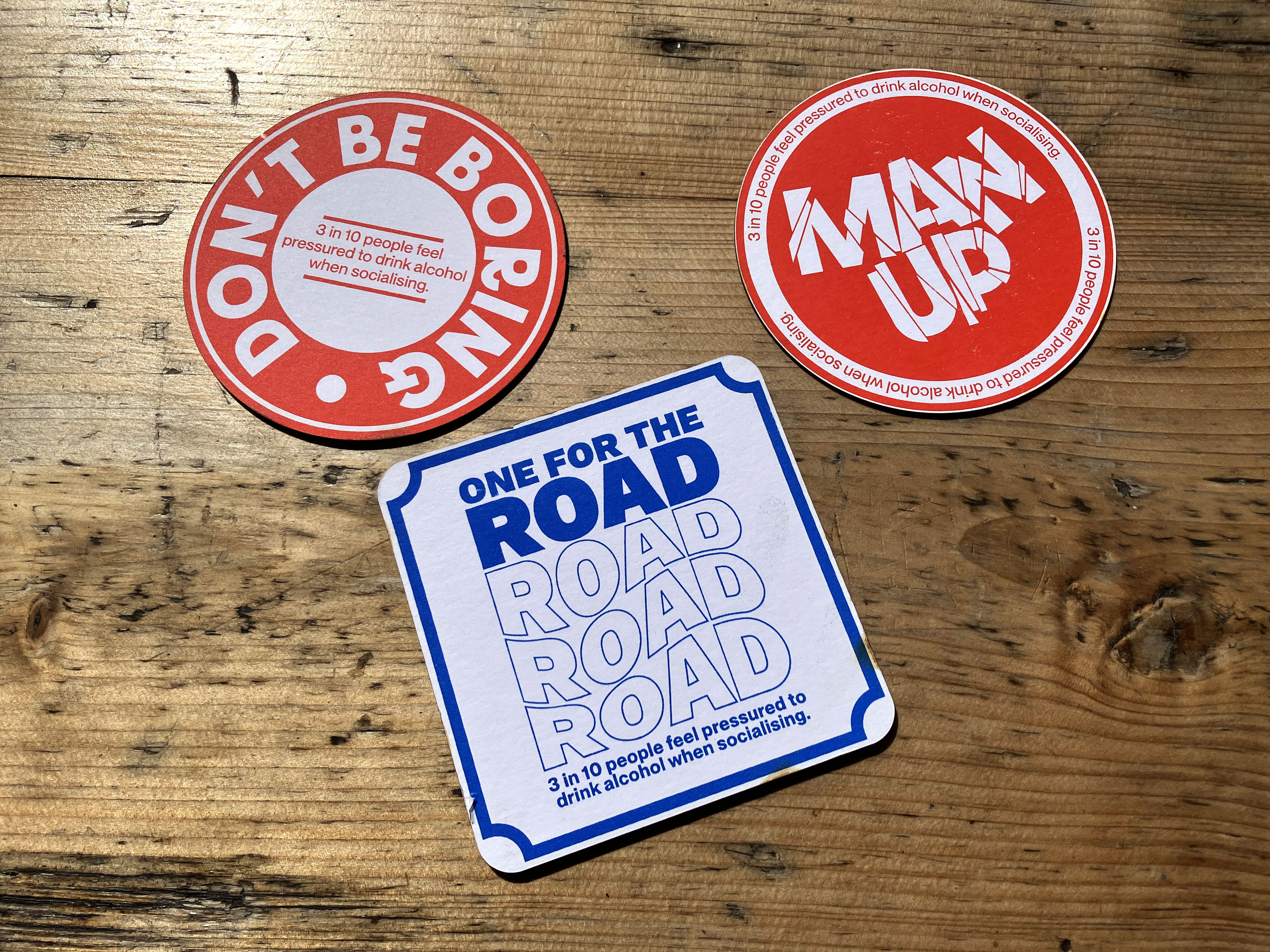
Drinking is so normalised in British society that almost all social events are fueled by alcohol. This can make it hard to turn a drink down without having a reason for doing so.
I designed and made these beer mats, aiming to address and challenge the language we often use to pressure our friends and family into drinking.
︎︎︎ Design: All designs were created in Illustrator using original sketches.
︎︎︎ Making Process: Designs were screen printed and cut using a laser cutter.
︎︎︎ Materials: Made from sustainable mount board.
Freelance Project
Branding / Logo Design
KSL Consulting
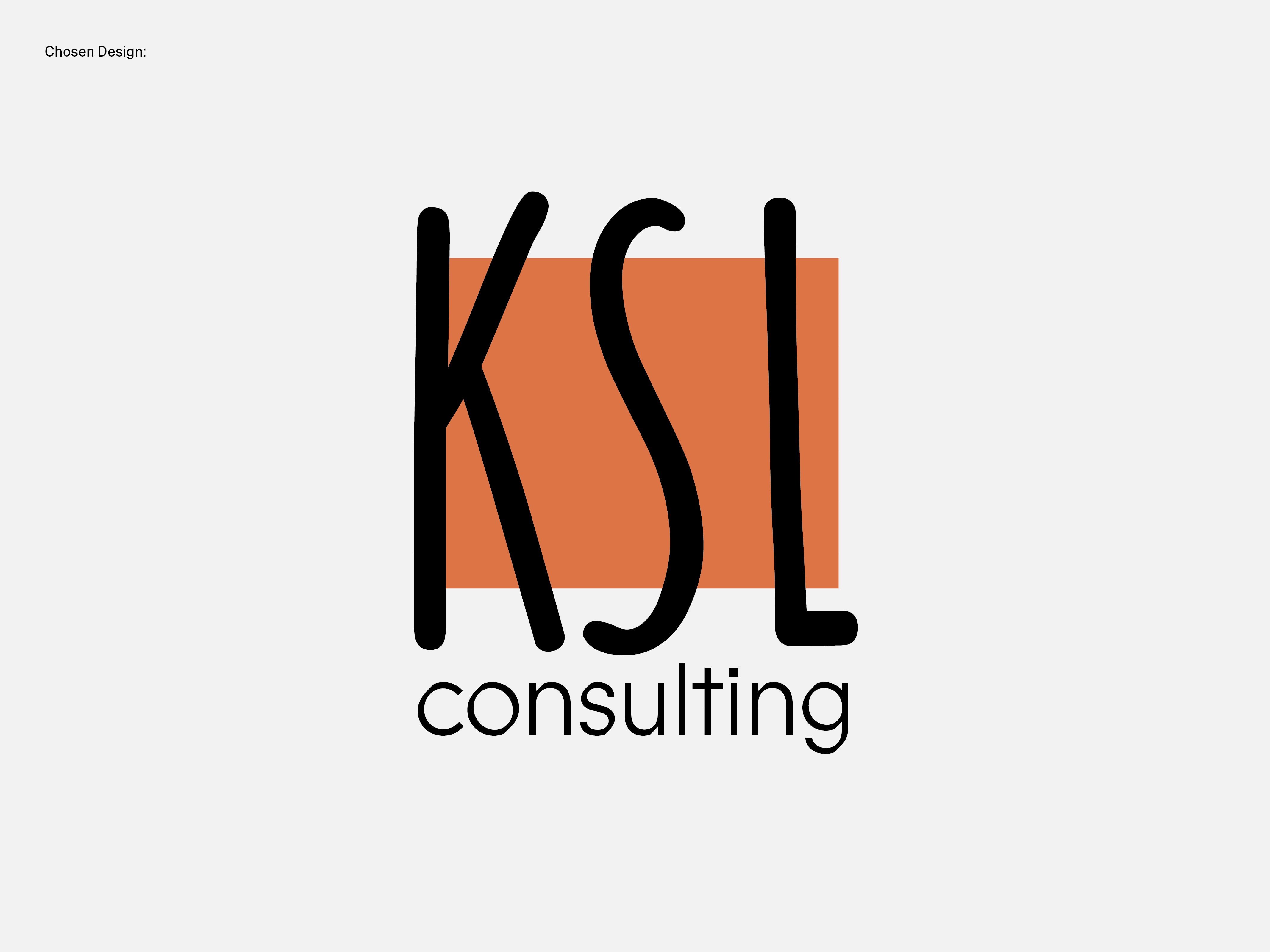
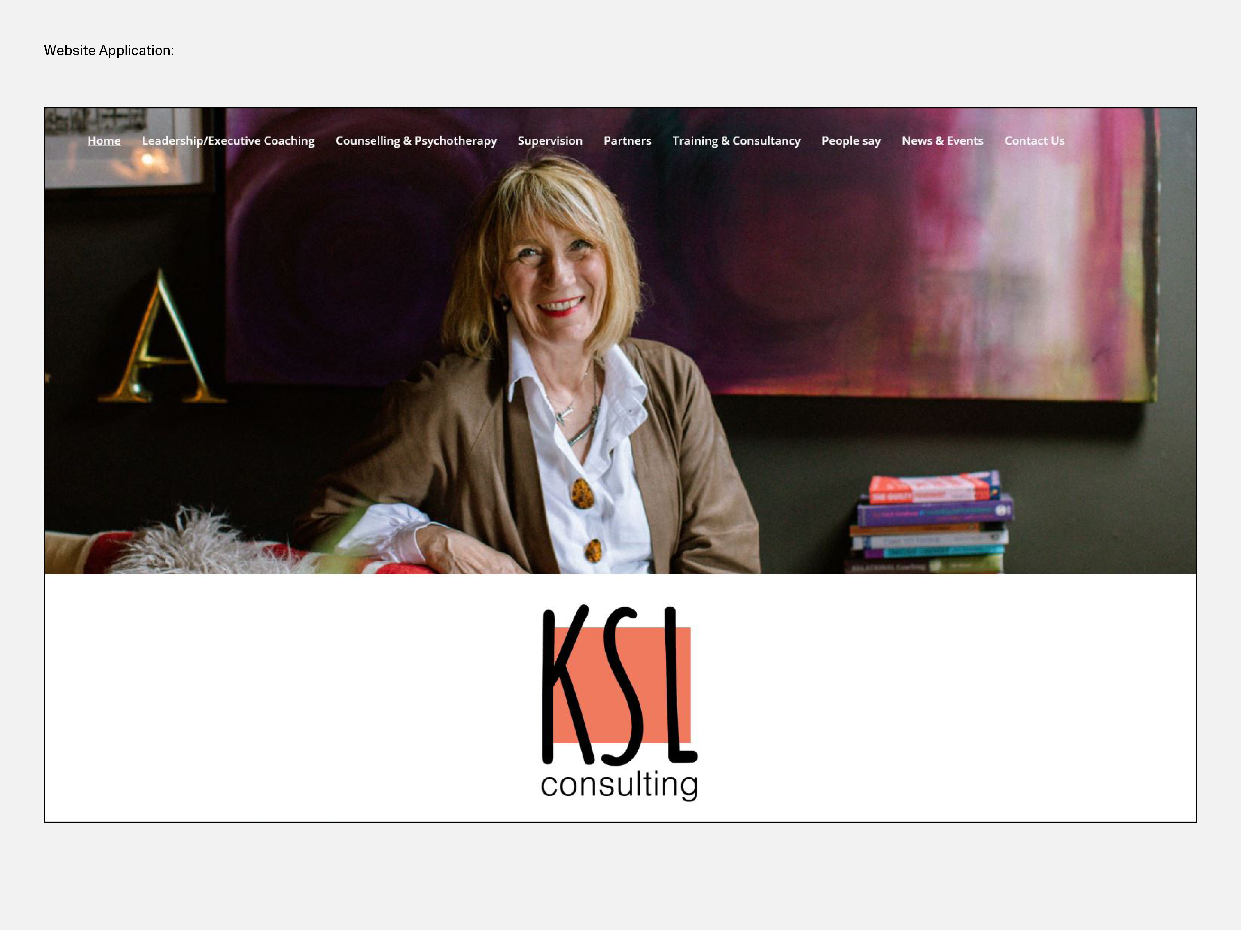
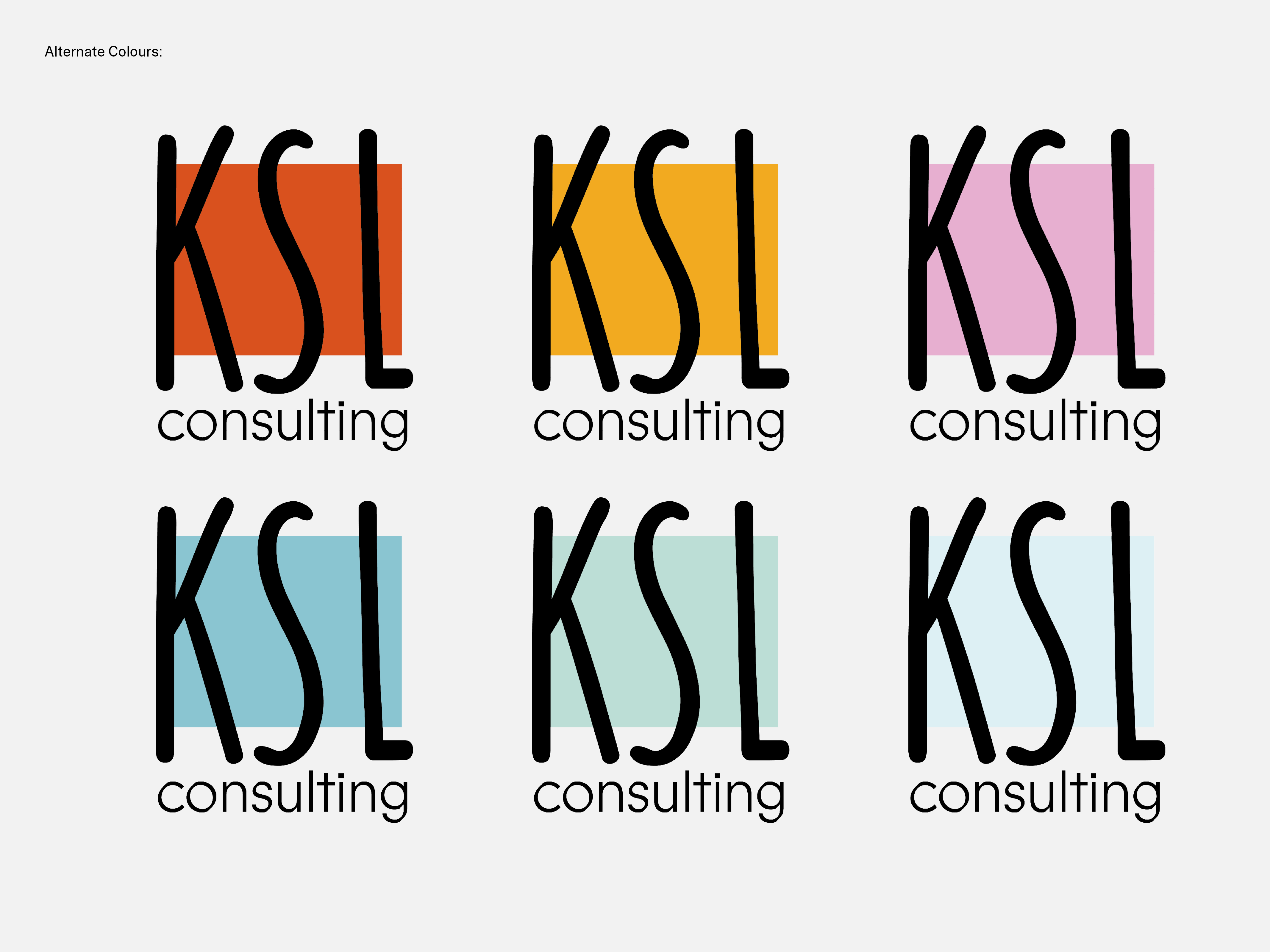
For this project, I was tasked by my client to redefine their psychotherapy and professional coaching practice by designing them a new logo to compete with other contemporary practices. Using a combination of colours and typography, the outcome aimed to connect with their psychotherapy and coaching client base.
︎︎︎ Software used: Illustrator.
Univesity Project
Editorial Design
SAAB Book
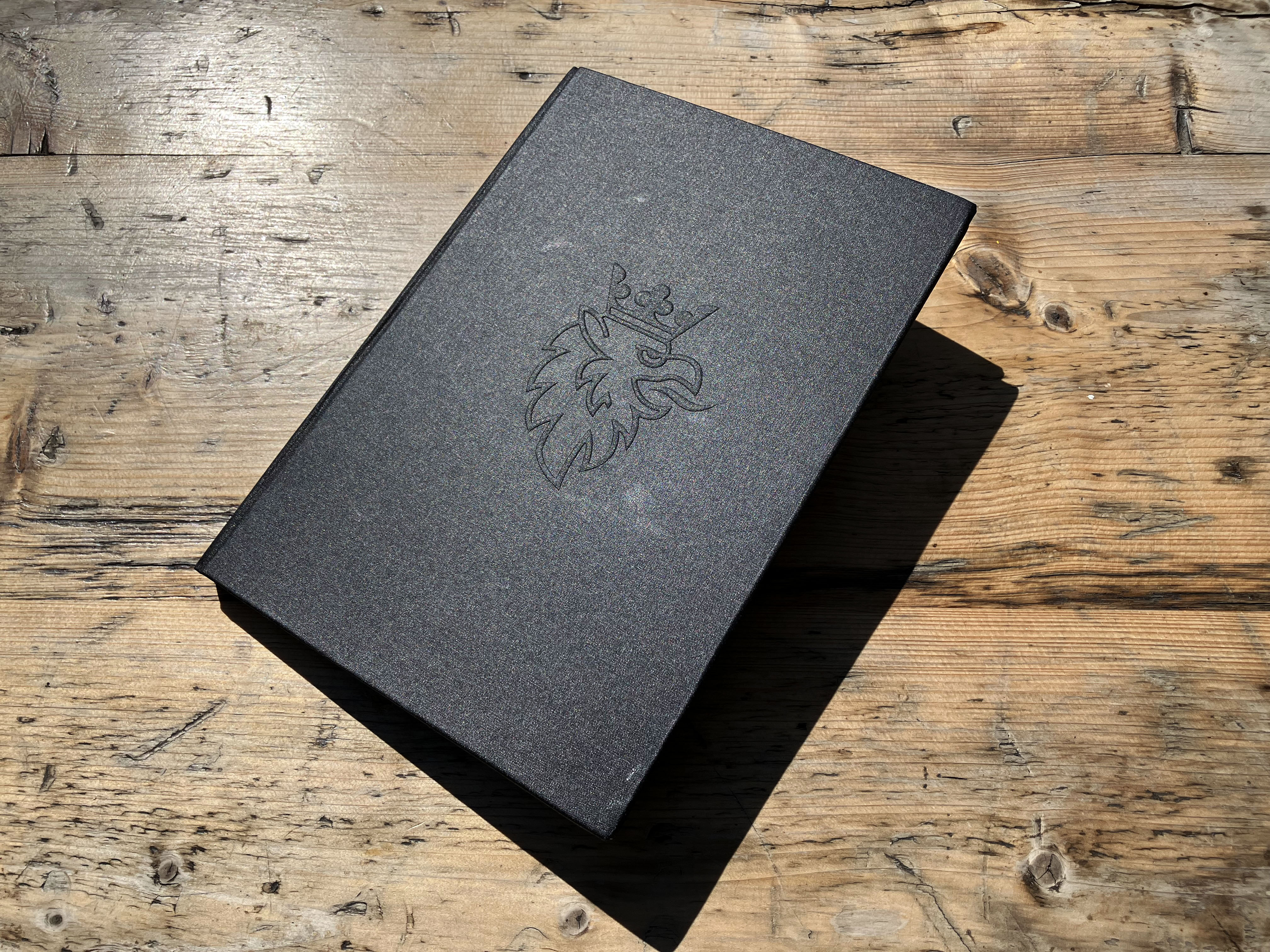
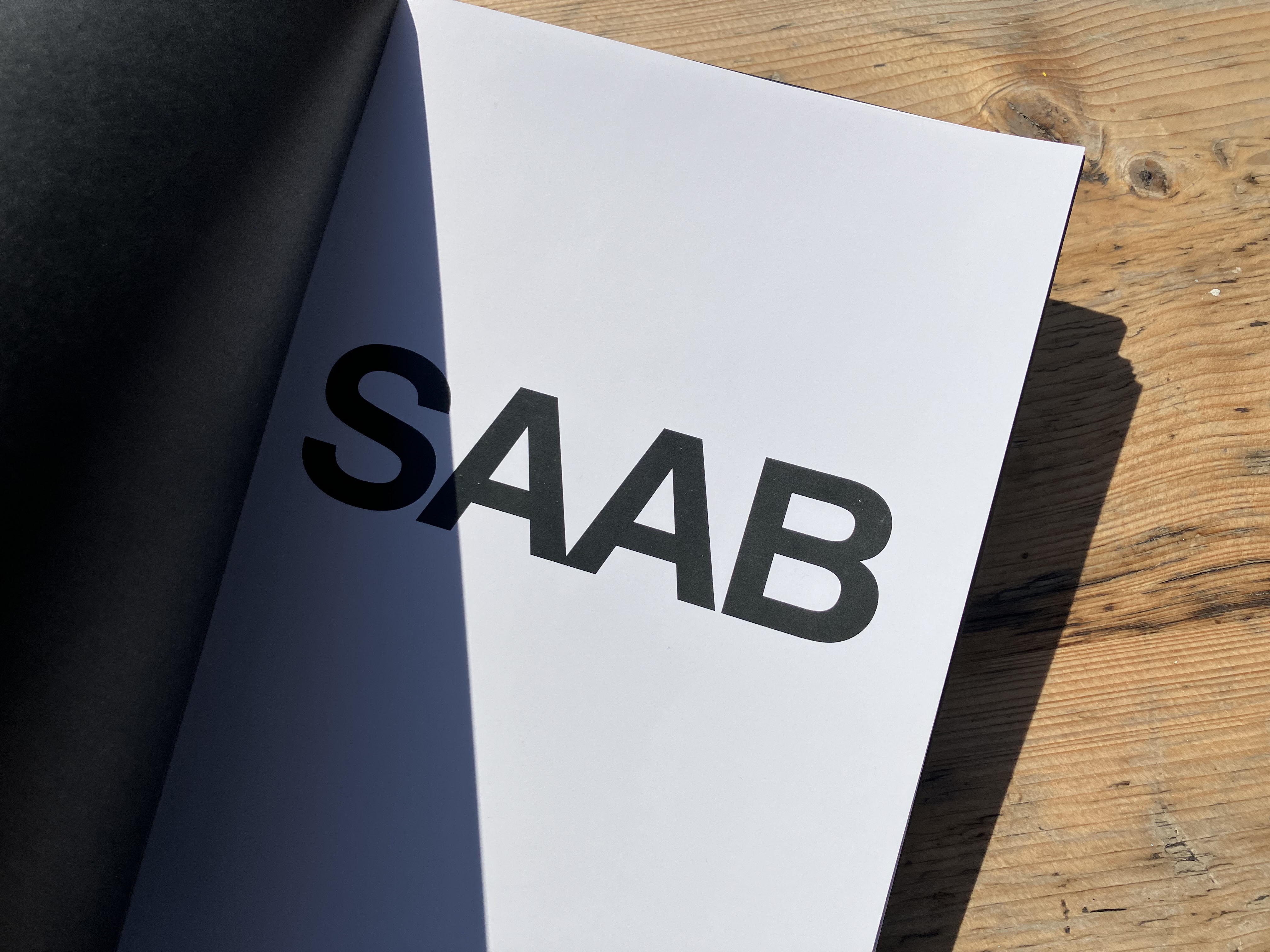
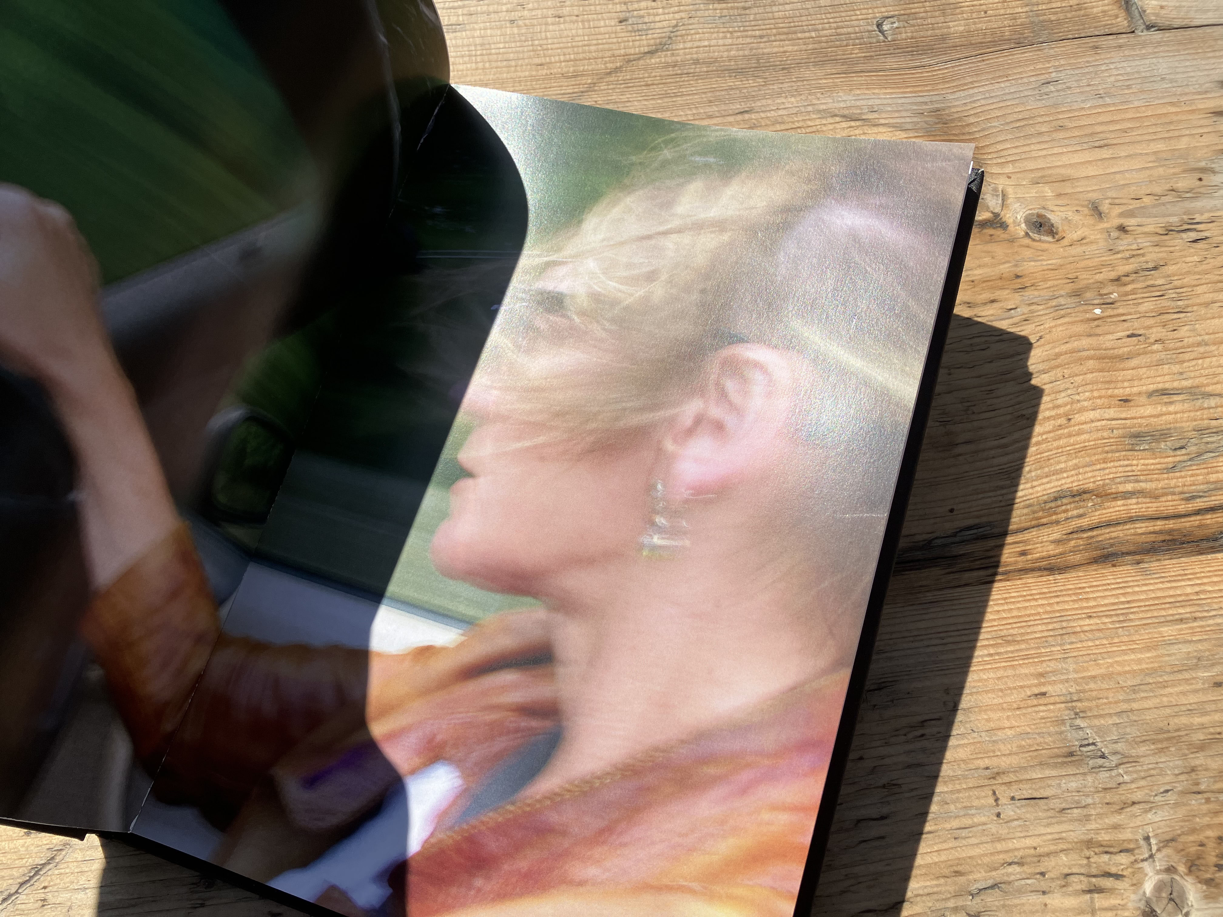
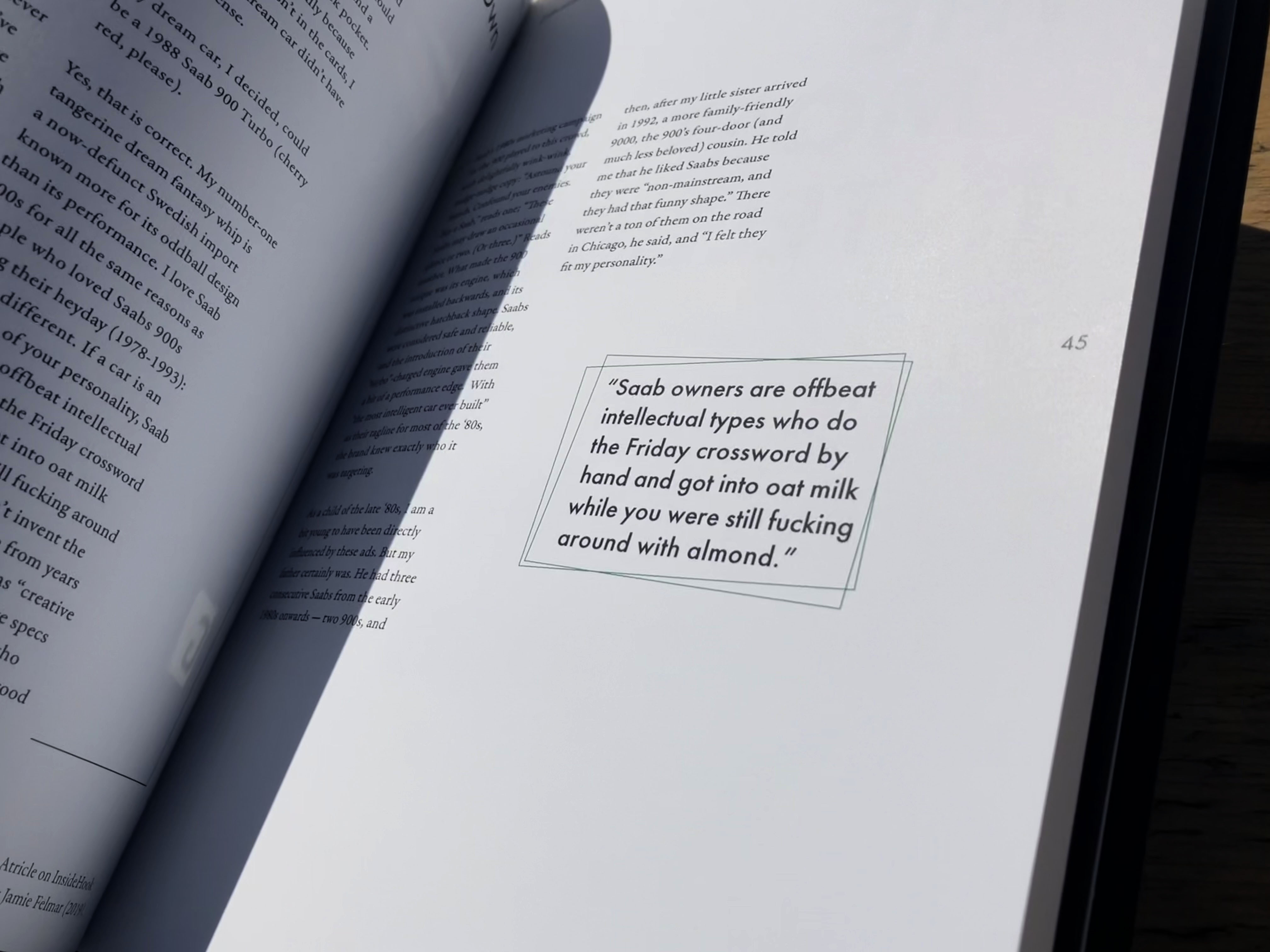
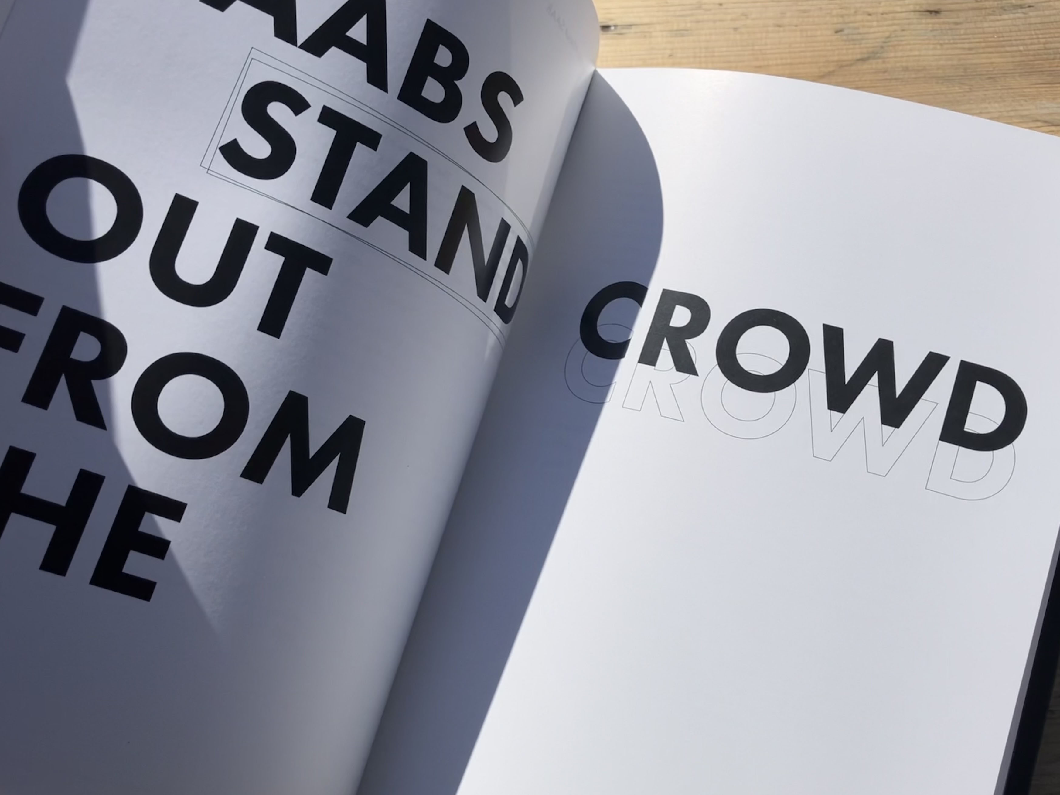
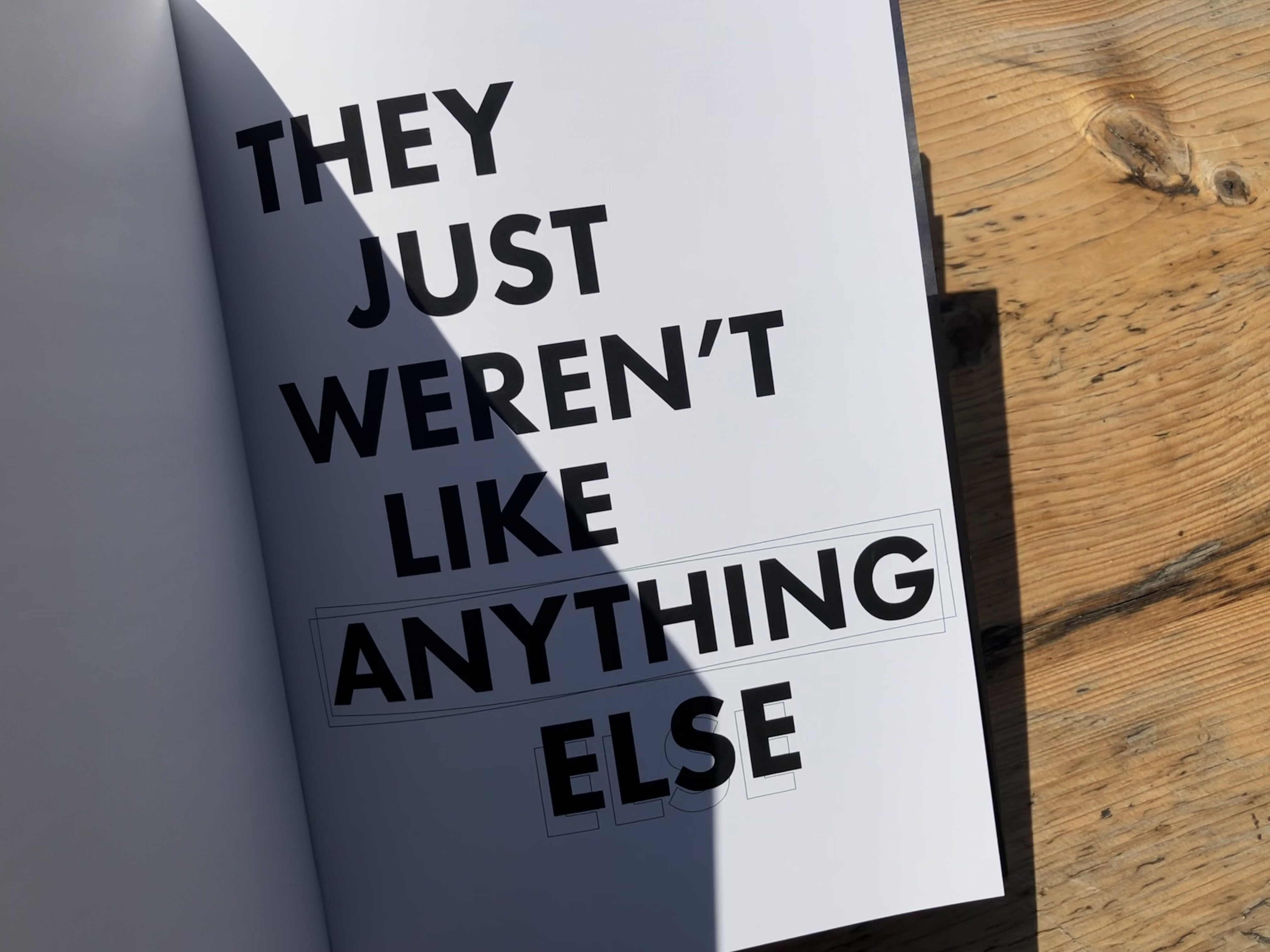
For my Level 2 major project, I designed, made, and bound a substantial publication. My book explores the (now defunct) car manufacturer - Saab, my personal connection to the car, its involvement in my family life and childhood, as well as why they are so loved and why it’s so hard to say goodbye.
︎︎︎ Materials: Hand-made Book cover, embossed and wrapped in black fabric.
︎︎︎ Typeography: Futura PT, Garamond Premier Pro
︎︎︎ Binding: Perfect bound.
︎︎︎ Primary Content: Interviews with family, experts and SAAB enthusiasts.
︎︎︎ Image Treatment: Images used were taken by me.
︎︎︎ Materials: Hand-made Book cover, embossed and wrapped in black fabric.
︎︎︎ Typeography: Futura PT, Garamond Premier Pro
︎︎︎ Binding: Perfect bound.
︎︎︎ Primary Content: Interviews with family, experts and SAAB enthusiasts.
︎︎︎ Image Treatment: Images used were taken by me.
Freelance Project
Promotional Campaign / Poster Design
HECTIC
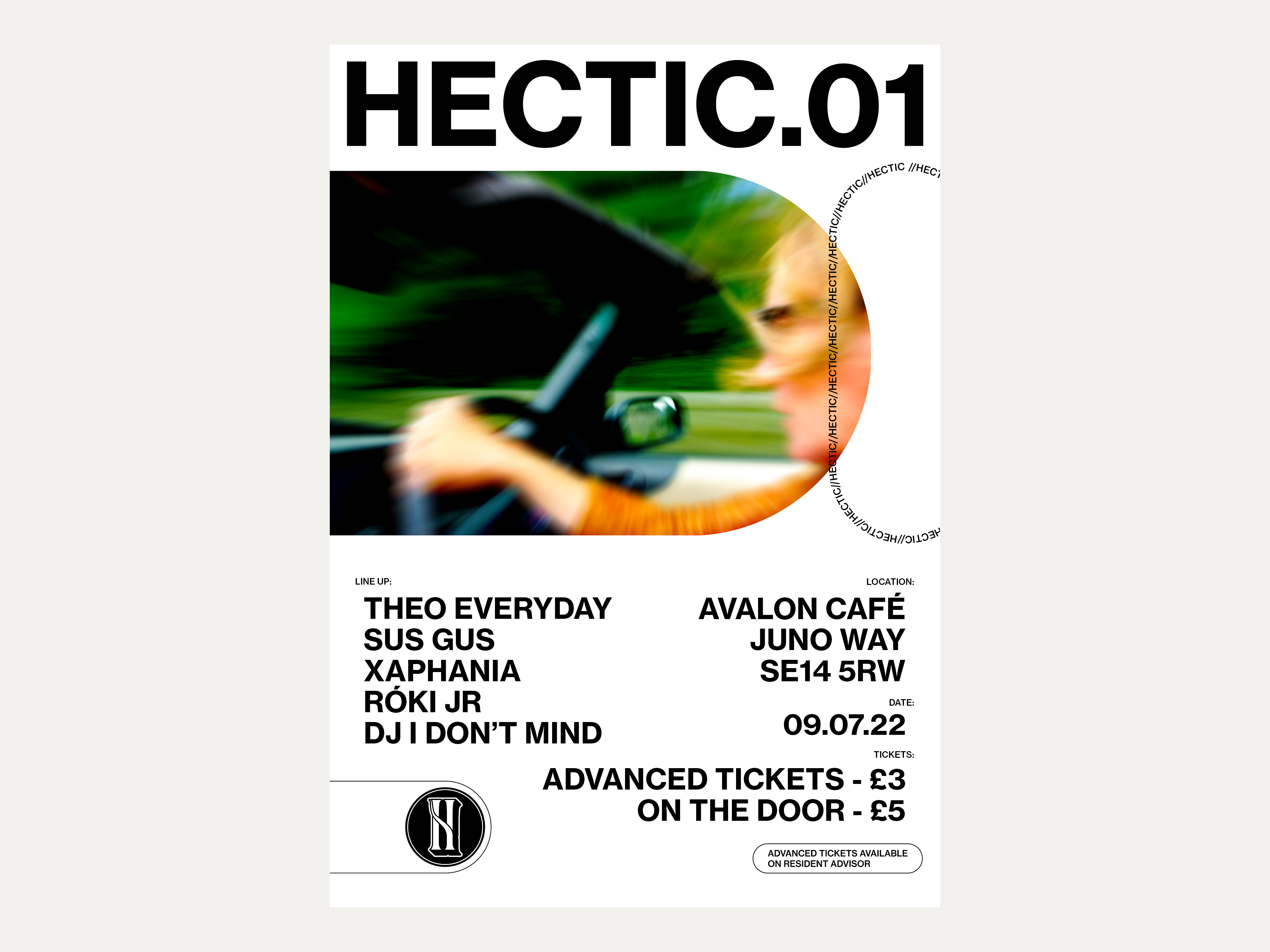
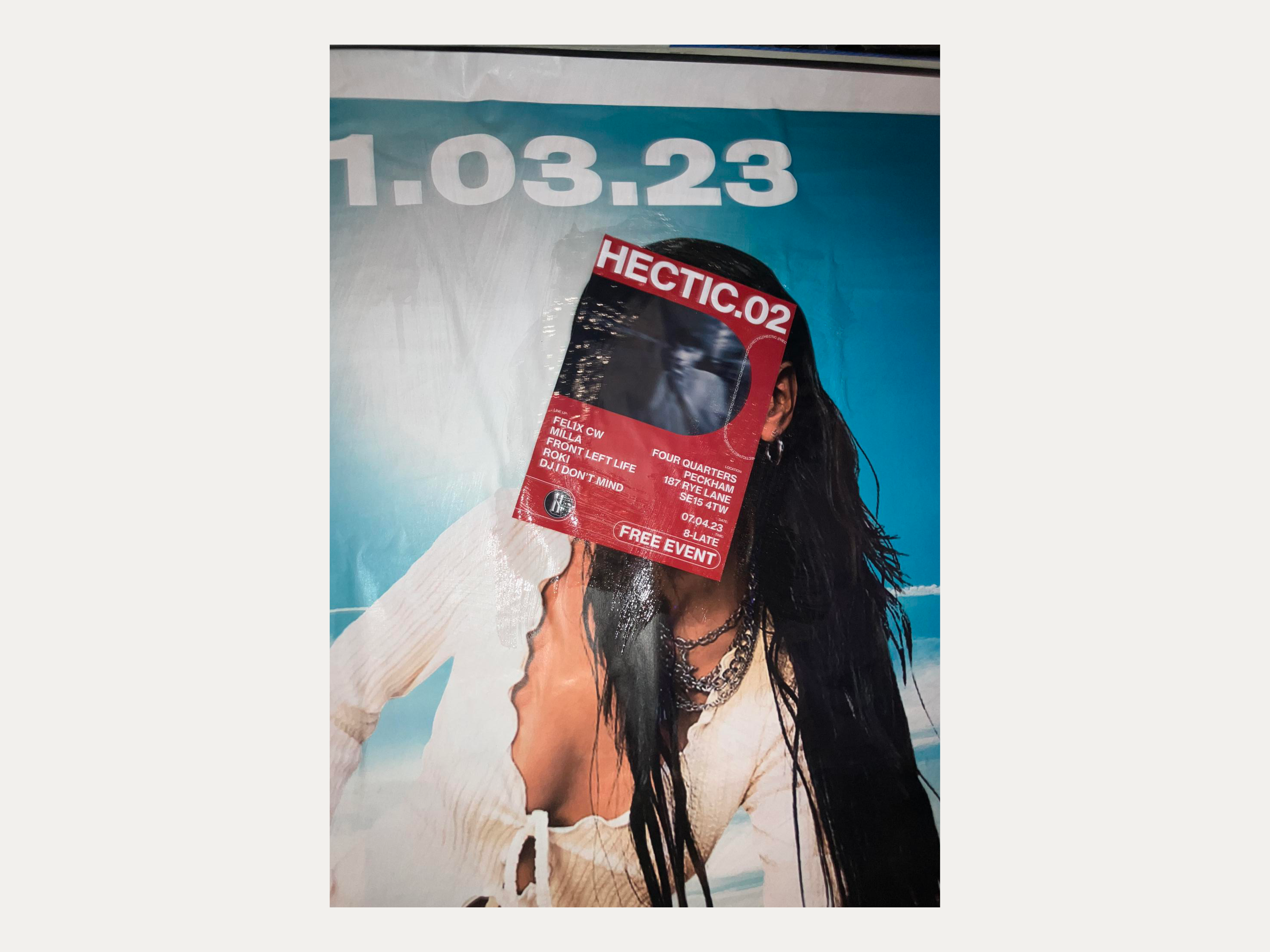
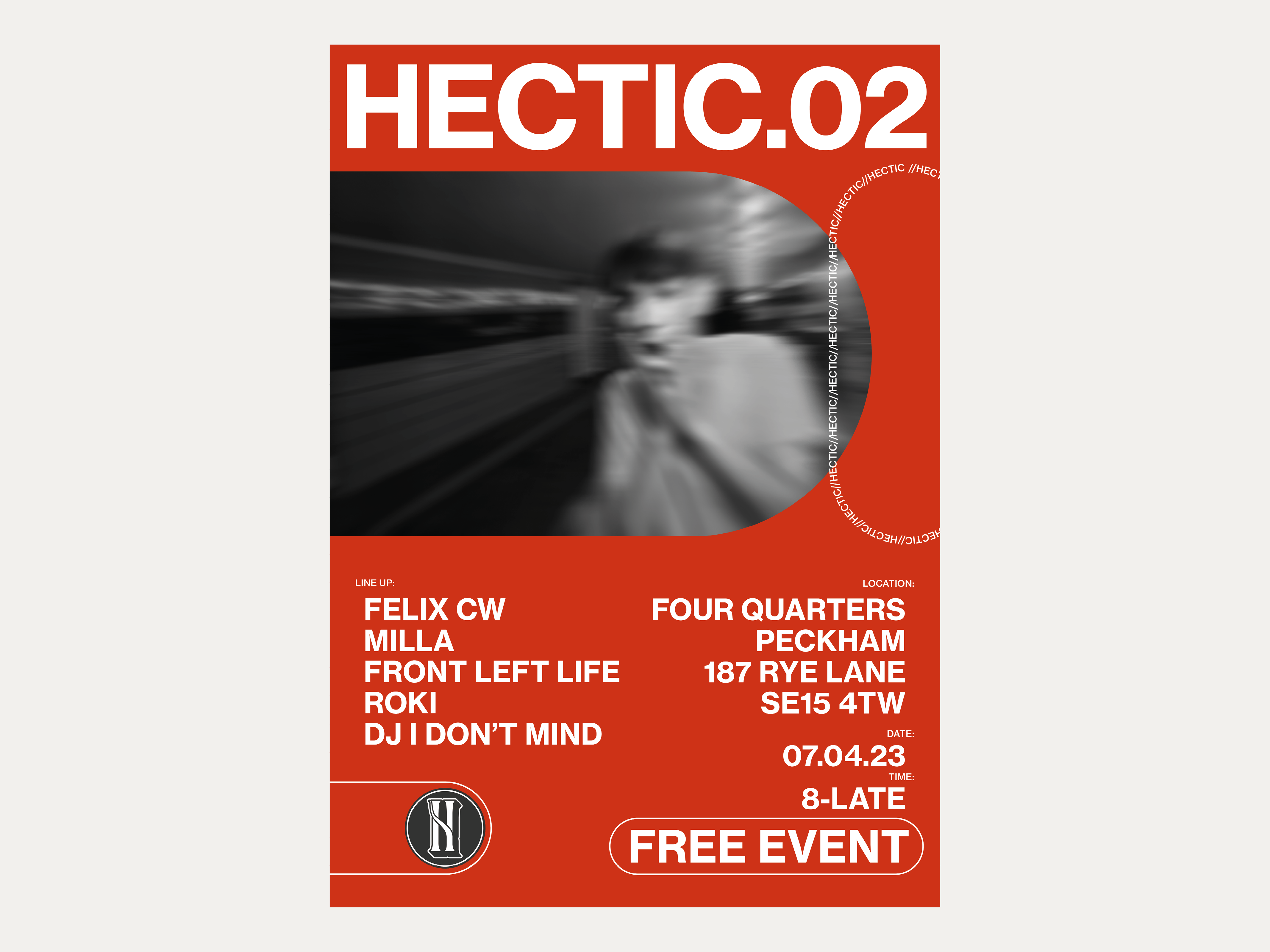
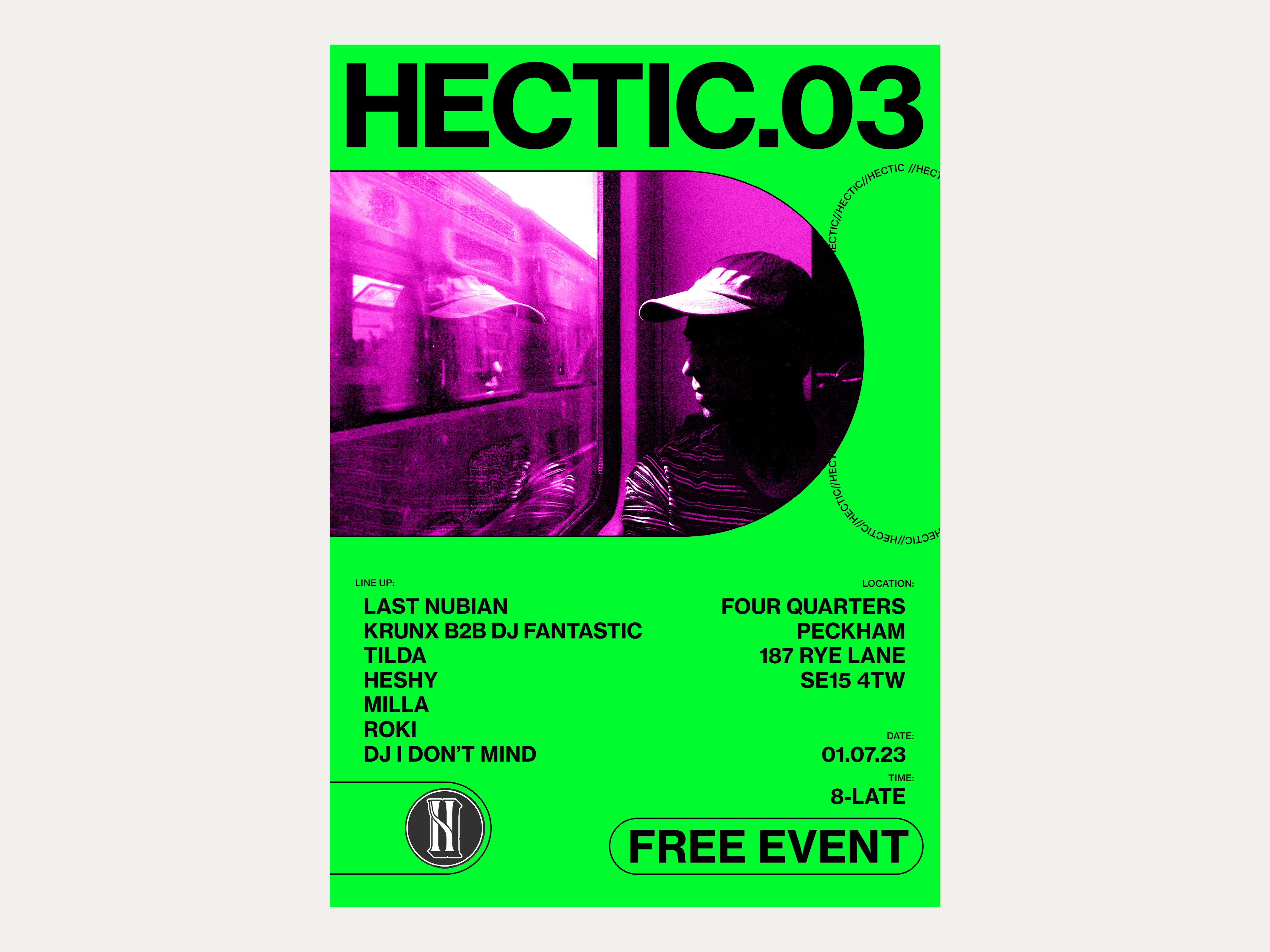
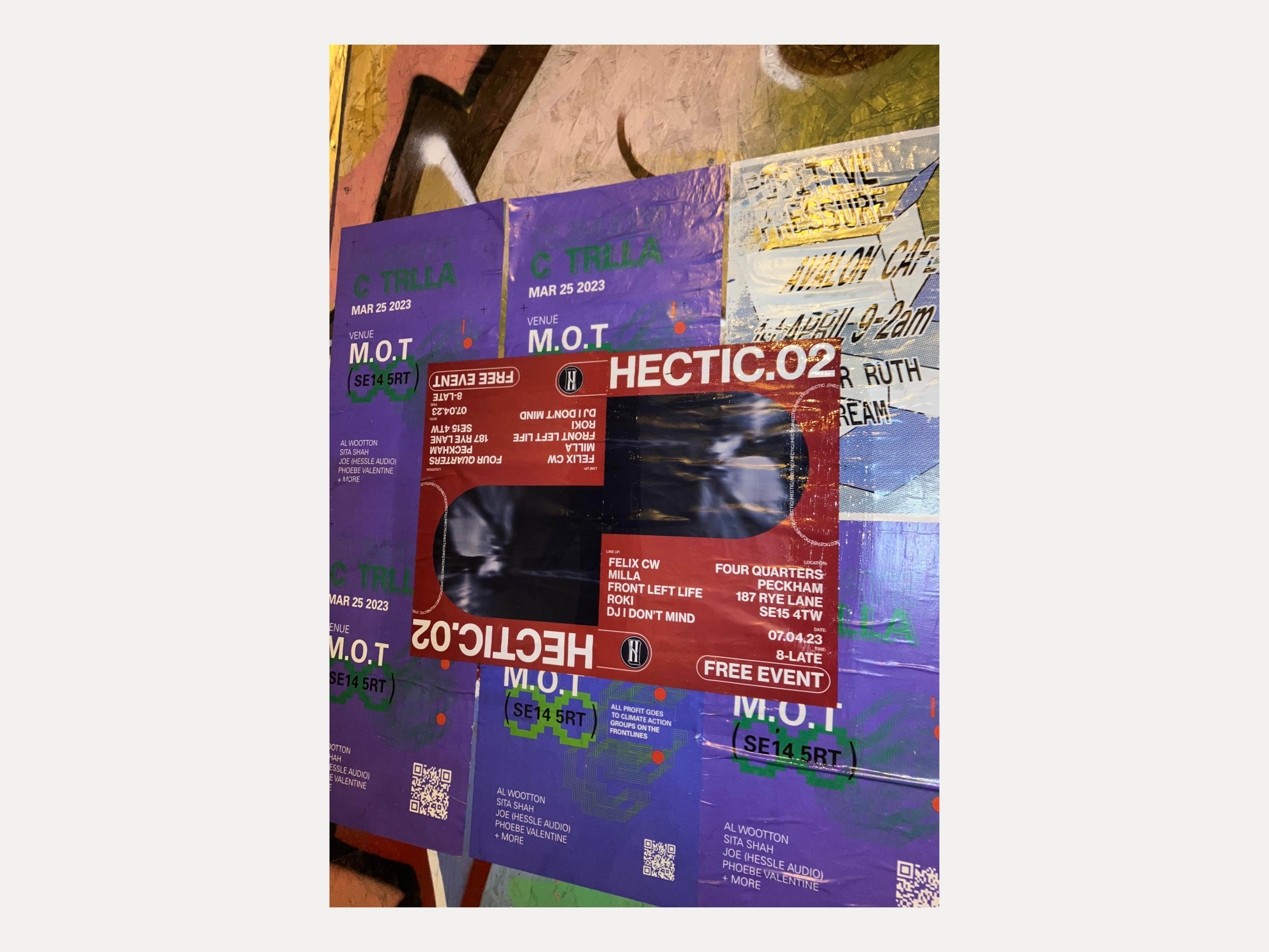
The organisers of HECTIC, a music collective based in London, hired me on a long-term basis to design the promotional posters for their regular music events.
︎︎︎ Image Treatment: Custom Images.
︎︎︎ Software Used: Illustrator, Photoshop, and InDesign.
︎︎︎ Image Treatment: Custom Images.
︎︎︎ Software Used: Illustrator, Photoshop, and InDesign.
Univesity Project
Editorial Design
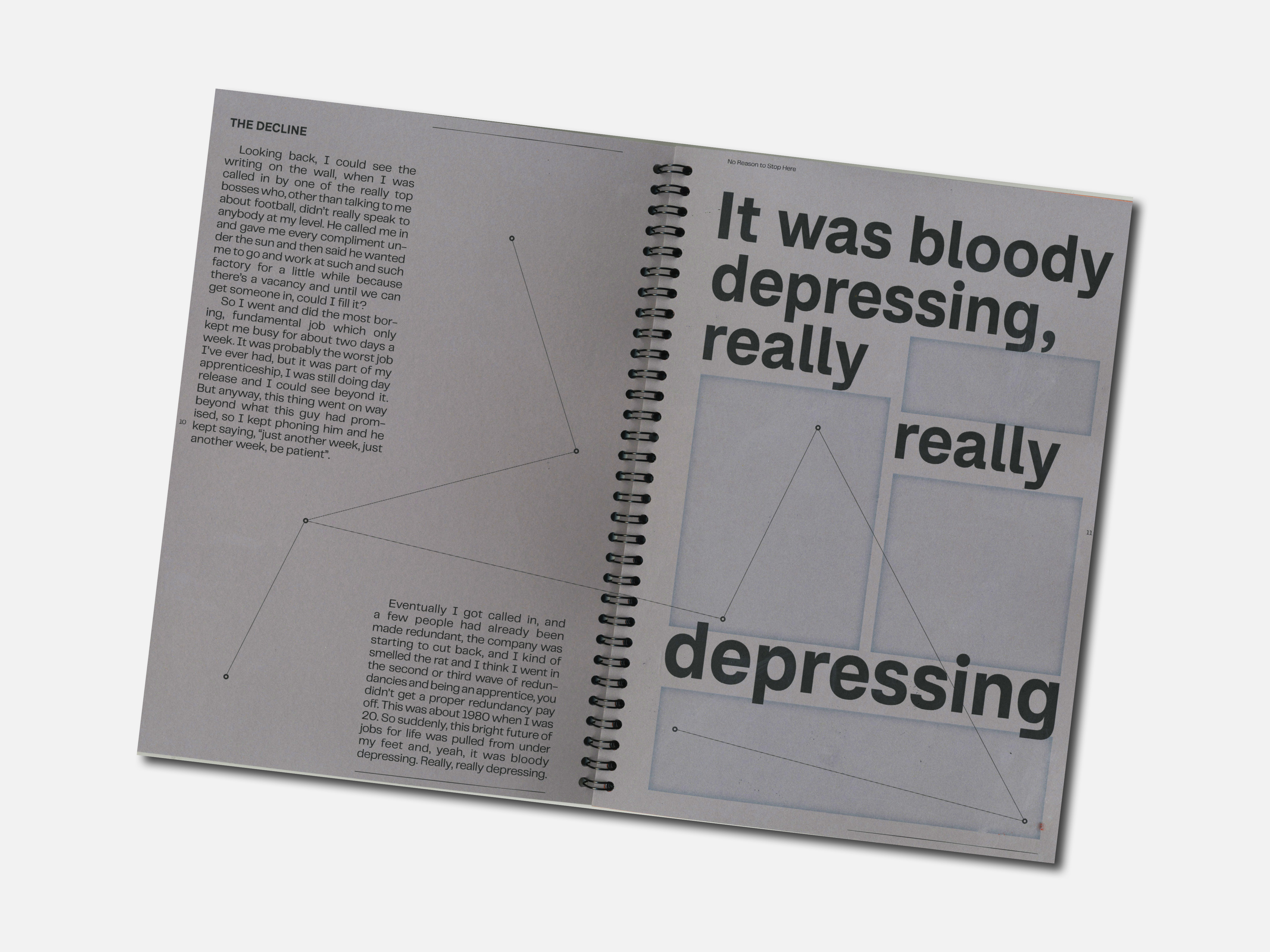
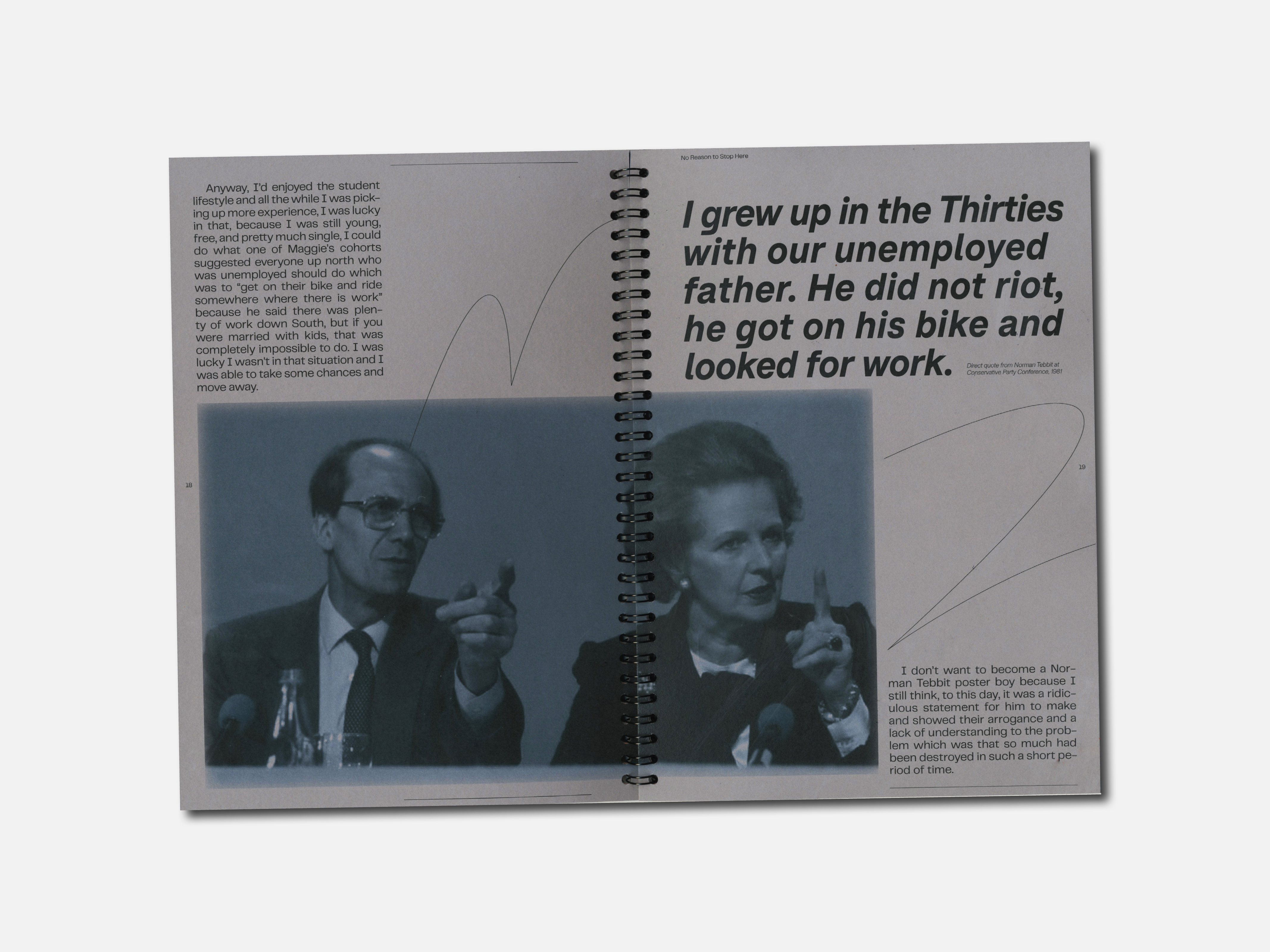
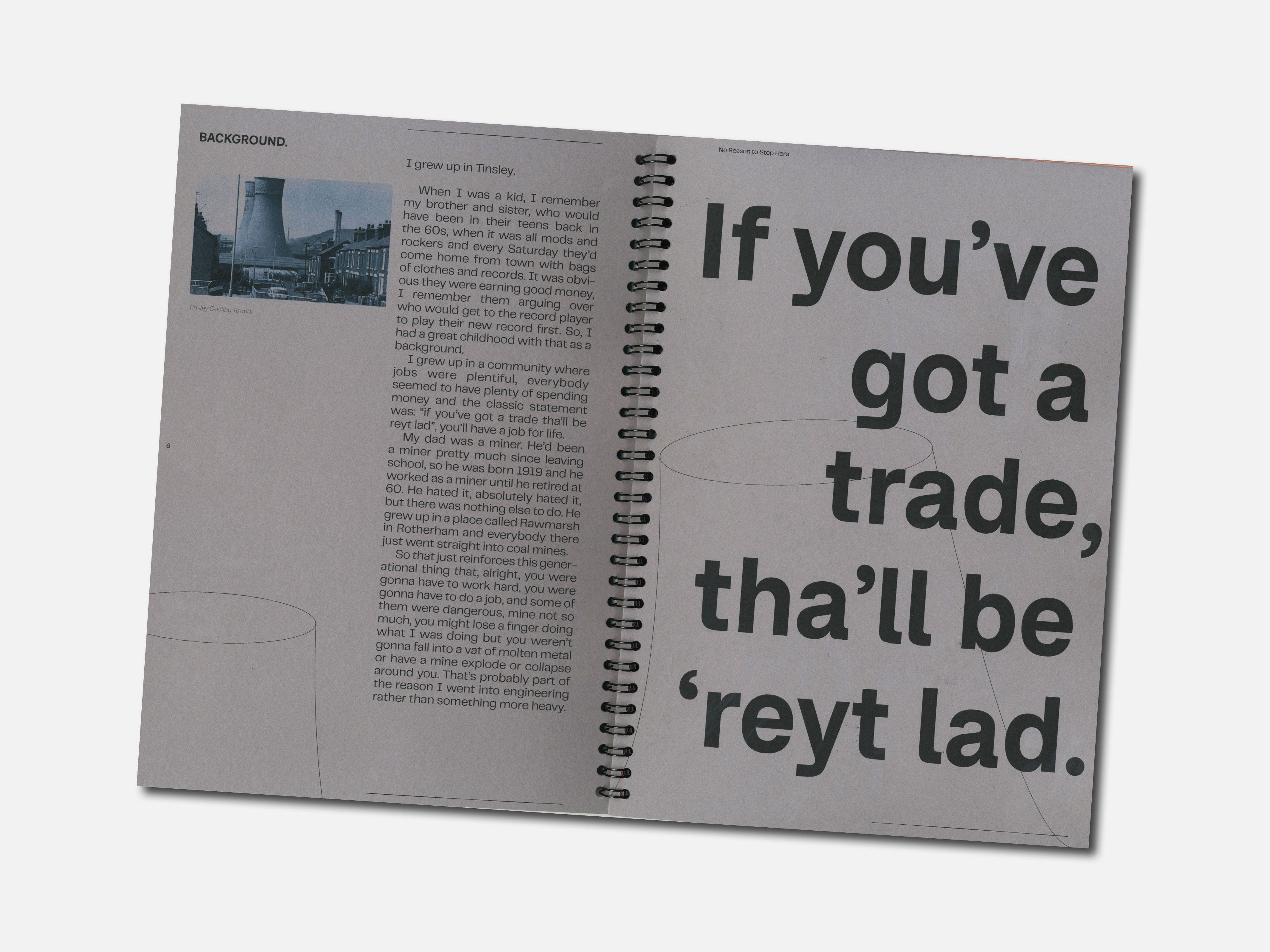
No Reason to Stop Here
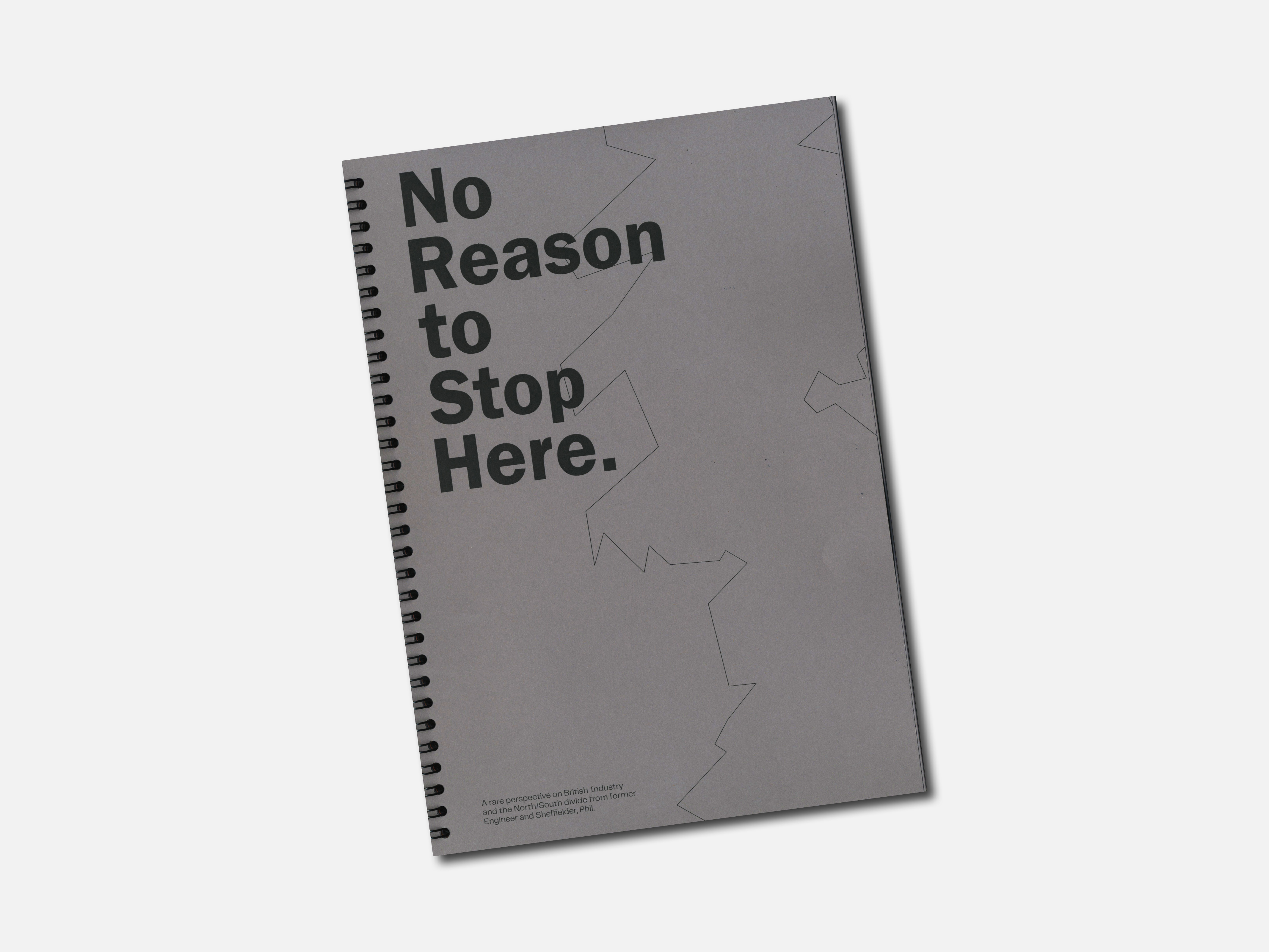
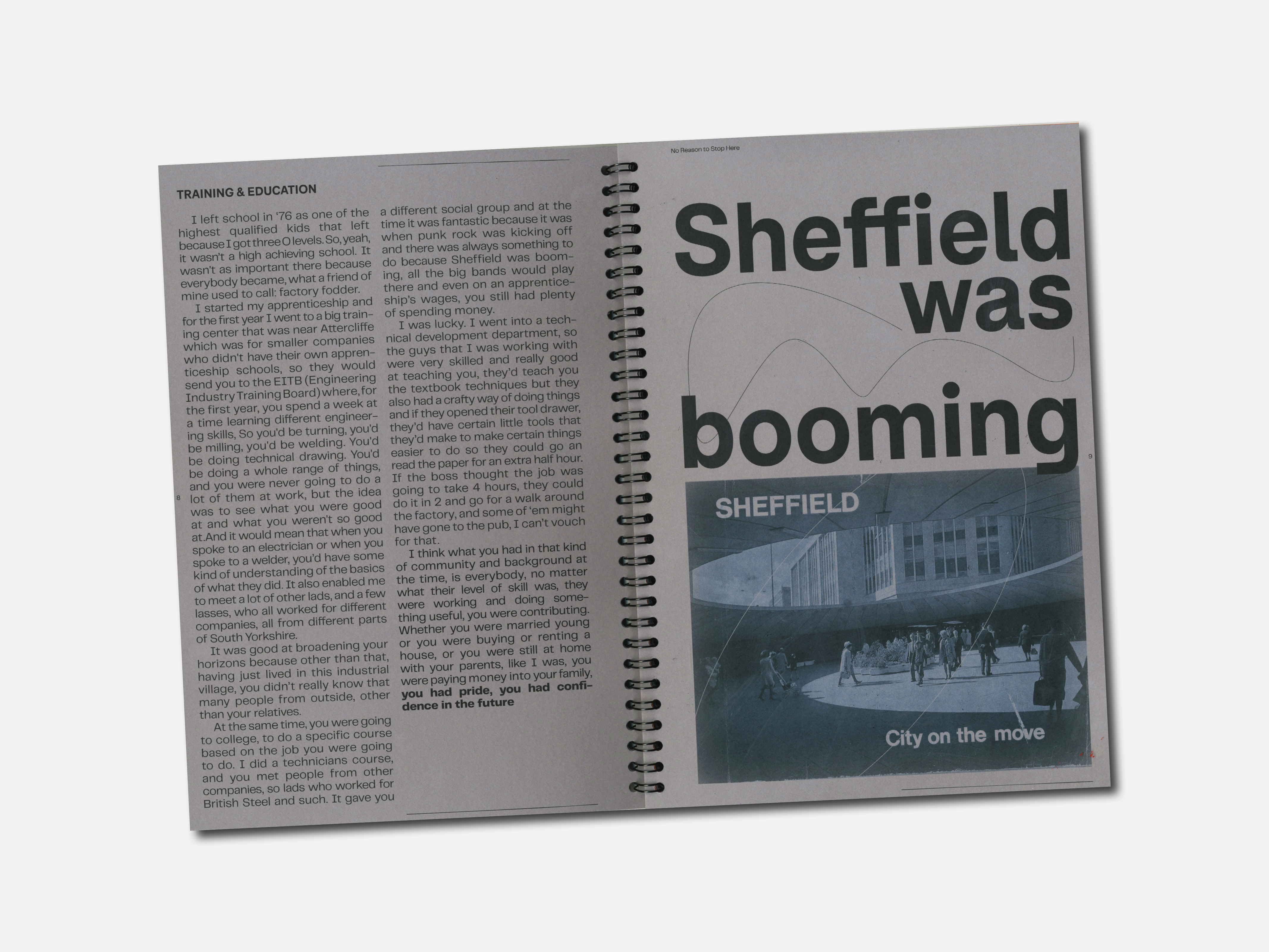
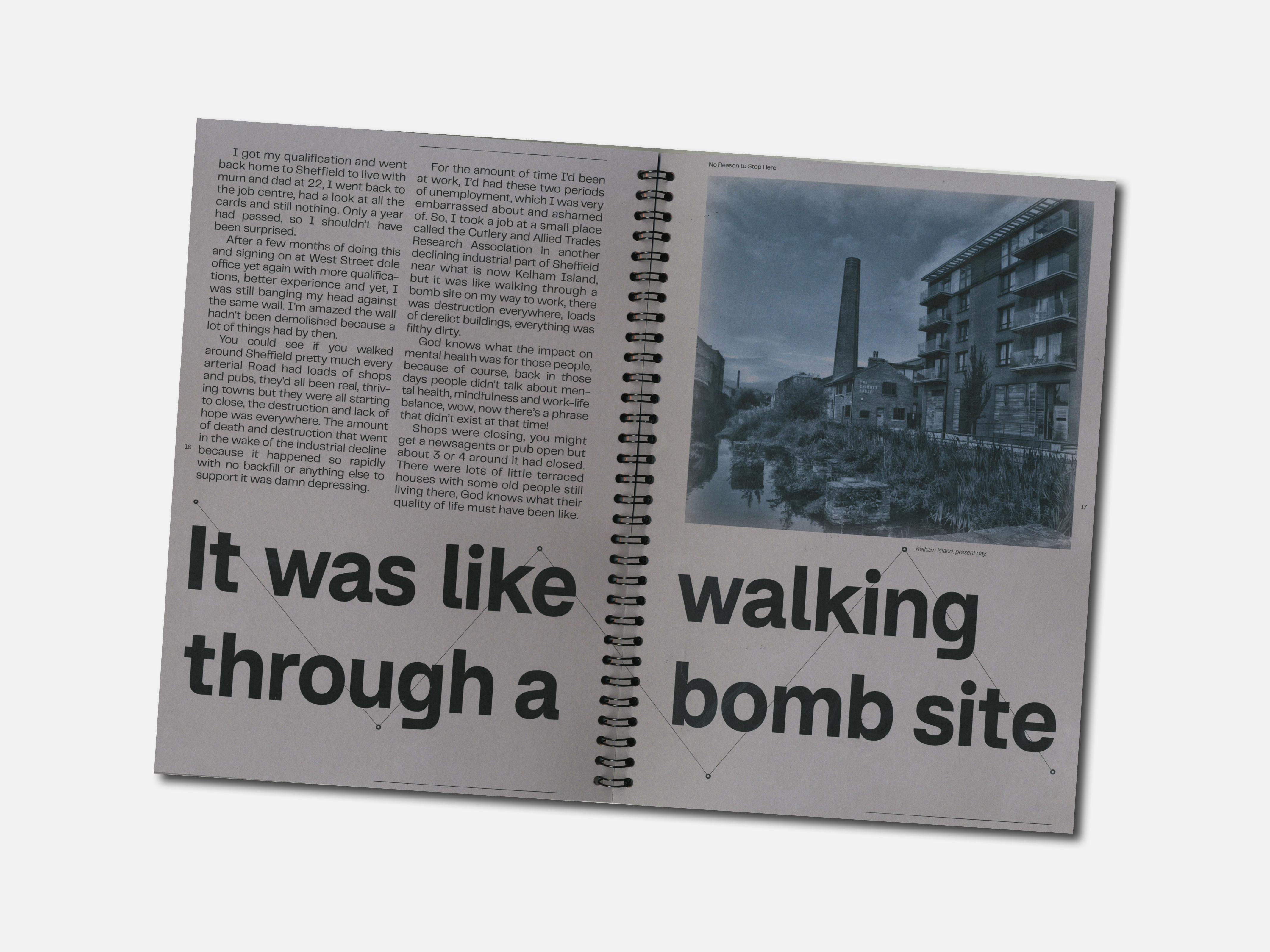
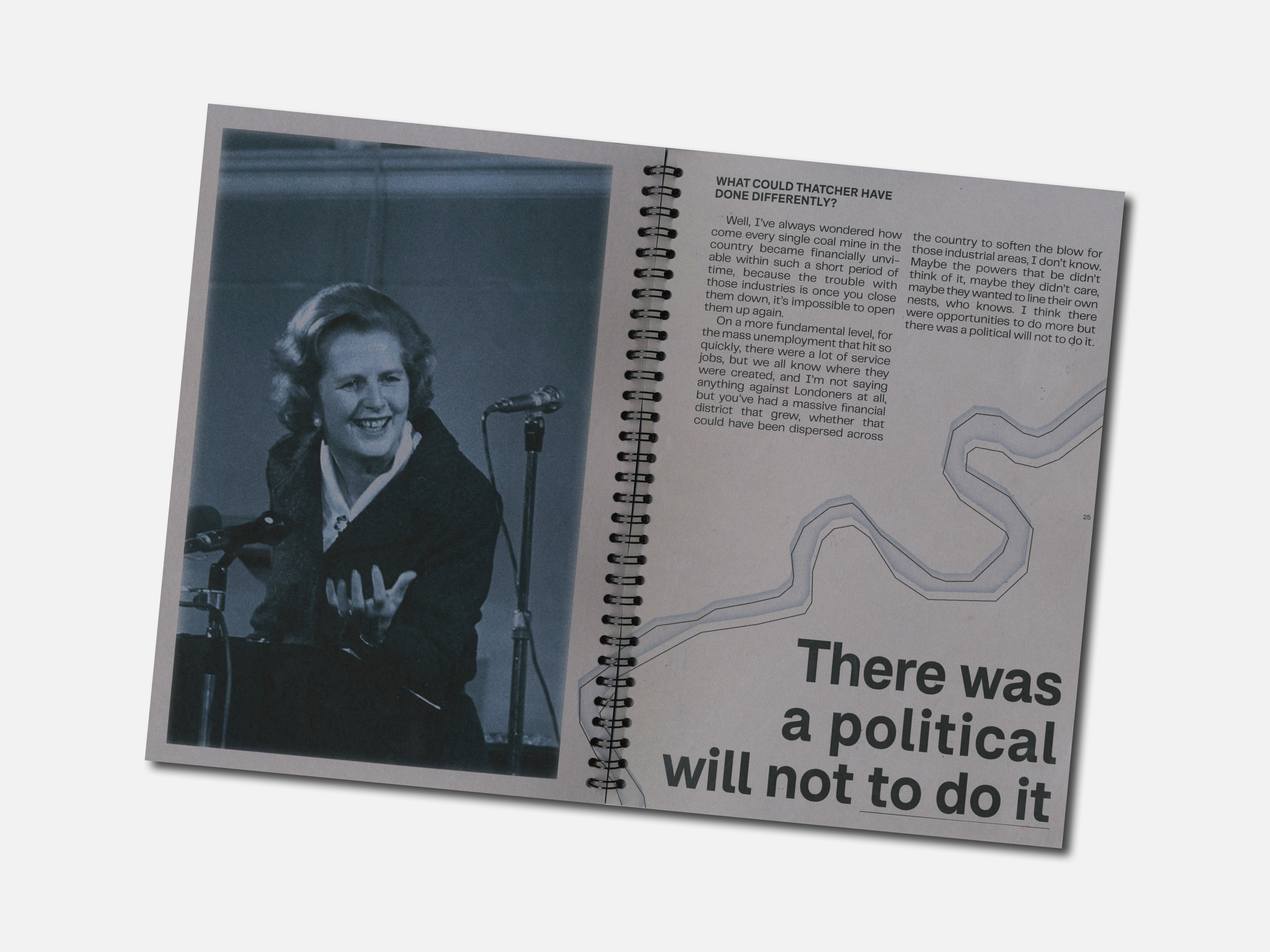
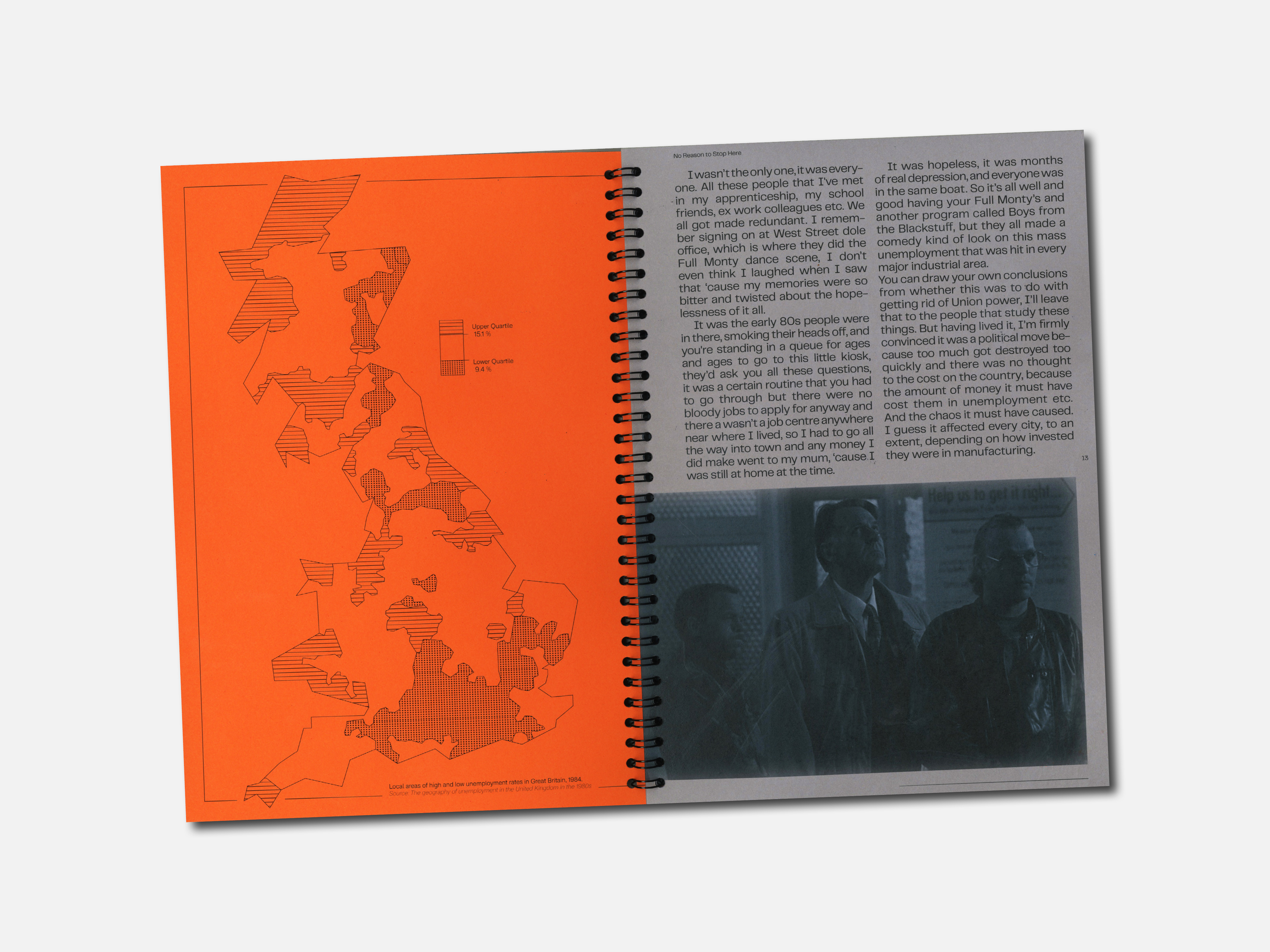
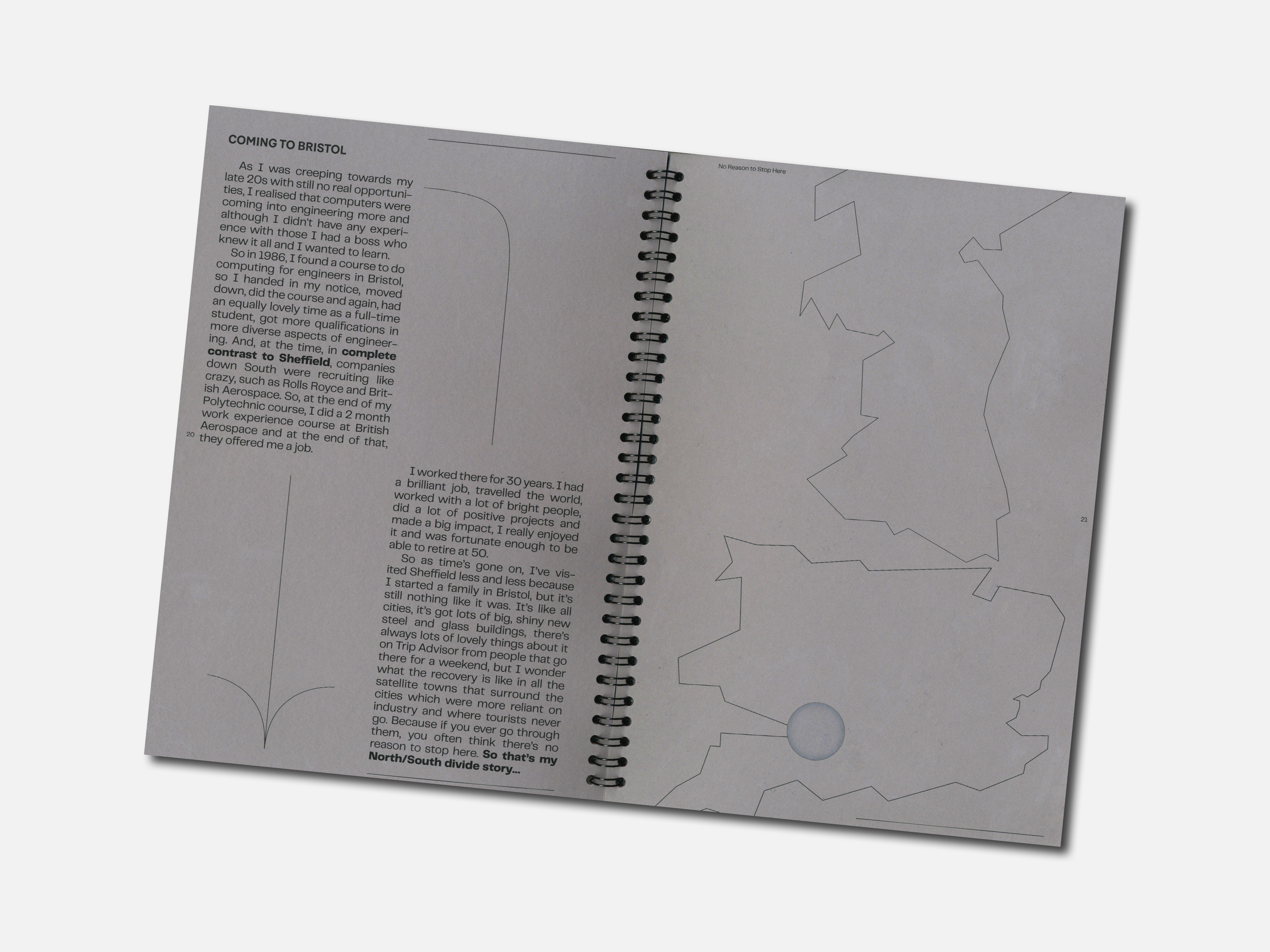
No Reason to Stop Here is a publication which explores how the fall of British industry had a direct effect on working-class communities.
The written content for this book consists entirely of an interview with a former engineer working within the steel industry in Sheffield during its downfall. His detailed knowledge and experience provide a unique perspective on how local, industry-reliant, working-class communities were deeply affected by the closure of steel factories and coal mines during the 1980s.
︎︎︎ Content: Interview (core content), data visualisations and illustrations (supporting content).
︎︎︎ Software used: InDesign, Photoshop, Illustrator.
︎︎︎ Binding: Ring-bound, with folex overlay cover.
︎︎︎ Stock: Seawhite Grey and Vermilion Orange.
︎︎︎ Typefaces: F37 Bolton, PP Telegraf.
University Project
Editorial Design / Zine
The Bomb
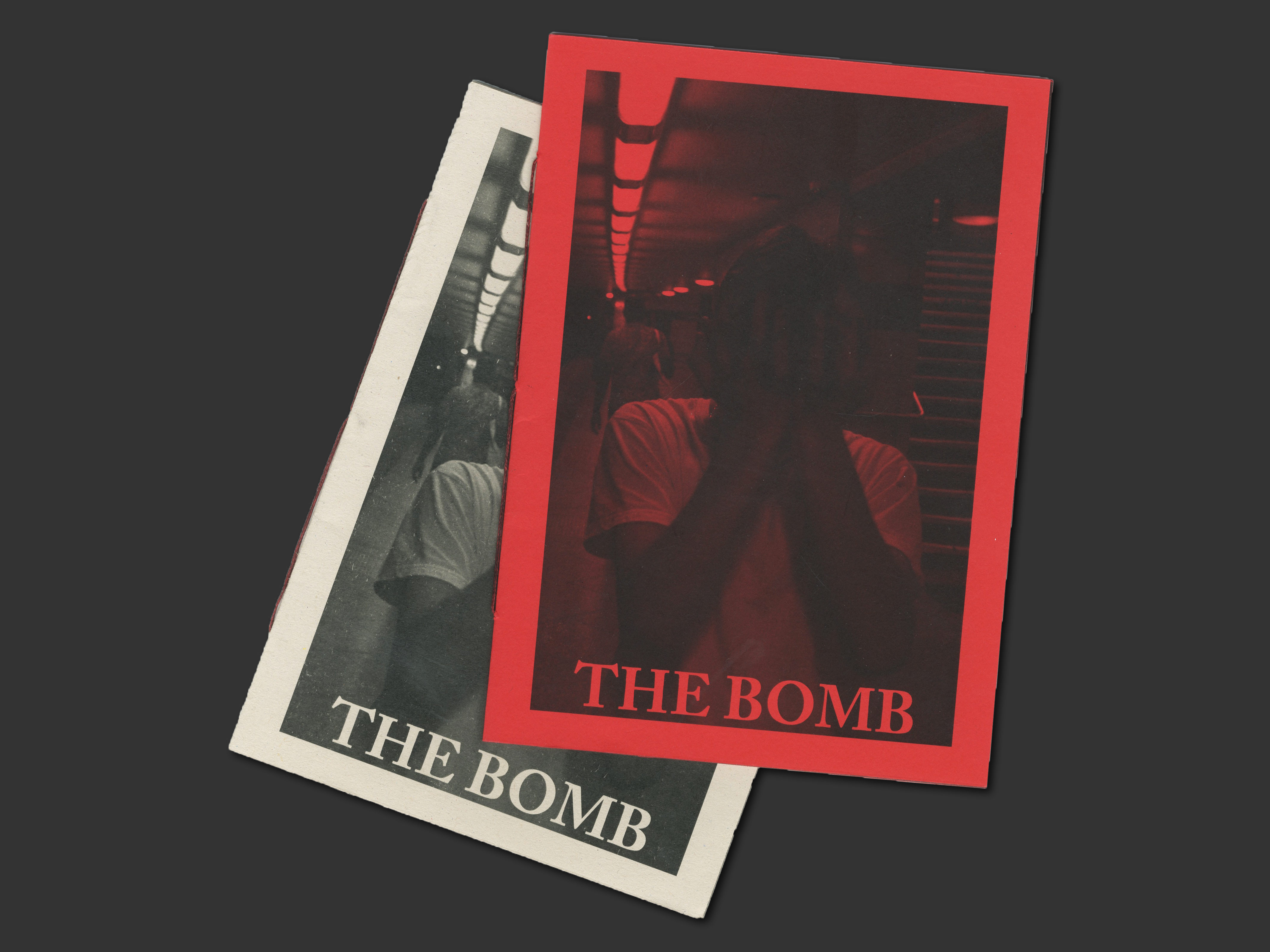
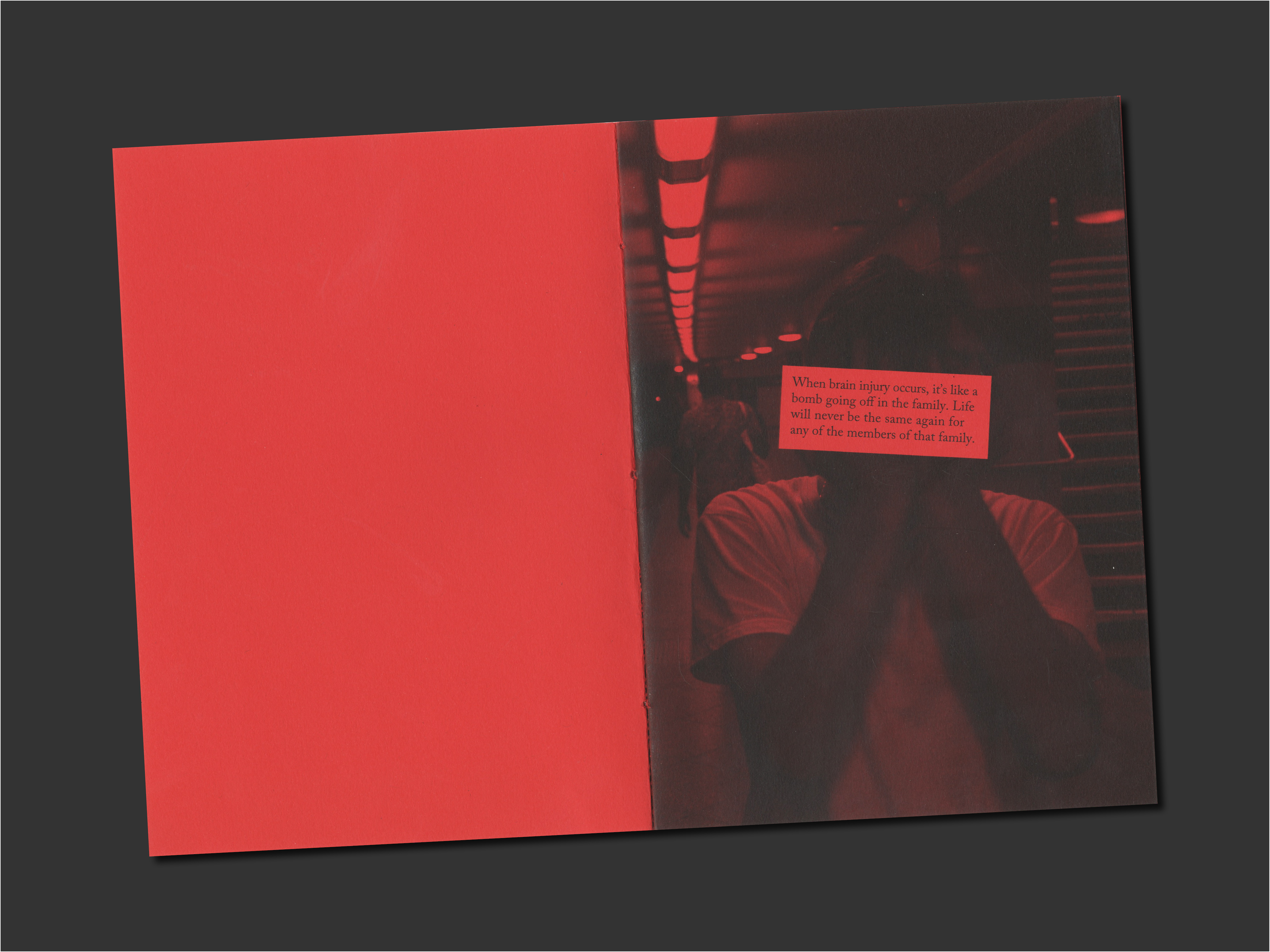
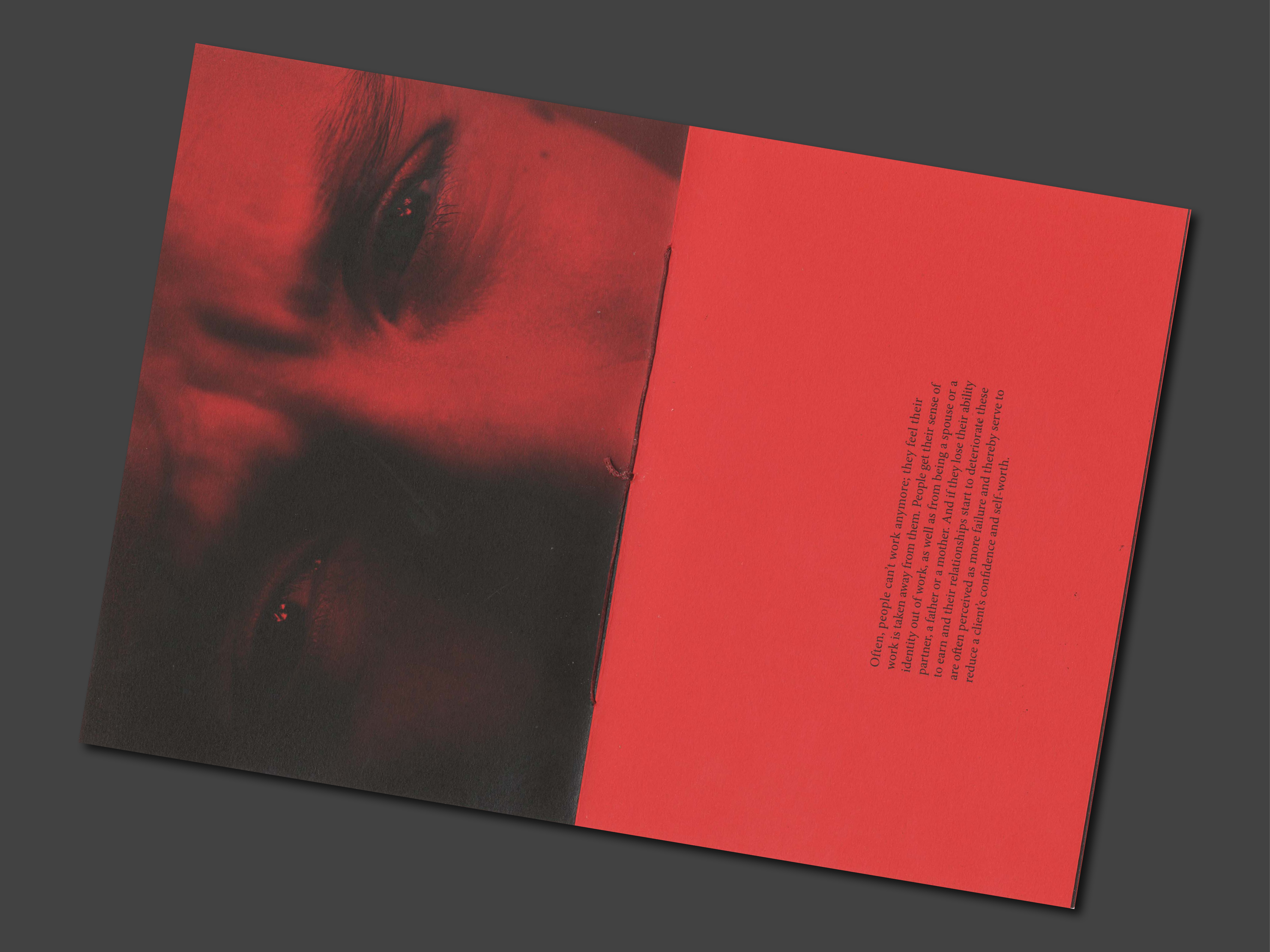
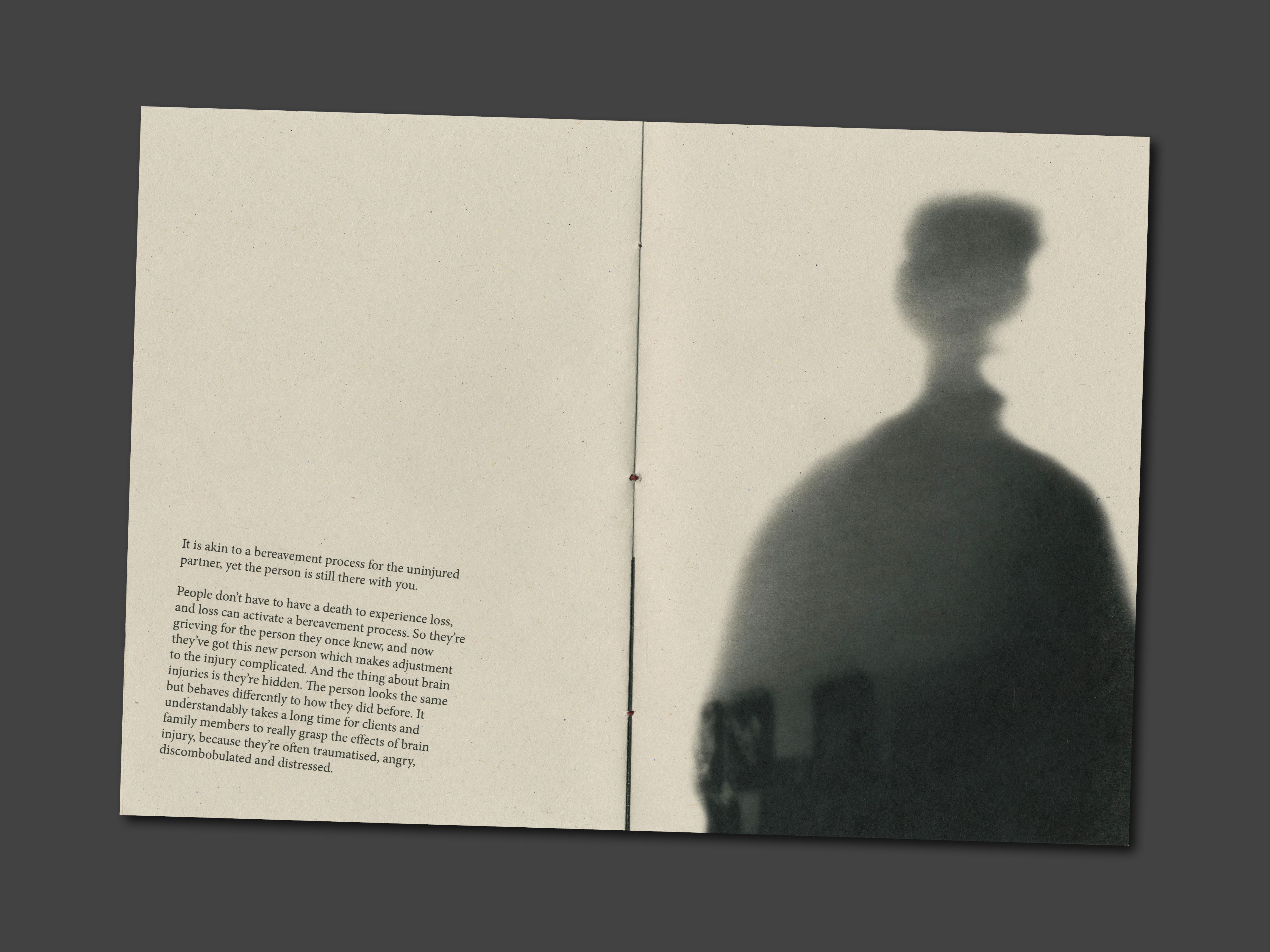
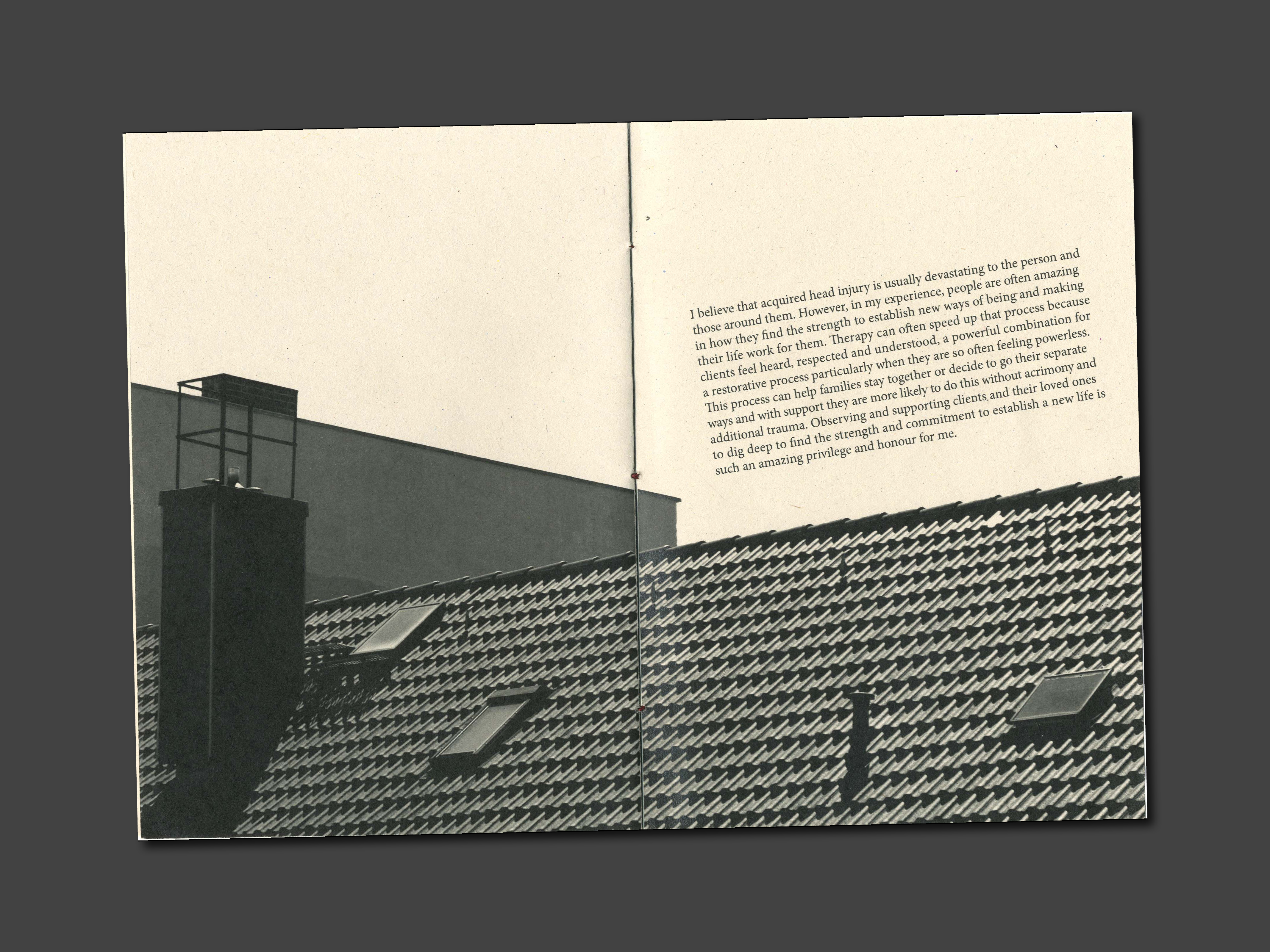
When a brain injury occurs, it’s like a bomb going off in the family. Life will never be the same again for any of the members of that family.
The Bomb is a zine I designed and bound, which explores the family experience of brain injury.
︎︎︎ Content: Article by two experts in psychotherapy and Images taken by me.
︎︎︎ Software used: InDesign, Photoshop.
︎︎︎ Binding: Saddle-stitch.
︎︎︎ Typography: Adobe Caslon Pro.
The Bomb is a zine I designed and bound, which explores the family experience of brain injury.
︎︎︎ Content: Article by two experts in psychotherapy and Images taken by me.
︎︎︎ Software used: InDesign, Photoshop.
︎︎︎ Binding: Saddle-stitch.
︎︎︎ Typography: Adobe Caslon Pro.
University Project
Branding / UI & UX / Logo Design
RSA: Signalling Change
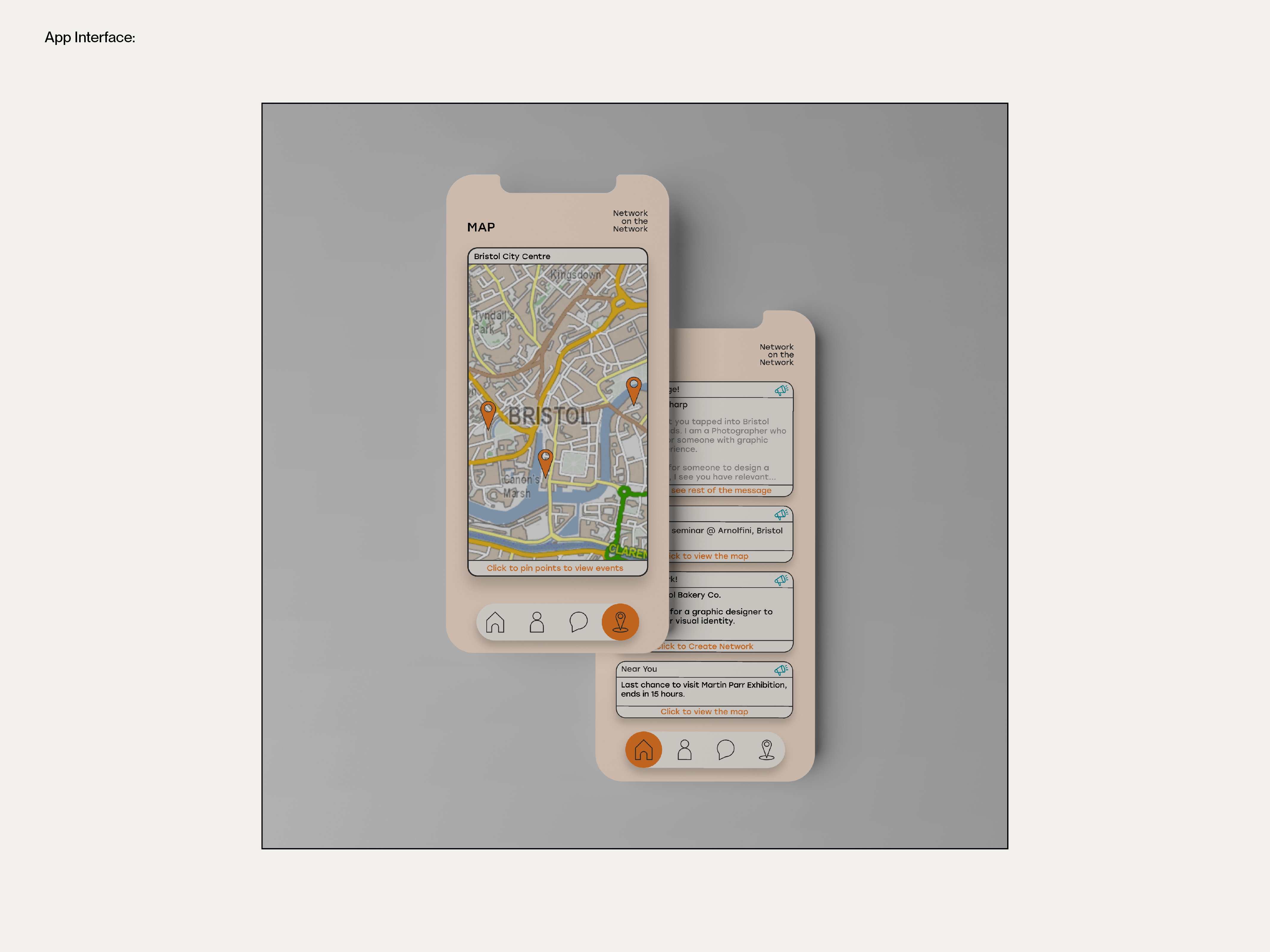
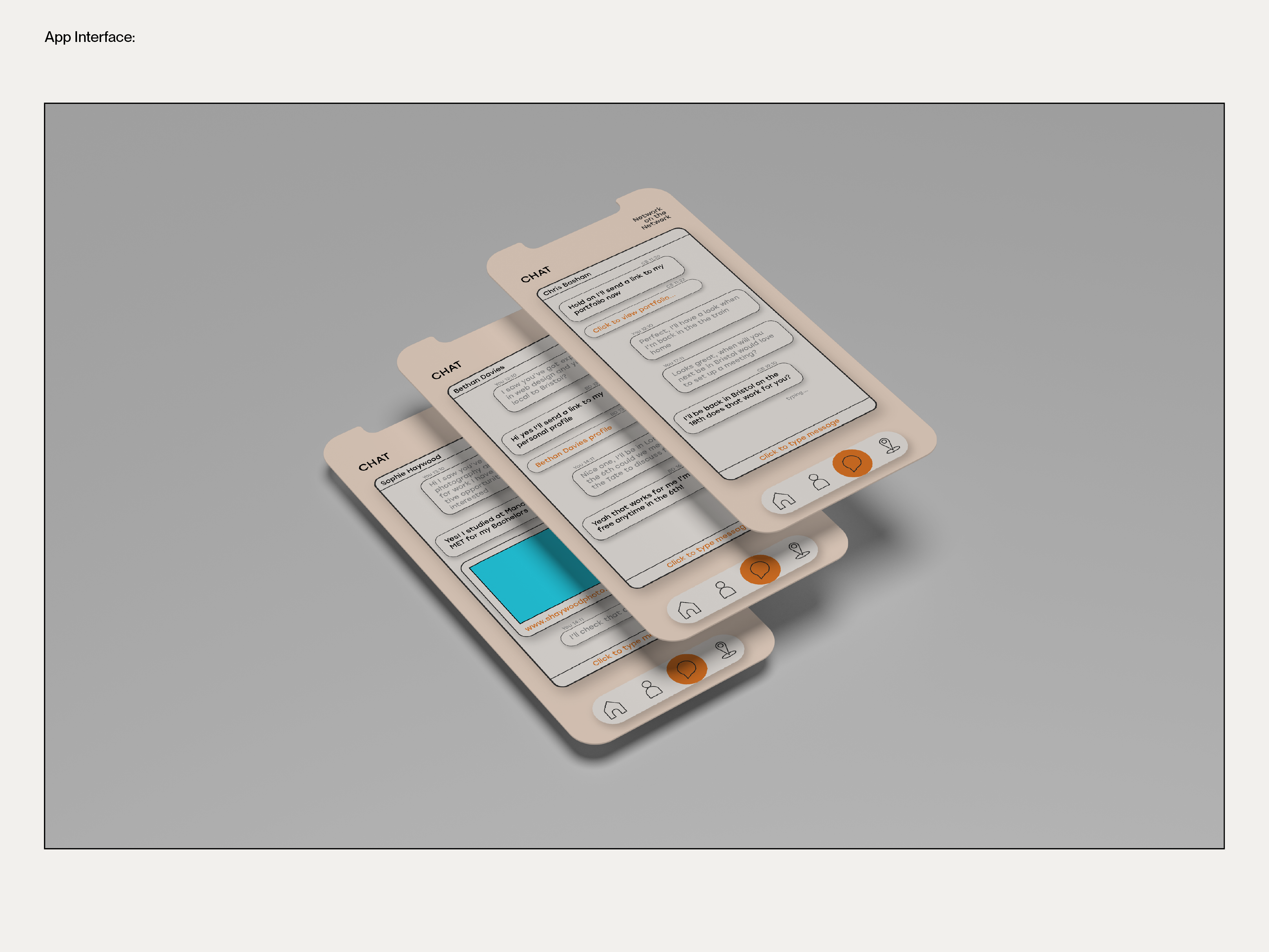
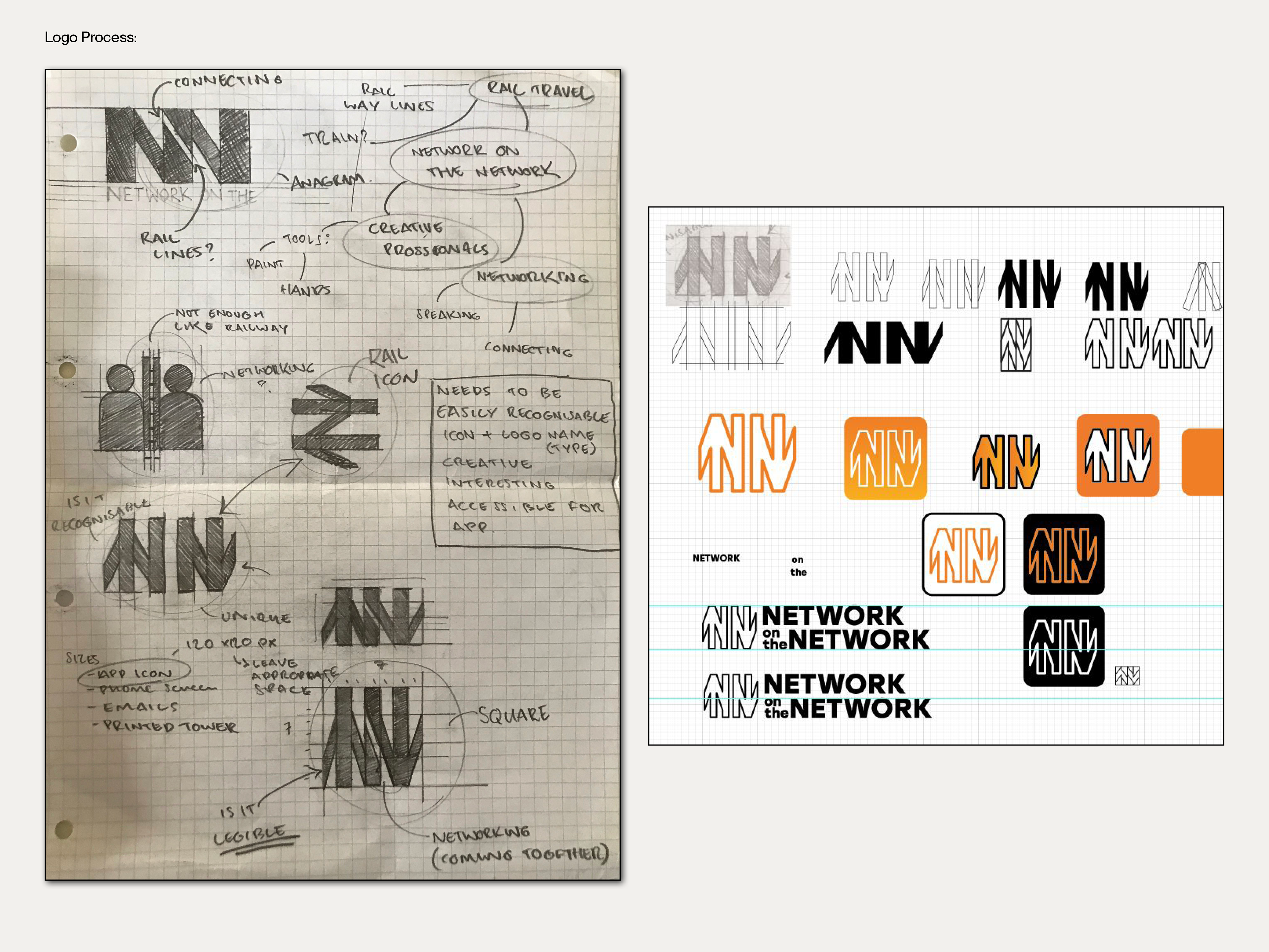
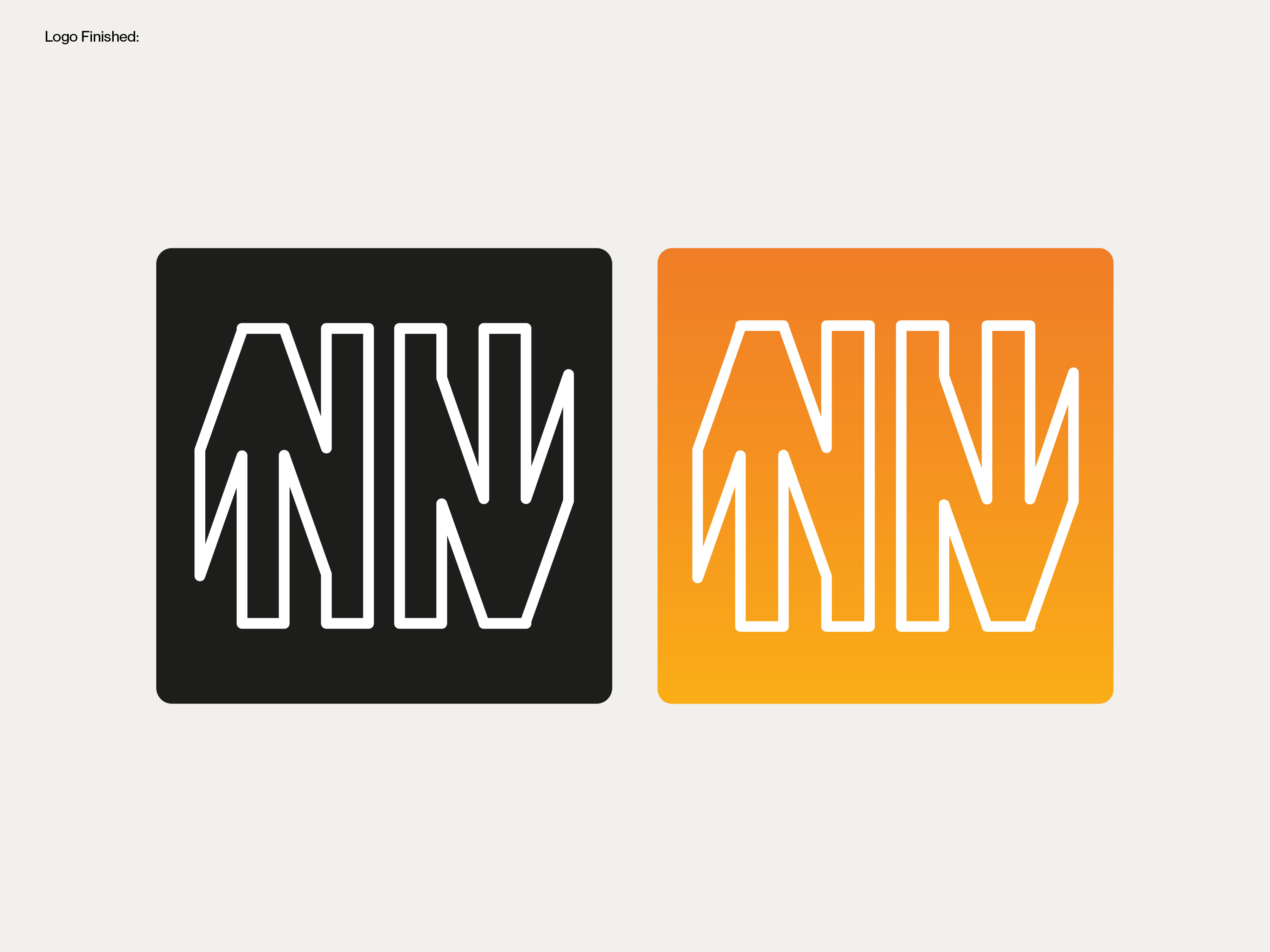
For the 2022-23 RSA student design awards, our group of three chose the brief ‘Signalling Change’ in which we were given the challenge to ‘tap into the potential of train stations so they become spaces that amplify and influence positive behaviour.’
Our idea was to create digital scanning hubs in train stations, accompanied by an app that would help travelling creatives connect with local creatives and professionals, as well as link them to related events such as seminars or exhibitions. Our aim was to boost social interaction, collaboration, job opportunities and make unfamiliar cities more accessible to
I led the branding and UI/UX design for the project. This involved rigorous primary and secondary research, user testing, and surveys. Additionally, we were expected to complete weekly presentations with a final pitch at the end of the project.
︎︎︎ Software used: Illustrator.
︎︎︎ Skills: User testing, surveys, observational research, visual research, and presentation.
University Project
Editorial Design
On Our Doorstep
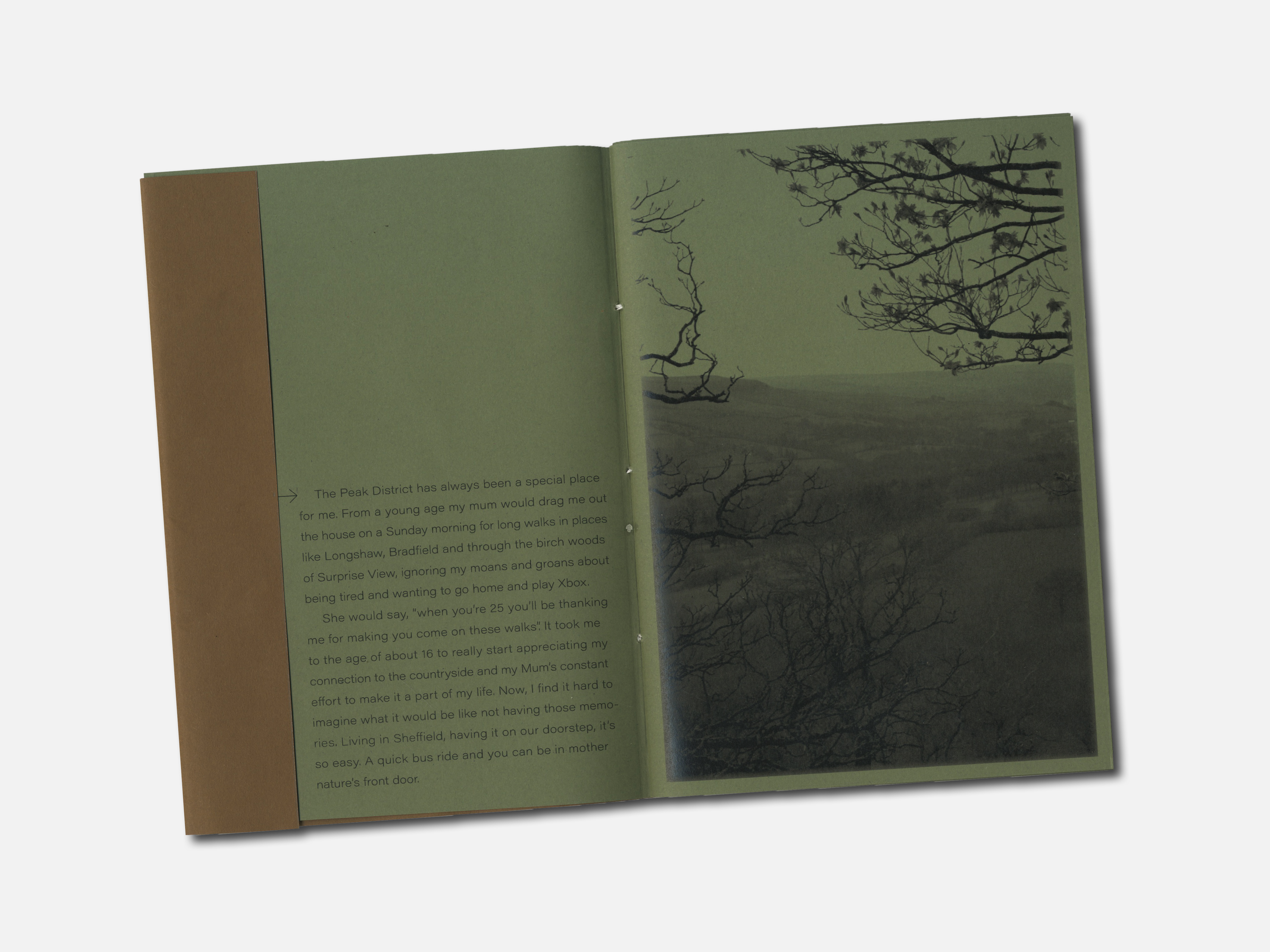
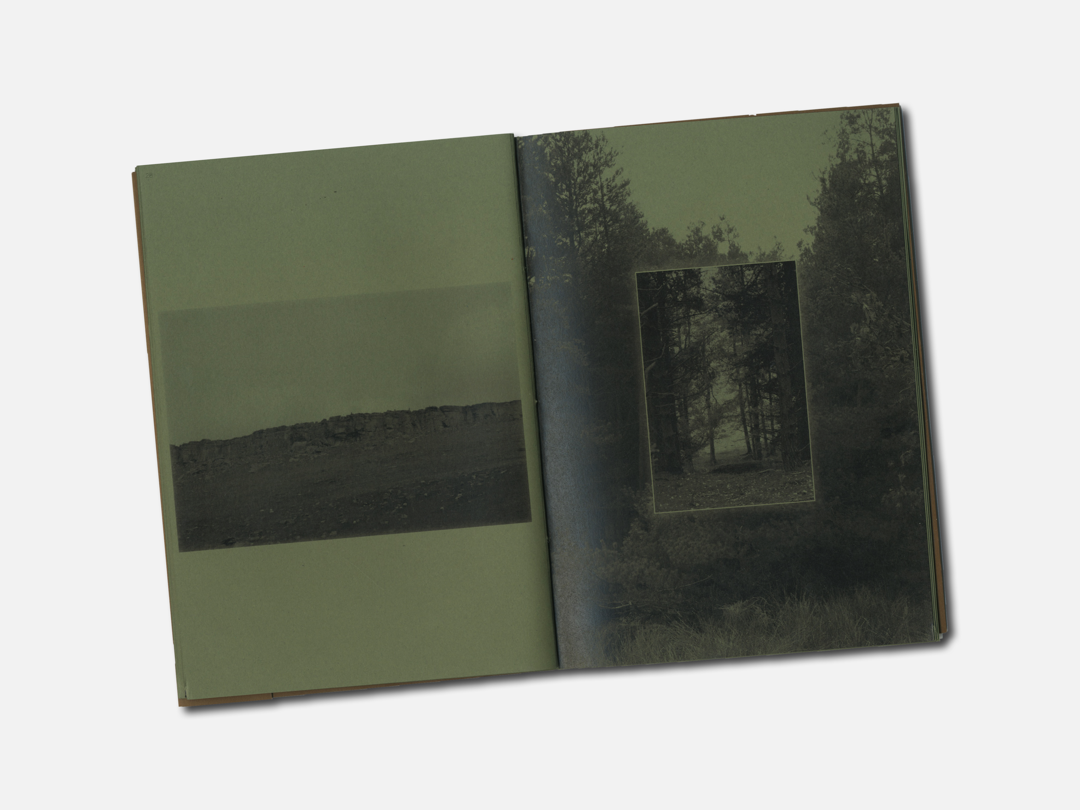
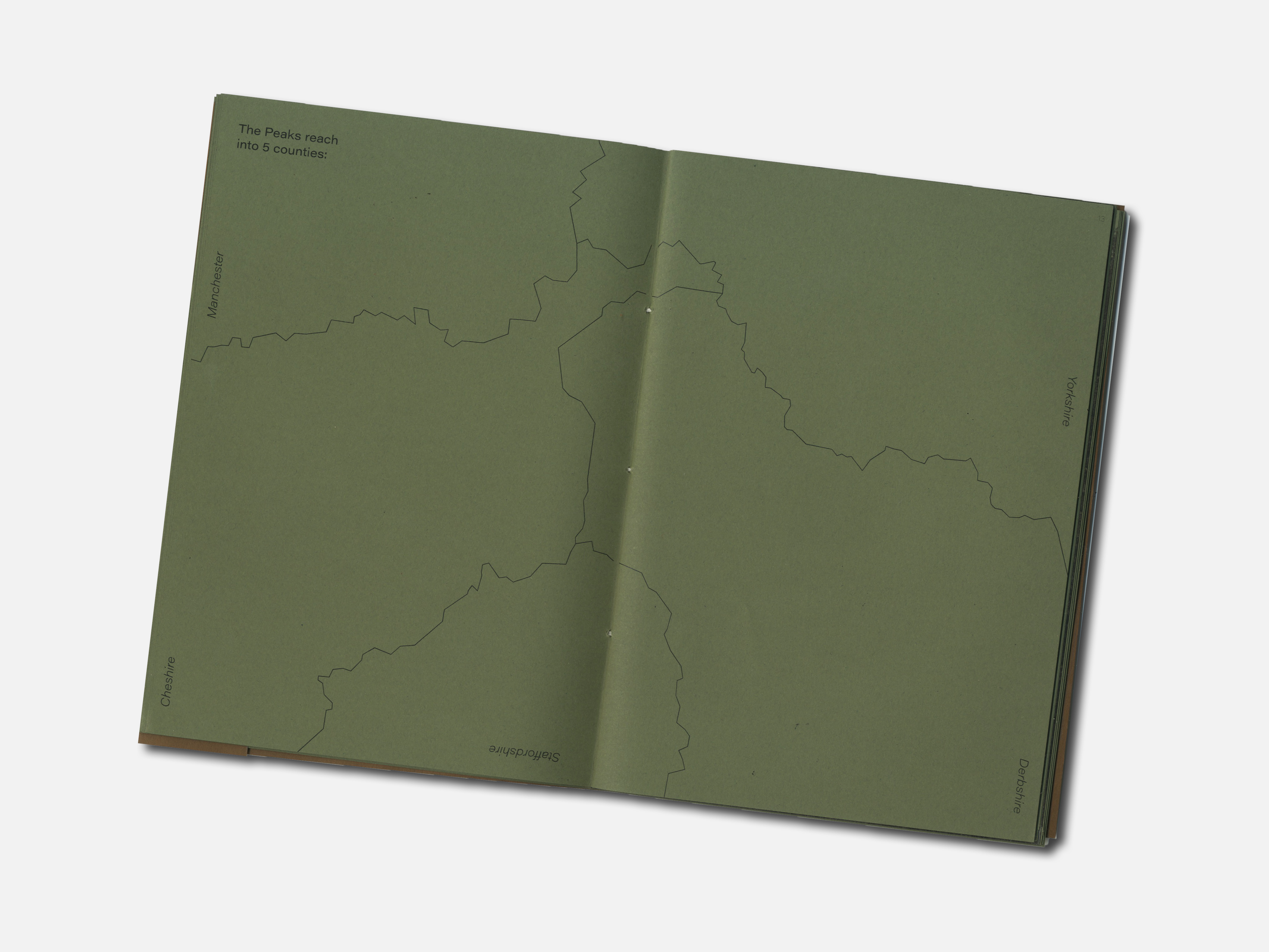
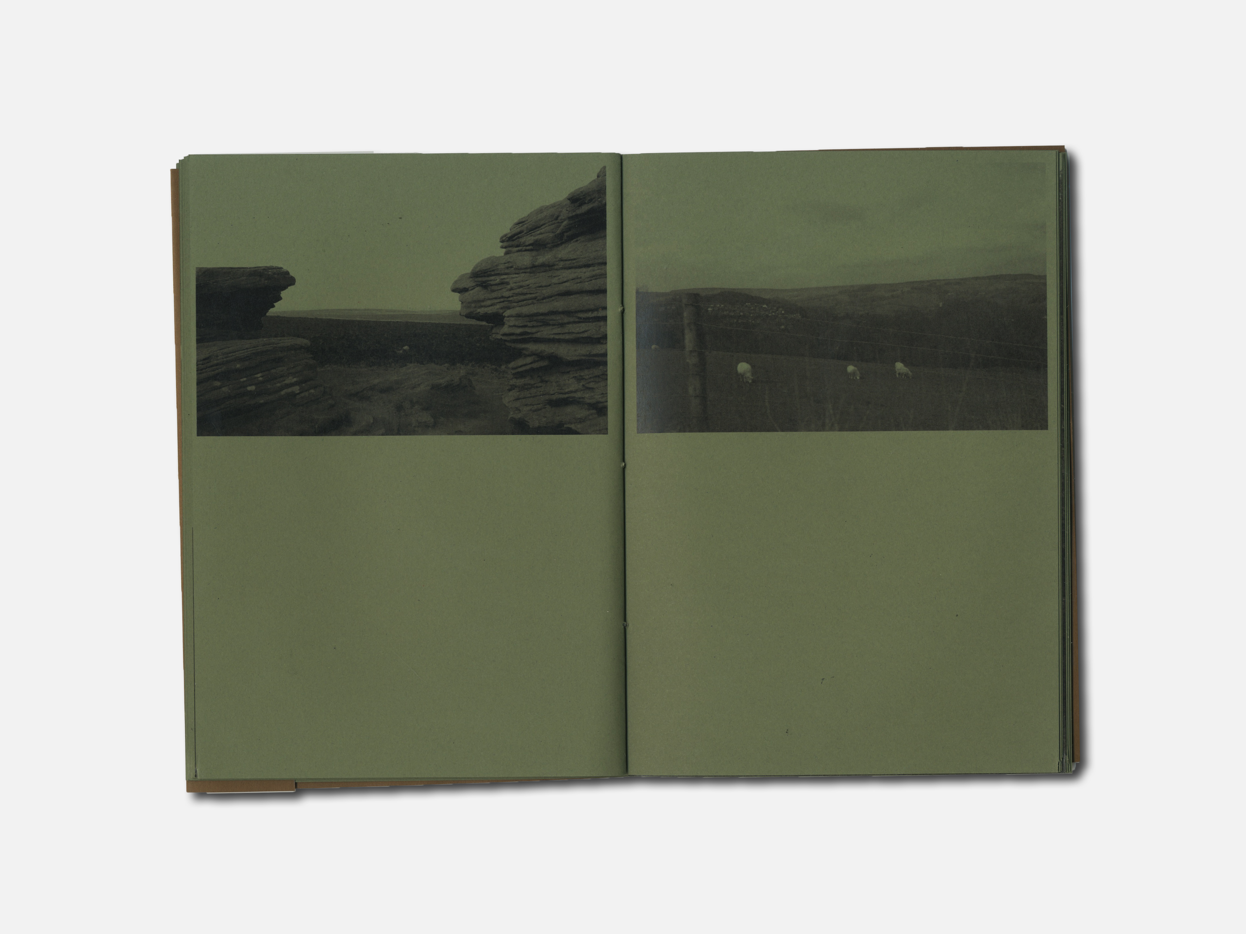
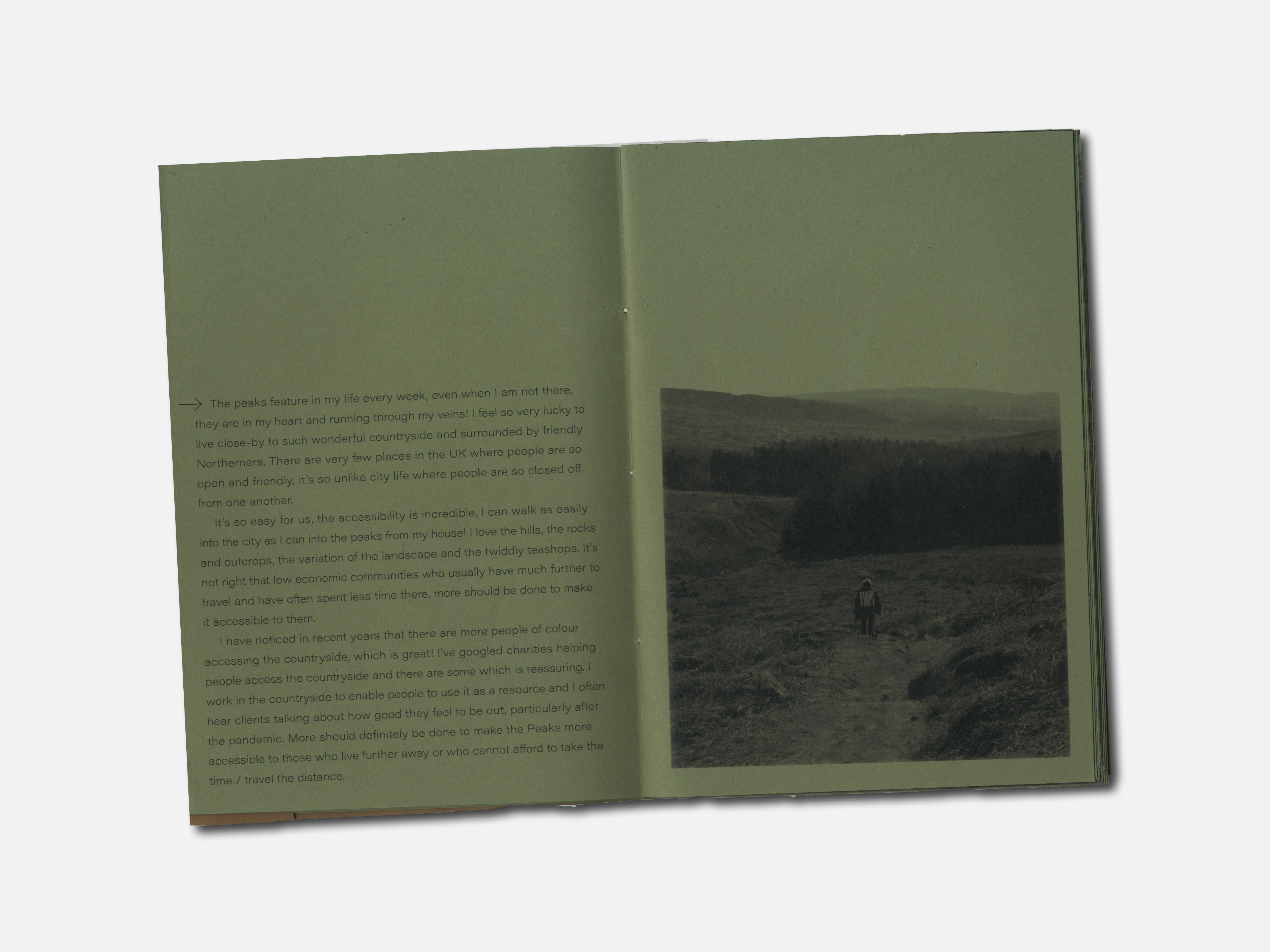
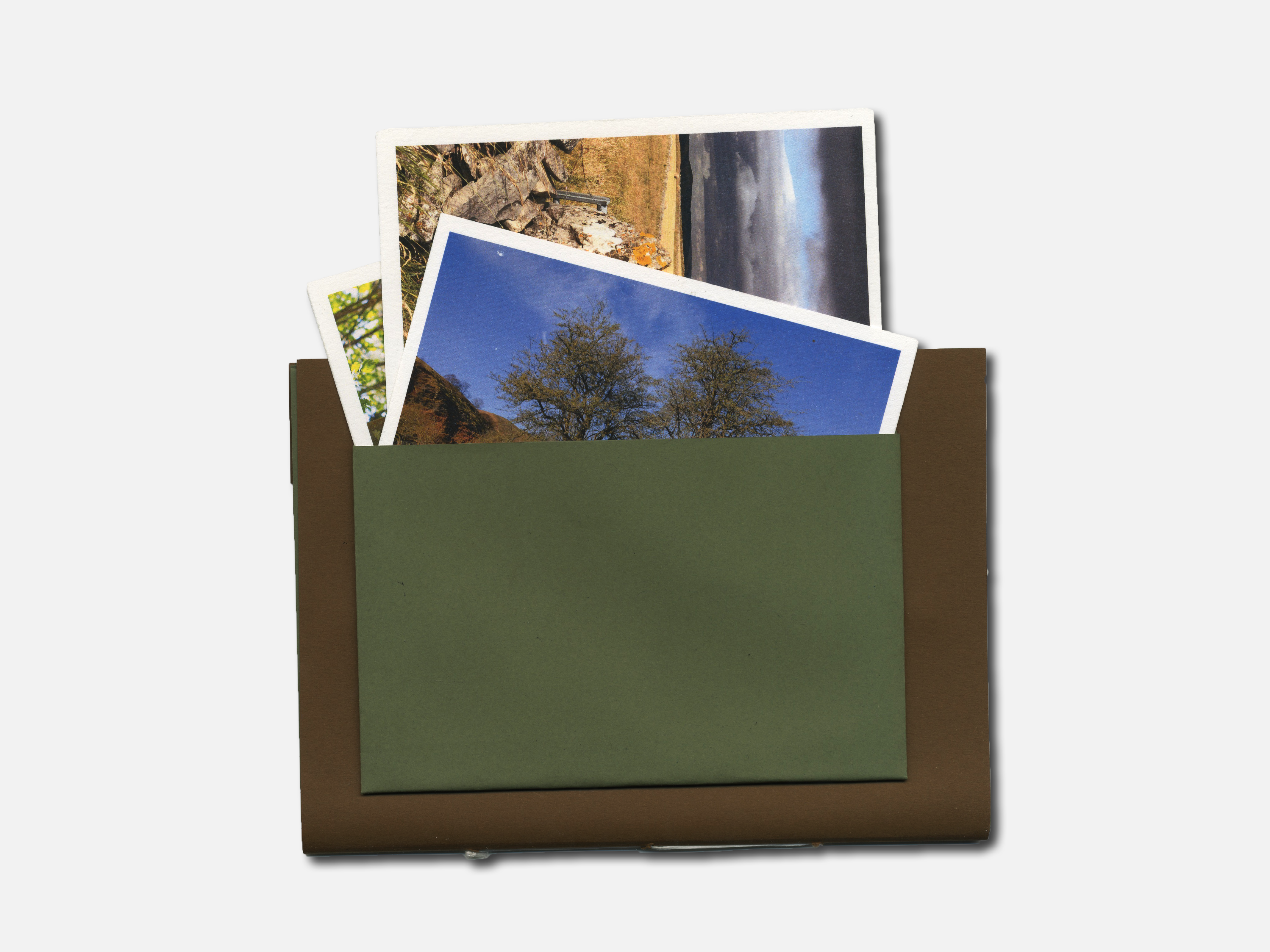
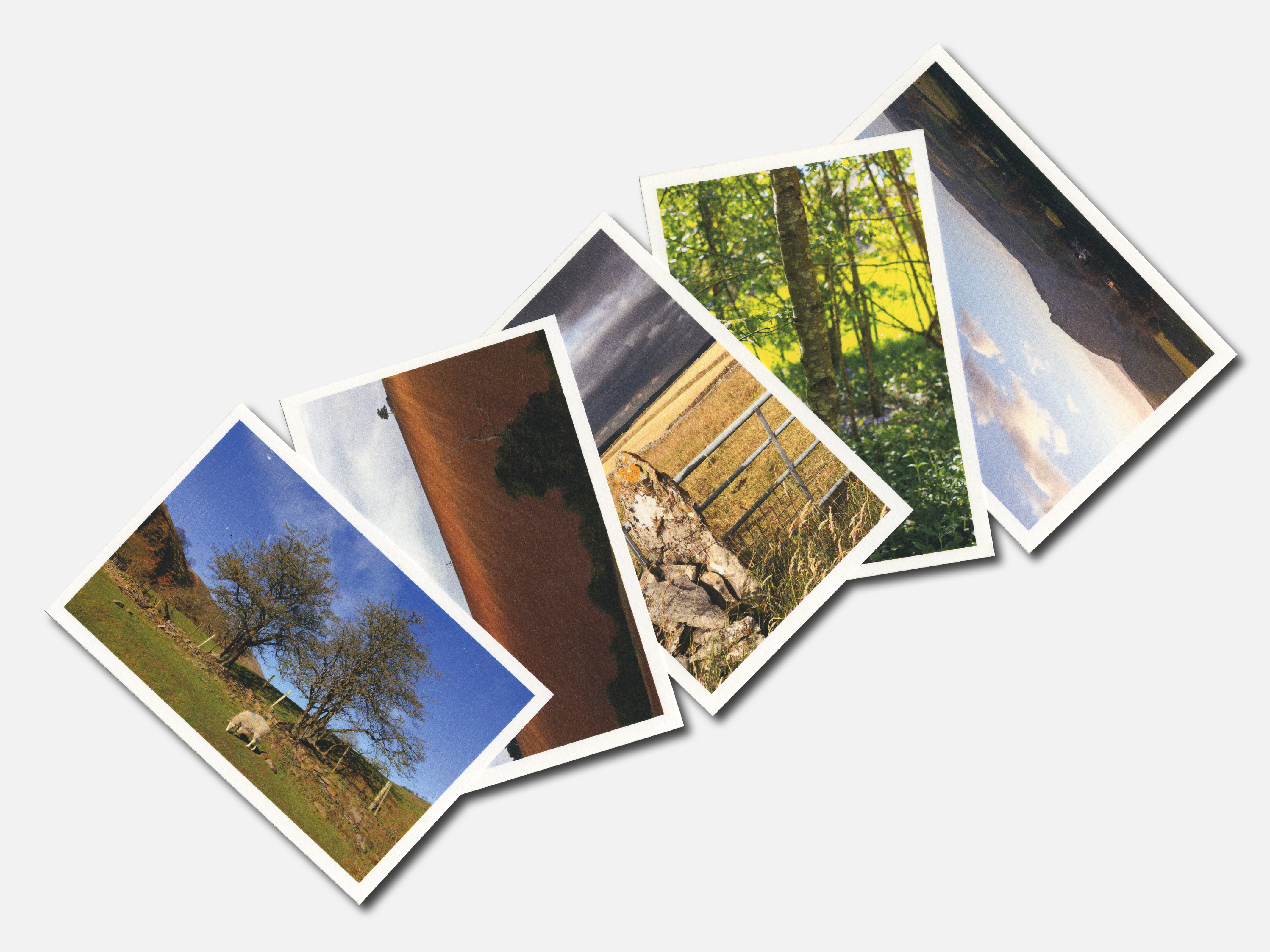
Ask anyone from Sheffield or Derbyshire about the Peak District and chances are they will only have good things to say. It often starts with the stunning scenery, such as the rocks of Stanage Edge or the birch forest of Surprise View, but I guarantee it will always end with them saying how lucky we are to have it on our doorstep.
Below is my publication with an attached sleeve on the back cover containing postcards which show the beauty of the Peaks in full colour.
︎︎︎ Materials: 120 gsm forest green (body stock), 120 gsm earth brown (cover), 250gsm textured card stock (postcards).
︎︎︎ Typography: Acumin Pro Wide.
︎︎︎ Binding: Saddle-stitch with embossed cover.
︎︎︎ Software: InDesign, Photoshop, Illustrator.
︎︎︎ Written Content: Conversations and accounts from family.
︎︎︎ Image Treatment: Images taken by me.